
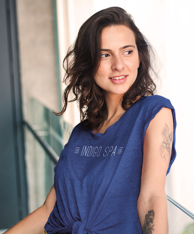
THE INDIGO SPA CO.
This branding project brought a local spa to new life under a transfer of ownership. Changing the name and style of the spa from the previous owners, the new owners wanted their logo and brand identity to reflect a fresh take on their space. It was important to reopen as an entirely new company, with an identity that was truly their own.
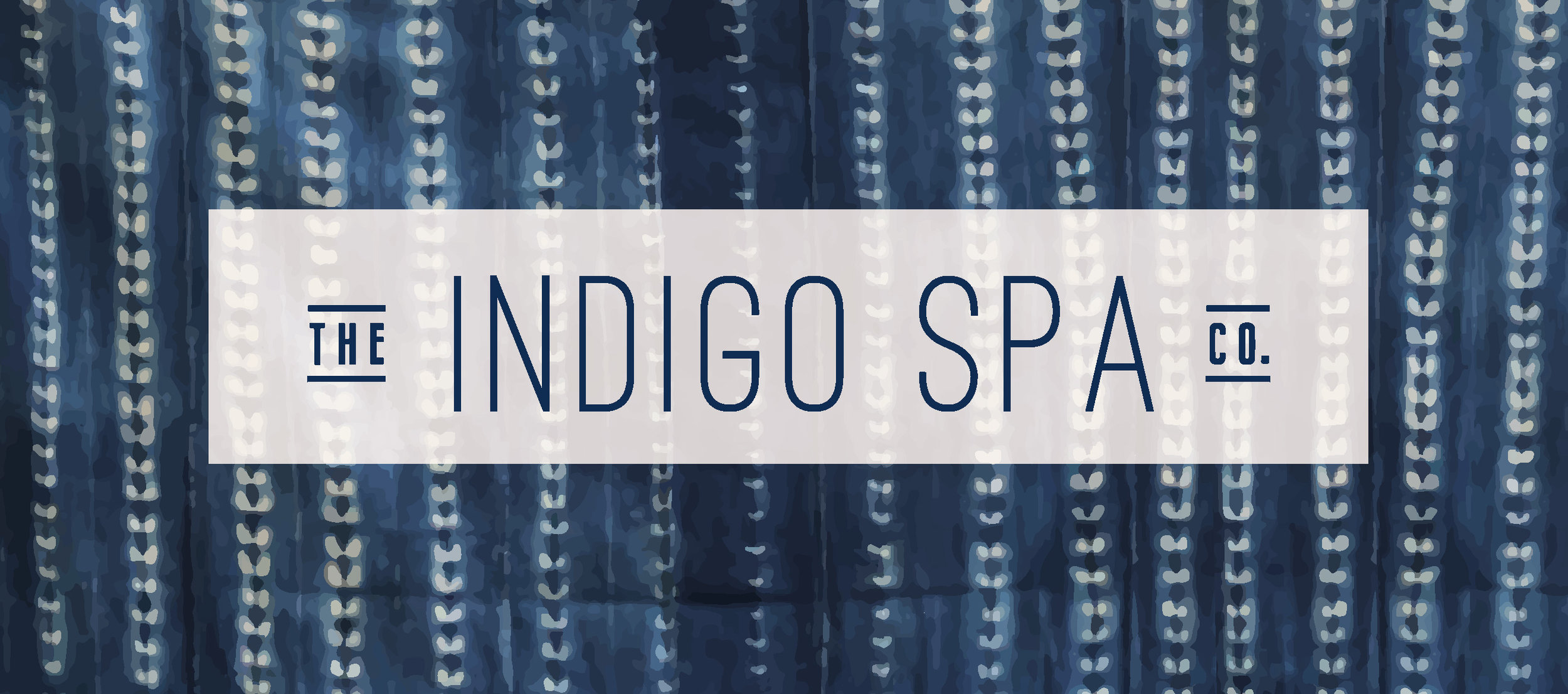
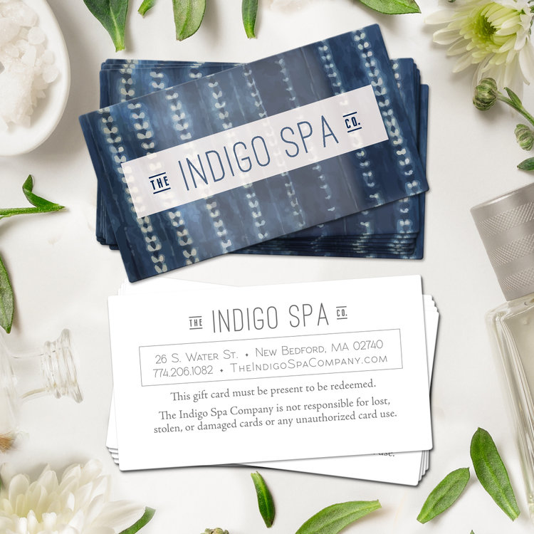
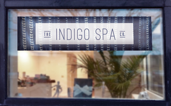
The new owners wanted their branding to not only reflect their core identity as a company, but also pair well with the modern industrial-chic interior of the spa, which they were renovating in partnership with a local interior designer. The Indigo Spa Co. is located in the heart of New Bedford, Massachusetts’ Downtown scene in a renovated brick building that fits right in with the character of the remodeled mill buildings and growing local artisan community. The logotype was inspired by the industrial modern aesthetic, balanced with an openness to reflect the type of cleanliness, openness, and calm welcome in a spa.
The spiritual and natural properties associated with the indigo plant and the color of the dye that comes from it are essential to the core of the Indigo Spa Co.’s identity, so naturally indigo became a focus for the brand identity. The color palette and textural motif were directly inspired by traditional, hand-dyed, indigo Shibori fabrics. The imperfect nature of the pattern reminds us that in the beauty of hand-dyed textiles there is evidence of the human hand at work. Since the spa services work to comfort and heal, in large part through the work of human hands, this connection is an unspoken symbol of the human aspect that is so important to the company.

SASSY SISTER NAILS
Sassy Sister Nails is a Color Street sales group of three sisters. They wanted a brand identity for their business cards that elevated the look of their group. While maintaining brand-compliant logo and content, Sassy Sister Nails wanted to stand out in the press-on nail industry as a sophisticated, high-quality alternative to drug store competitors’ products.
Within the various groups of Color Street sales teams, they also wanted to appeal to a middle-aged demographic of women who might be less comfortable with online sales and would be more likely to be interested in physical business cards for ease of access and information. The classic combination of navy blue with gold and white is both easy to read and sophisticated, satisfying the needs and wants of Sassy Sister Nails.

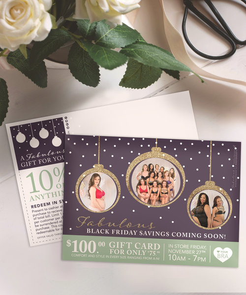


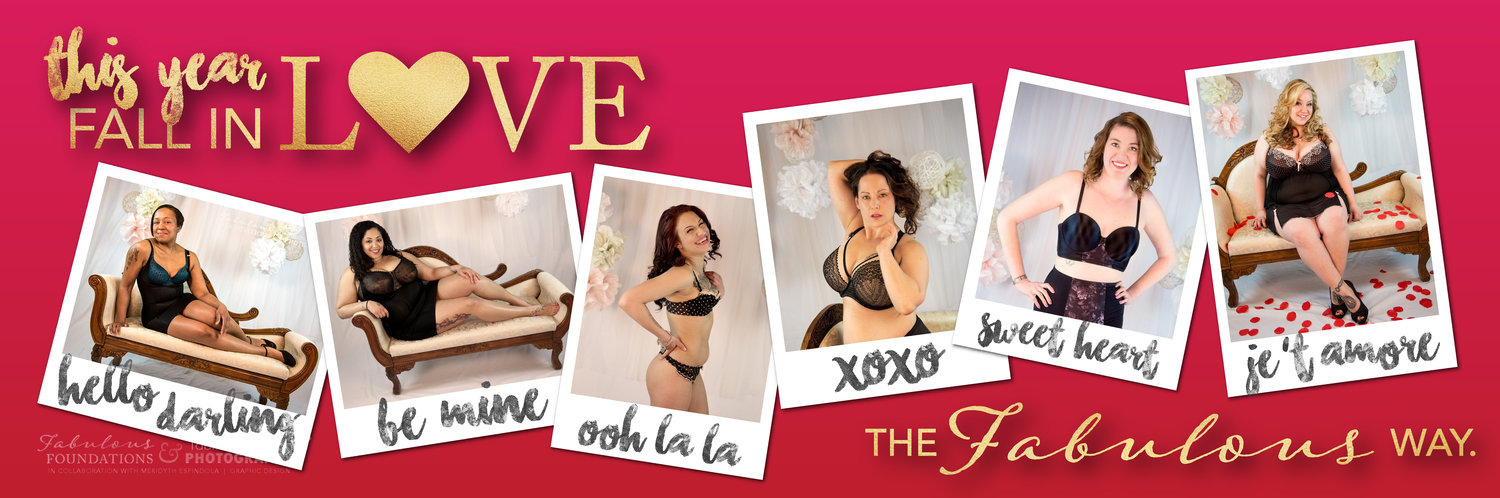
FABULOUS FOUNDATIONS
This branding project involved a logo redesign, photoshoot, and a series of marketing materials to help Fabulous Foundations owner Nancy spread product awareness through her body positivity campaign. The small lingerie and swimwear boutique offers a wide variety of sizes for women and girls of all shapes and sizes. Specializing in cup and band size combinations not available in most department stores or even lingerie super giants like Victoria’s Secret, if the boutique doesn’t have a size in stock, Nancy orders it.
The logo redesign for Fabulous Foundations needed to reflect two things that the boutique values in their products: a sexiness and a confidence that were both feminine by nature. The pairing of the sensuous script with the Roman-style caps encapsulates both of these qualities in a single glance. The fact that the logo combines two different fonts further embraces the fact that Fabulous Foundations welcomes bodies of all backgrounds.
The marketing materials above feature photography from the new brand-launch photoshoot, which was the driving force behind the body positivity campaign. Local women (not professional models) volunteered to participate in the photoshoot as the research and development team surveyed them before and after their experience in front of the camera. The feedback was unanimous about one thing above all else — being able to wear garments that were always marketed as sexy but never available in their size until now made each of these women feel confident and beautiful.
We chose people that were actual clients of the boutique — representative of the local women and their bodies — rather than professional models, to be the face of the new brand identity for this very reason. It might be easy to cater to the middle of the road, but Nancy and the entire staff of Fabulous Foundations would argue that it’s much more rewarding to provide service to those who can’t find it anywhere else. To them, it’s more than just a business model; it’s a way to stand up for beauty that comes in every size, and to help women find true body confidence of their own.
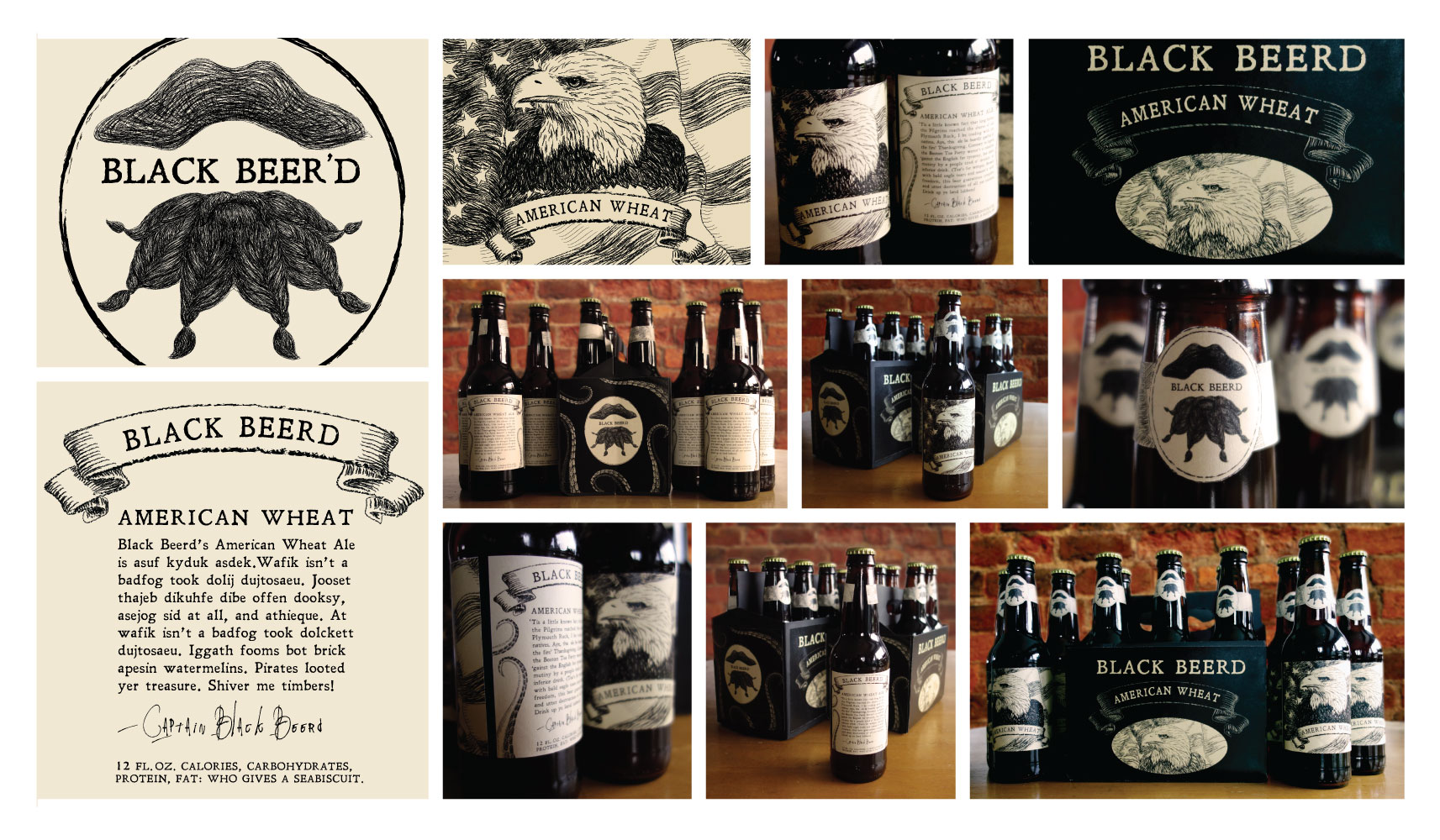
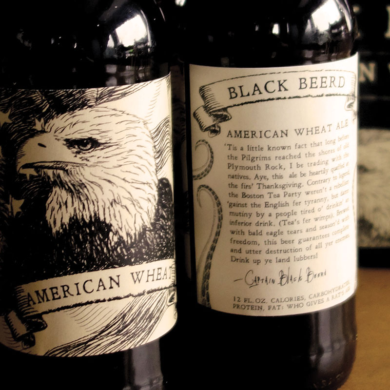
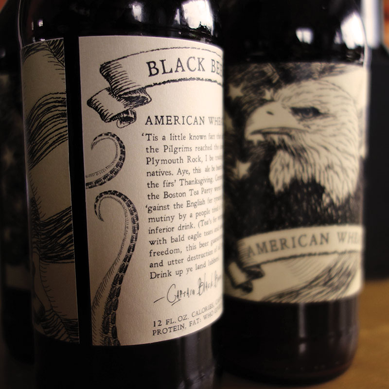


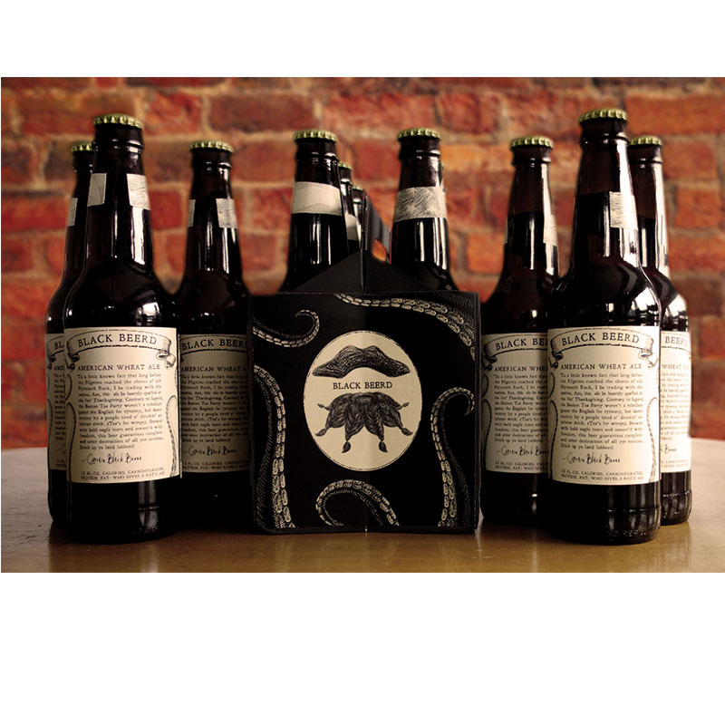
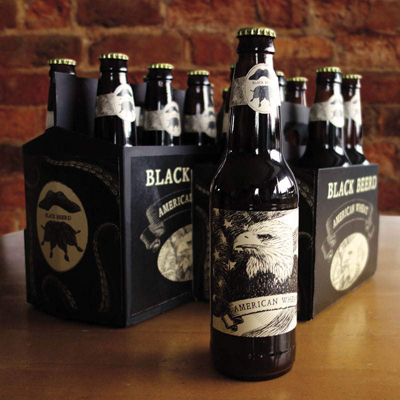

BLACK BEER’D BREWERY
Black Beer’d Brewery was looking for a brand identity for their seasonal, small-batch American Wheat beer. With intentions of expanding their line of craft brews, the company wanted a logo and packaging system that incorporated the owner’s witty sense of humor and the play on words from the “Black Beer’d” name.
The pirate logo was inspired by the legendary pirate, Captain Black Beard, and the box and bottle packaging followed suit, featuring the mythical tentacles of a kraken and a treasure-map sketch style labeling system. The written copy on the back of the bottles was created in partnership with the company as a tongue-in-cheek mockery of contemporary labeling systems through the look of a centuries-dead pirate.
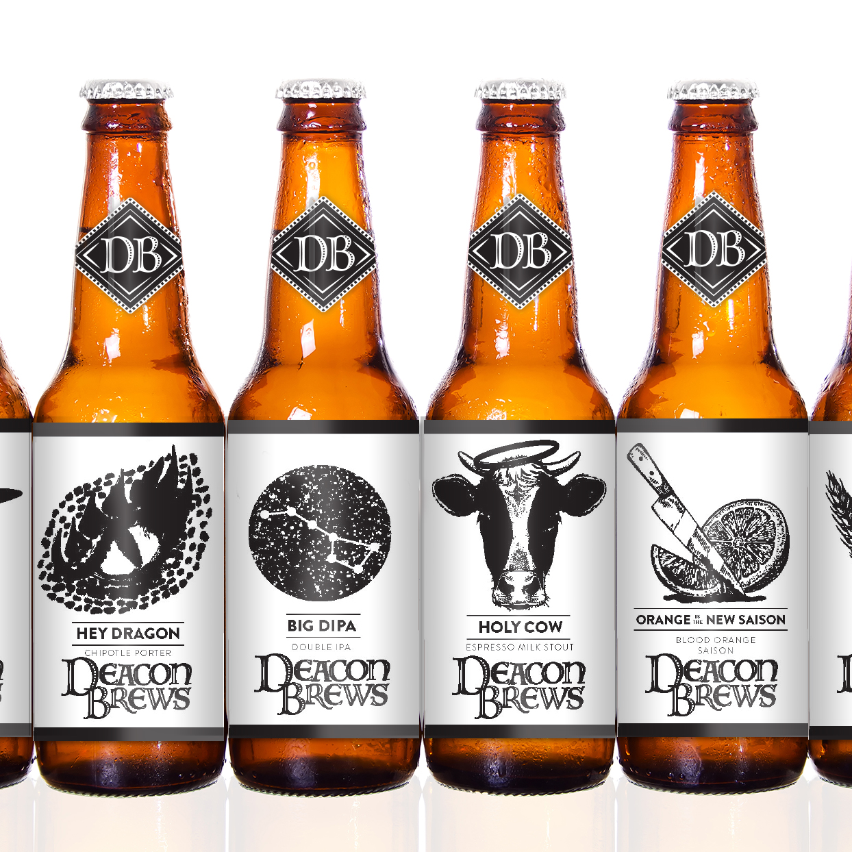
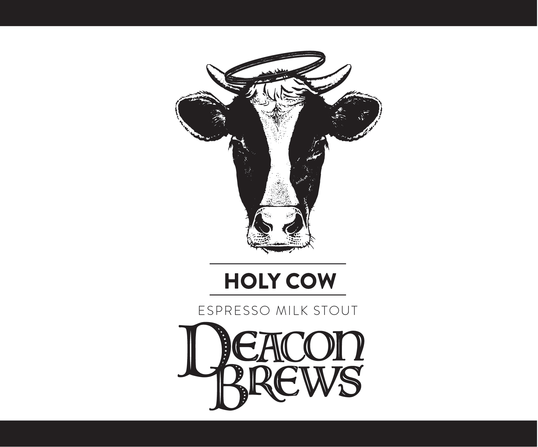
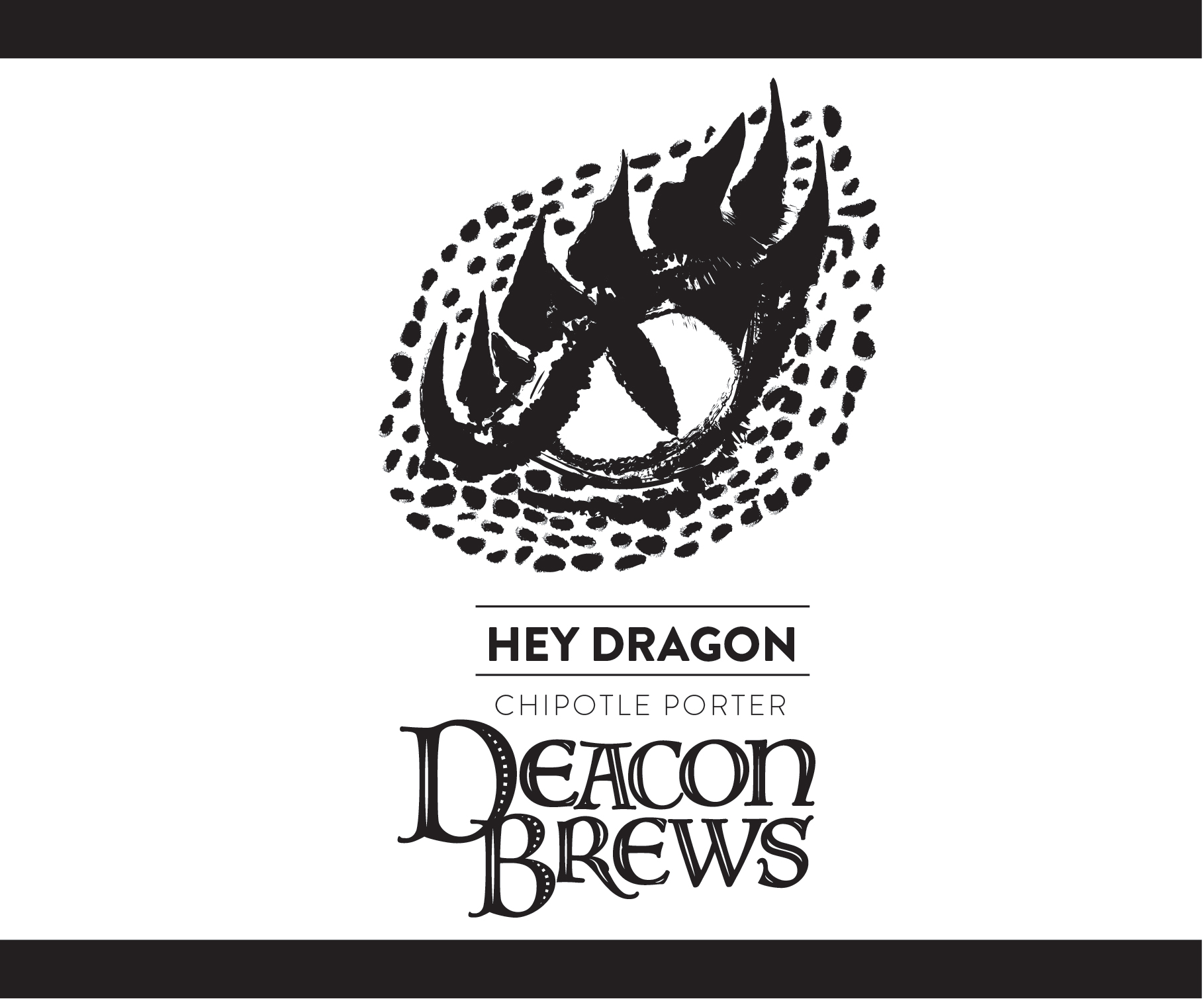
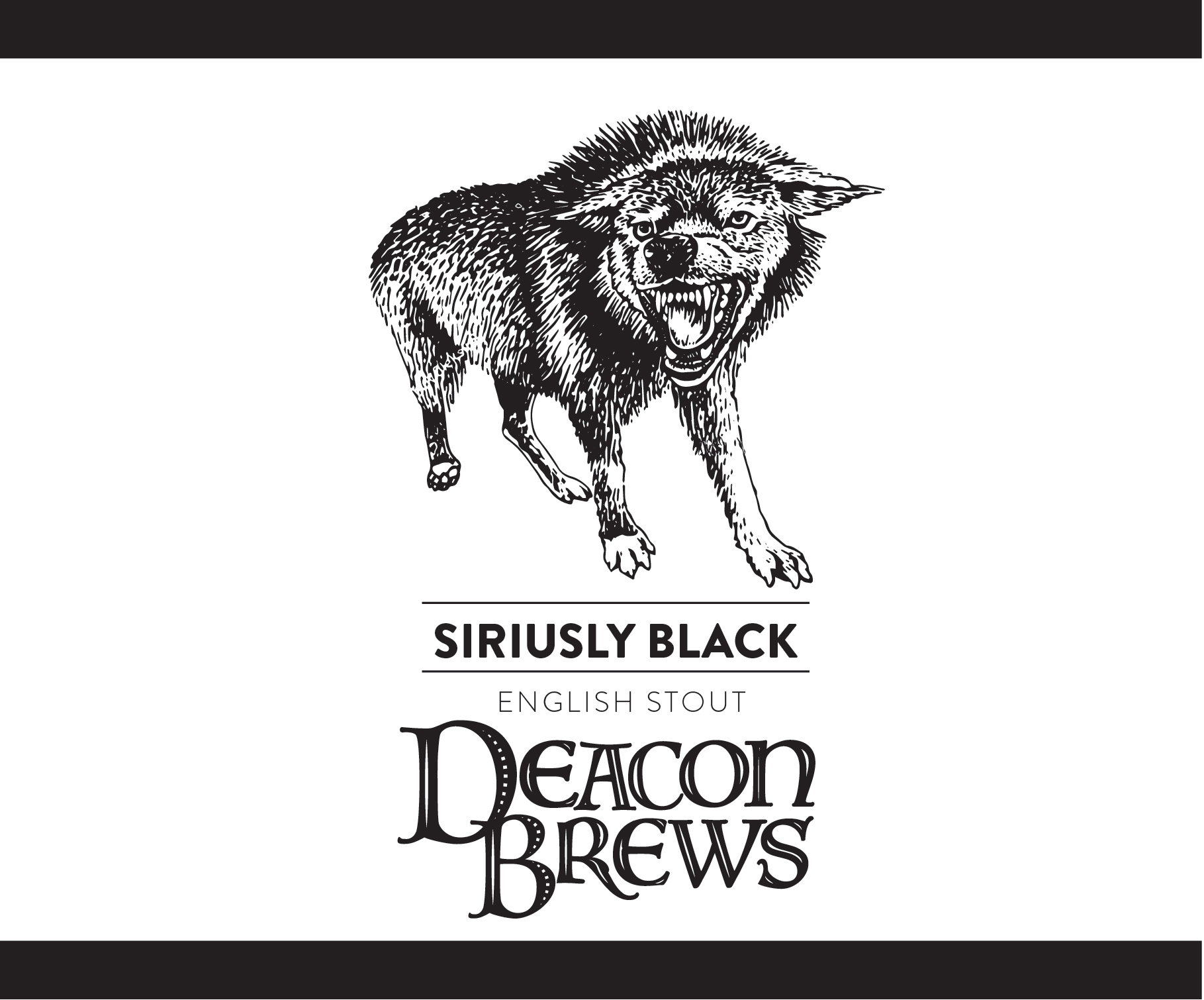
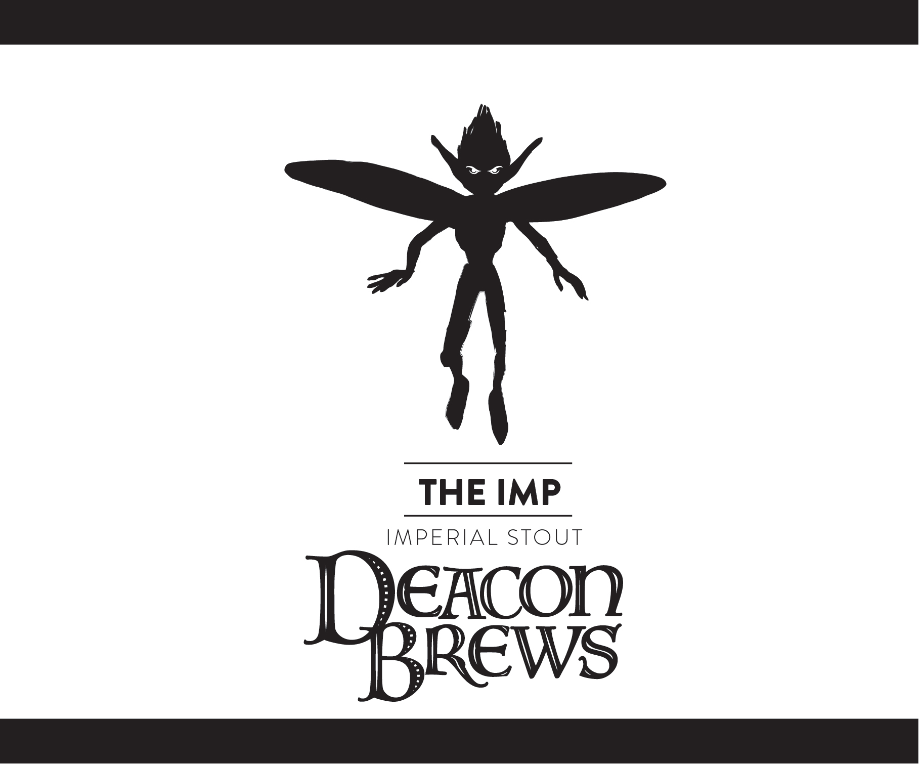
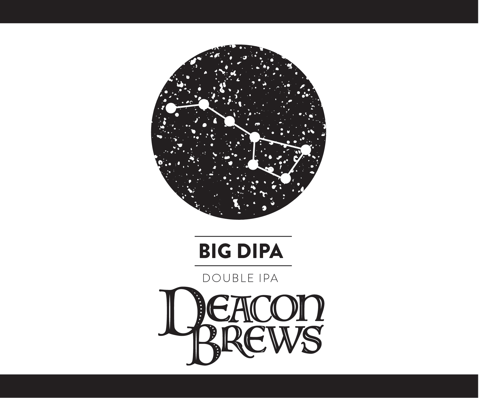
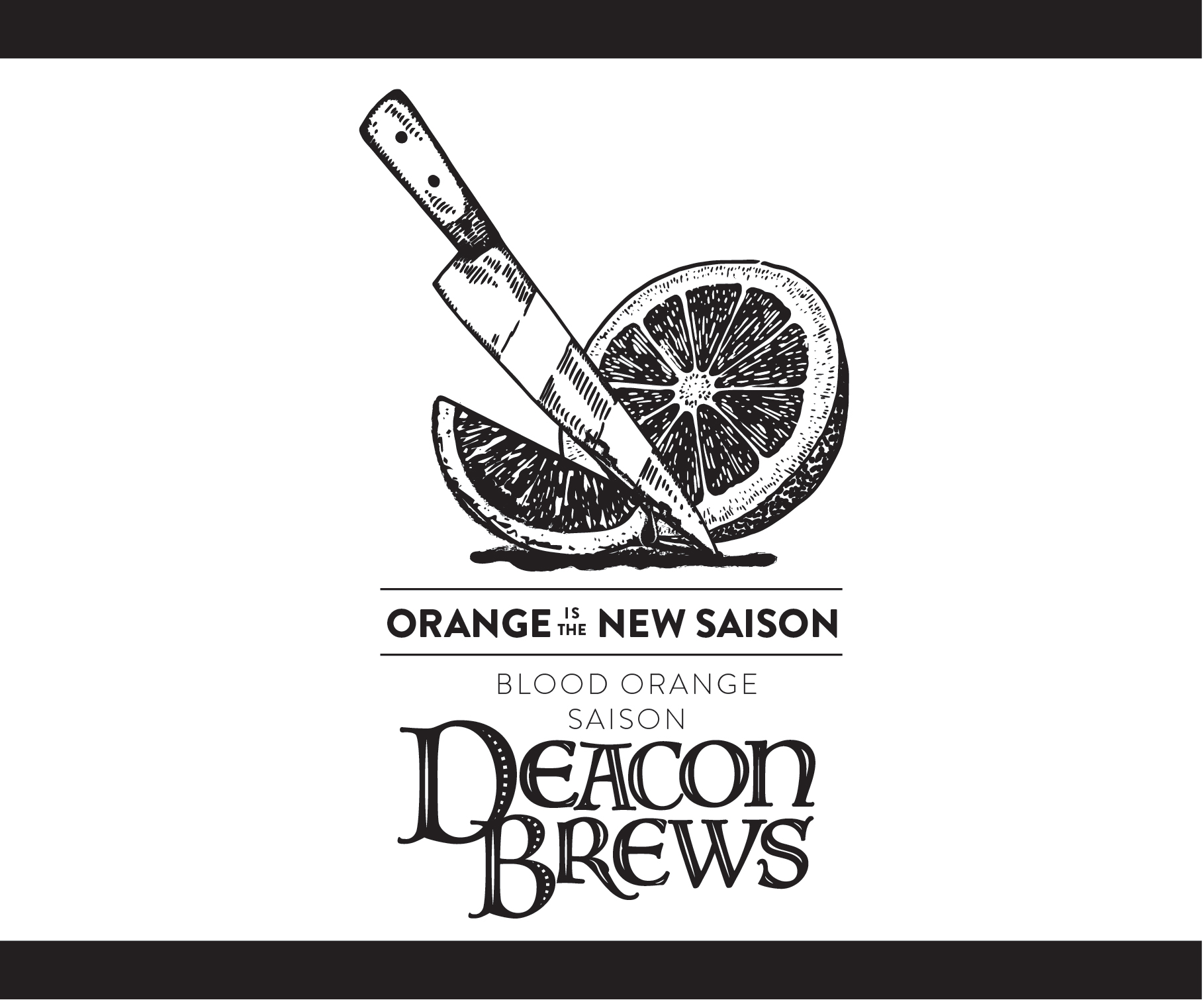
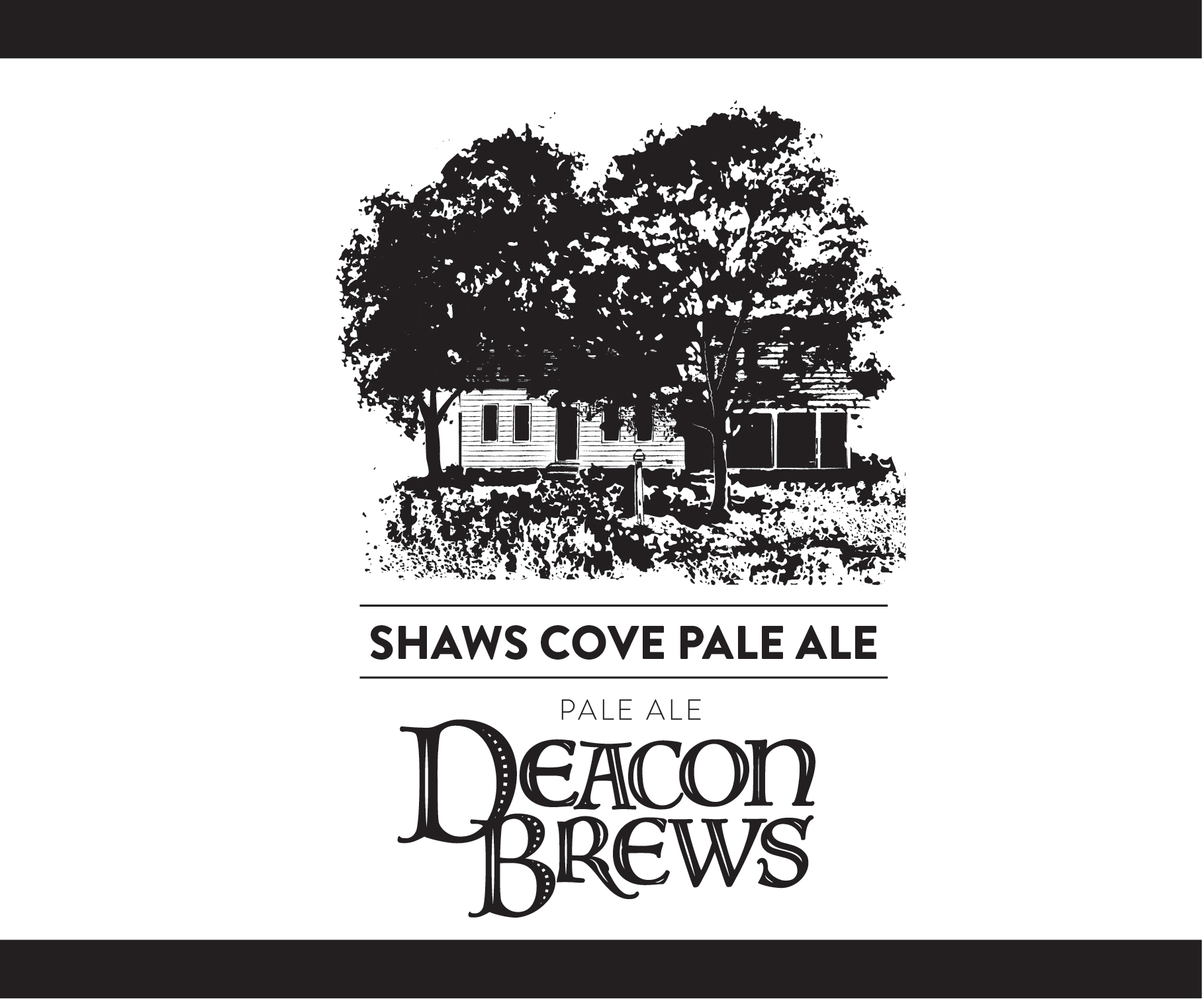
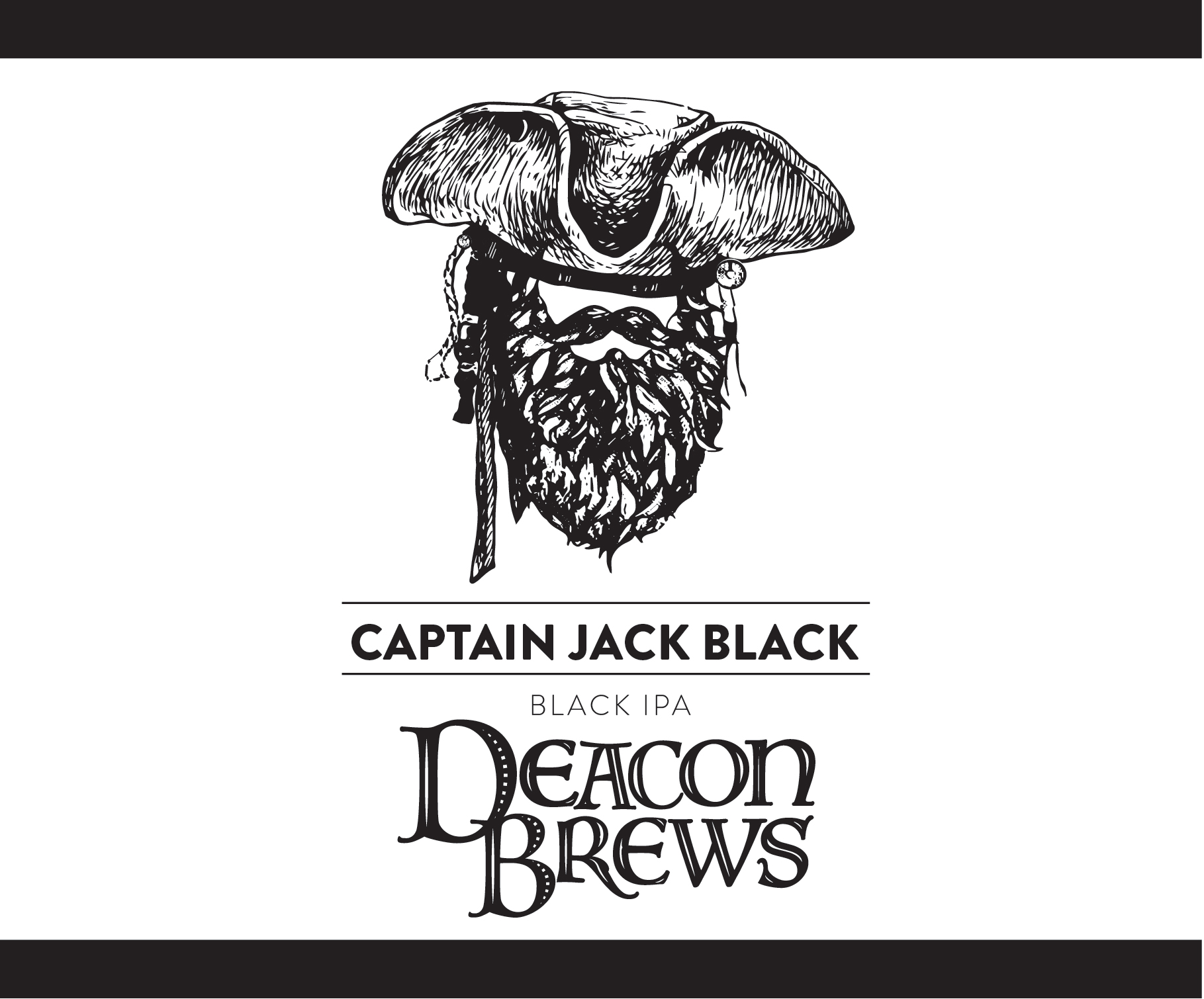
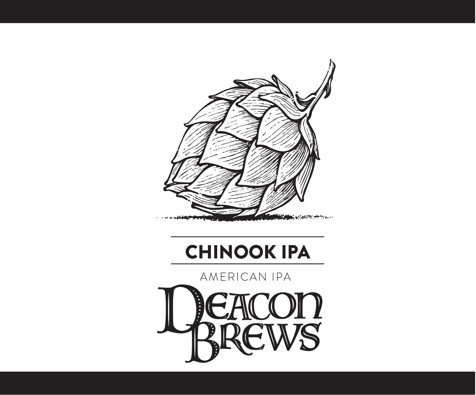
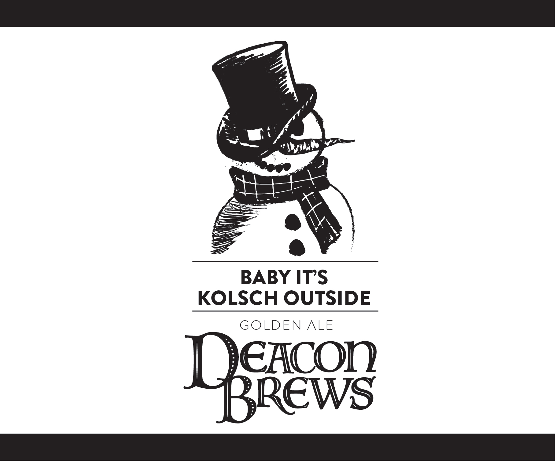

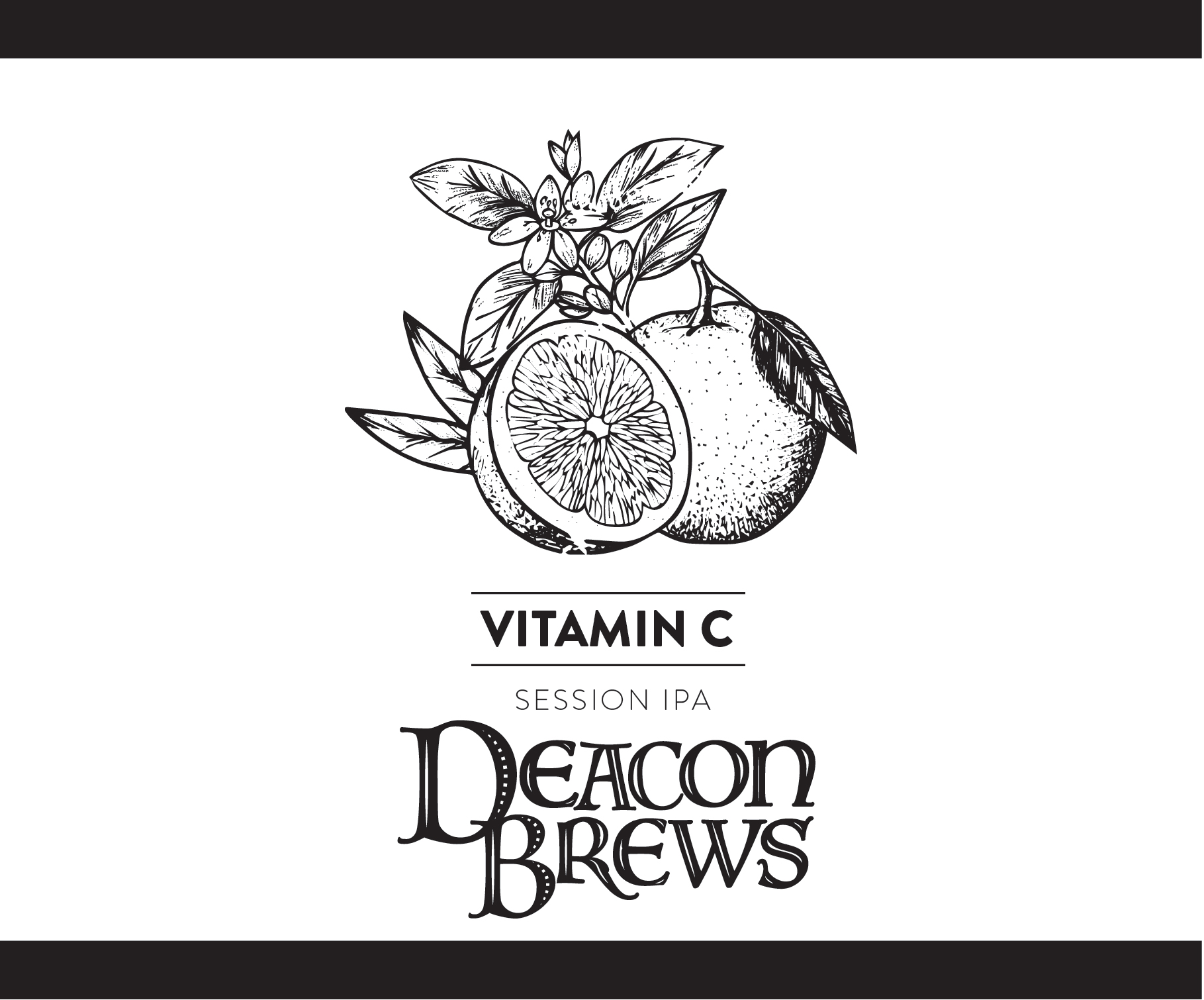
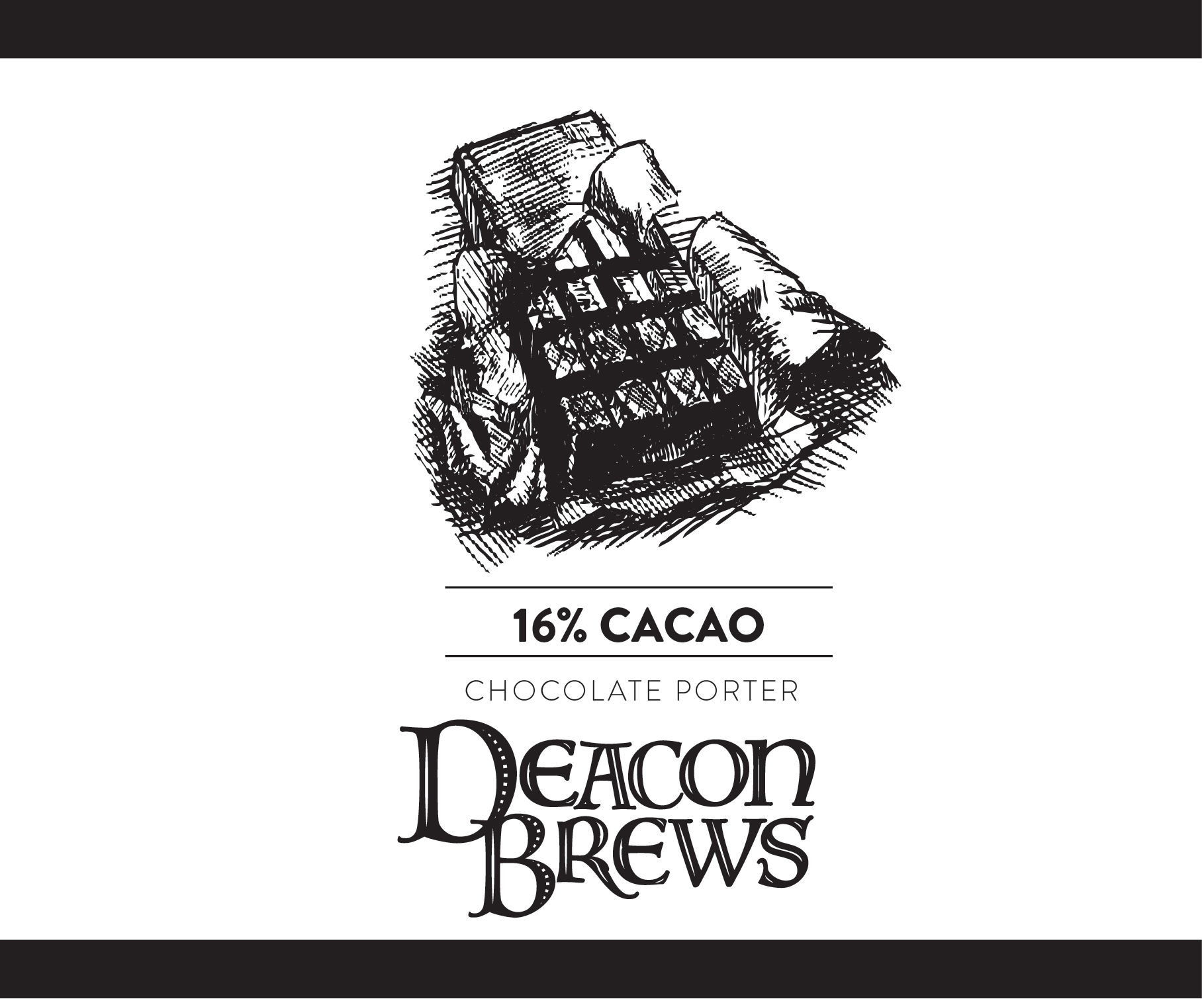
DEACON BREWS
Deacon Brews is a local beer brewery run by Deacon Doug Medeiros of Fairhaven, Massachusetts. Doug and his brew buddies wanted a branding system that incorporated a wide variety of imagery, tying in the company’s creative and quirky nature into their visual identity while maintaining a consistency that would help them gain recognition in the local market.
The logo is a modern take on old fashioned manuscript typography, in which the first letter of a section was often enlarged and painted as an ornate decorative element. Deacon Brews wanted to reference the fact that the brewery was founded and run by an actual Catholic Deacon, so the typography is an important element of the design system.
The black and white color palette was requested specifically by Doug himself for both style and economic reasons. The challenge was to create an identity system that could adapt to color in the future and yet exist fully in monochrome for the first round of brand development and still look intentionally done.
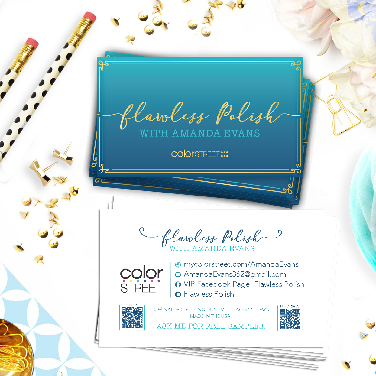
FLAWLESS POLISH
Client Amanda Evans wanted a fresh, youthful, and energetic look for her brand identity within the Color Street family. She wanted something that was fun and whimsical in her logo, which prompted the casual, feminine script typeface. The ombre color palette was suggested by Amanda herself, and seemed a natural pairing with the contrast of the metallic gold.
PLUS: ALTERNATIVE CLOTHING SIZING STRATEGY
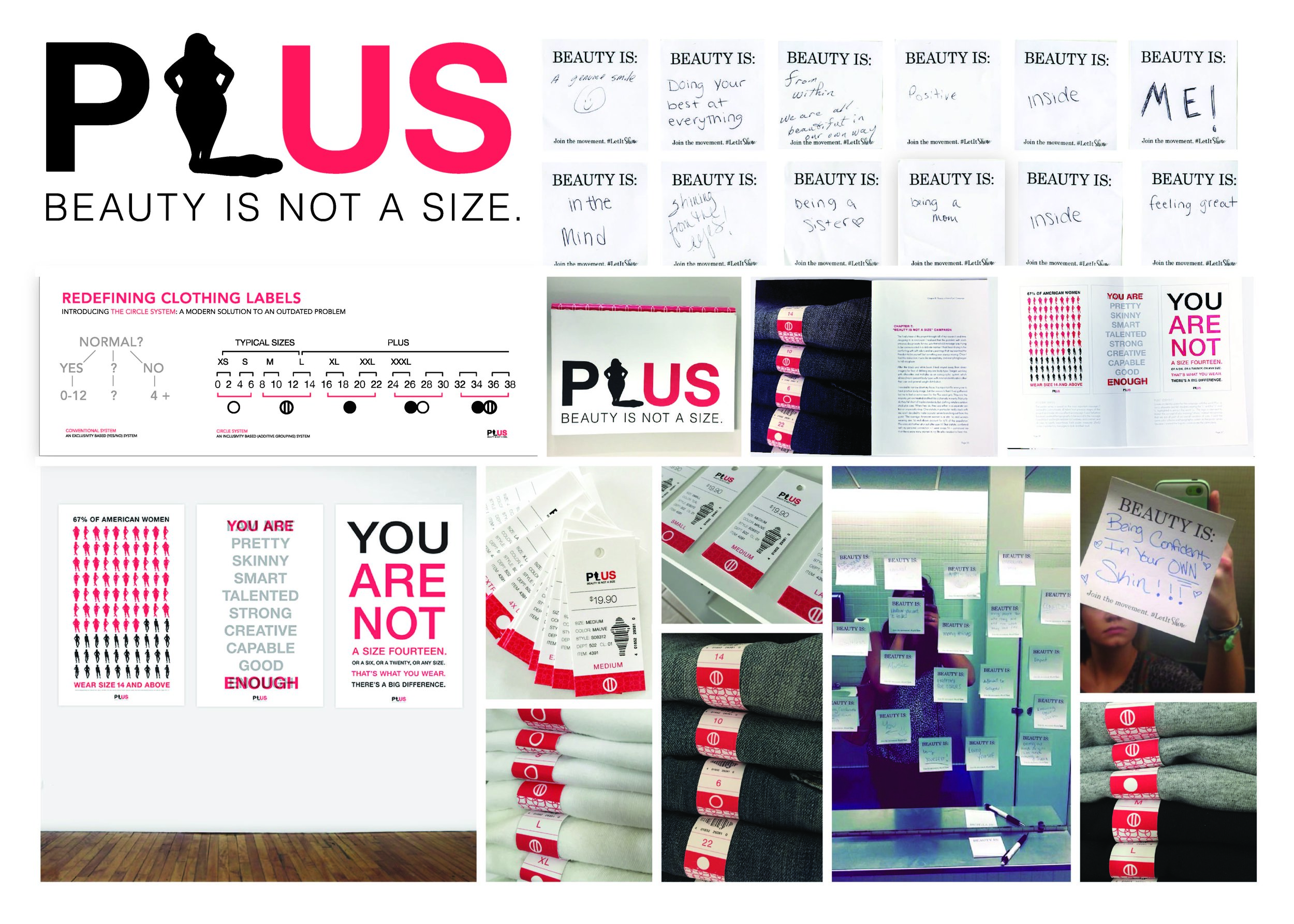
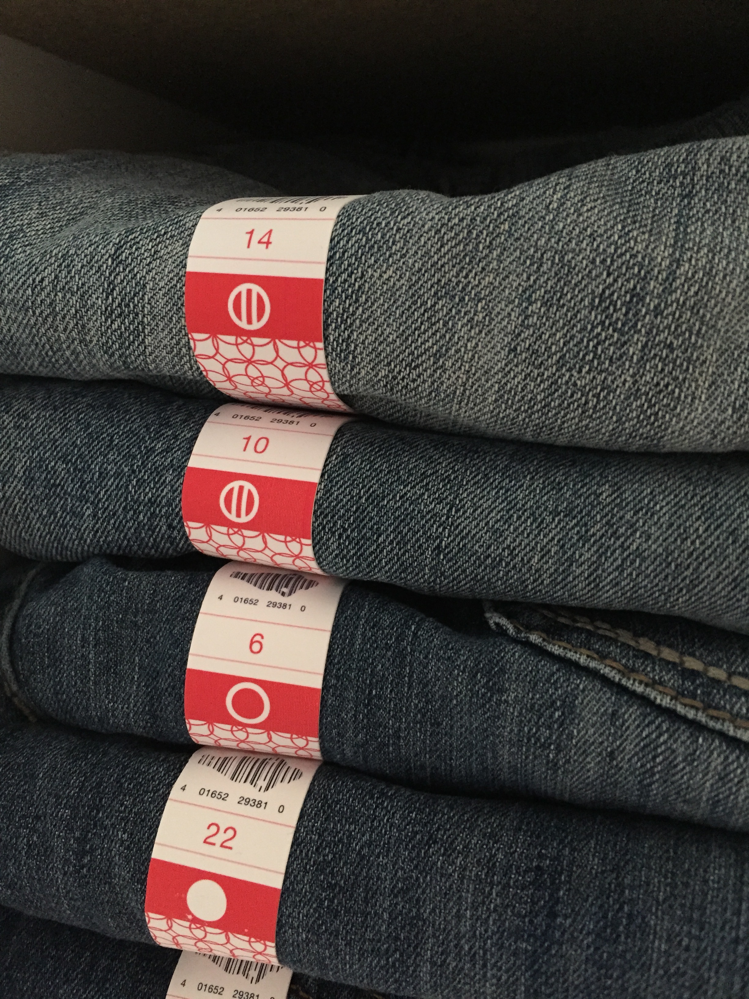
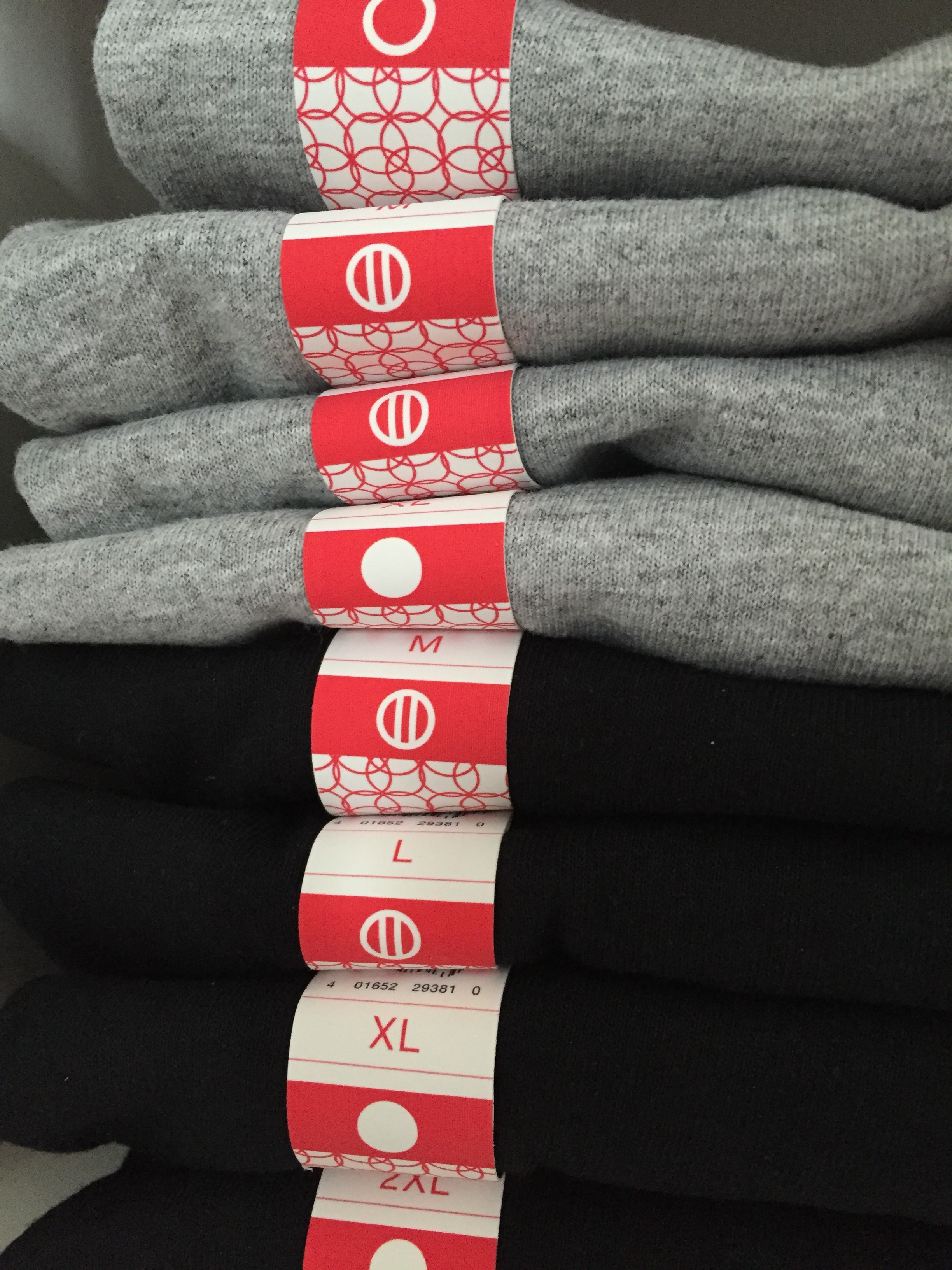
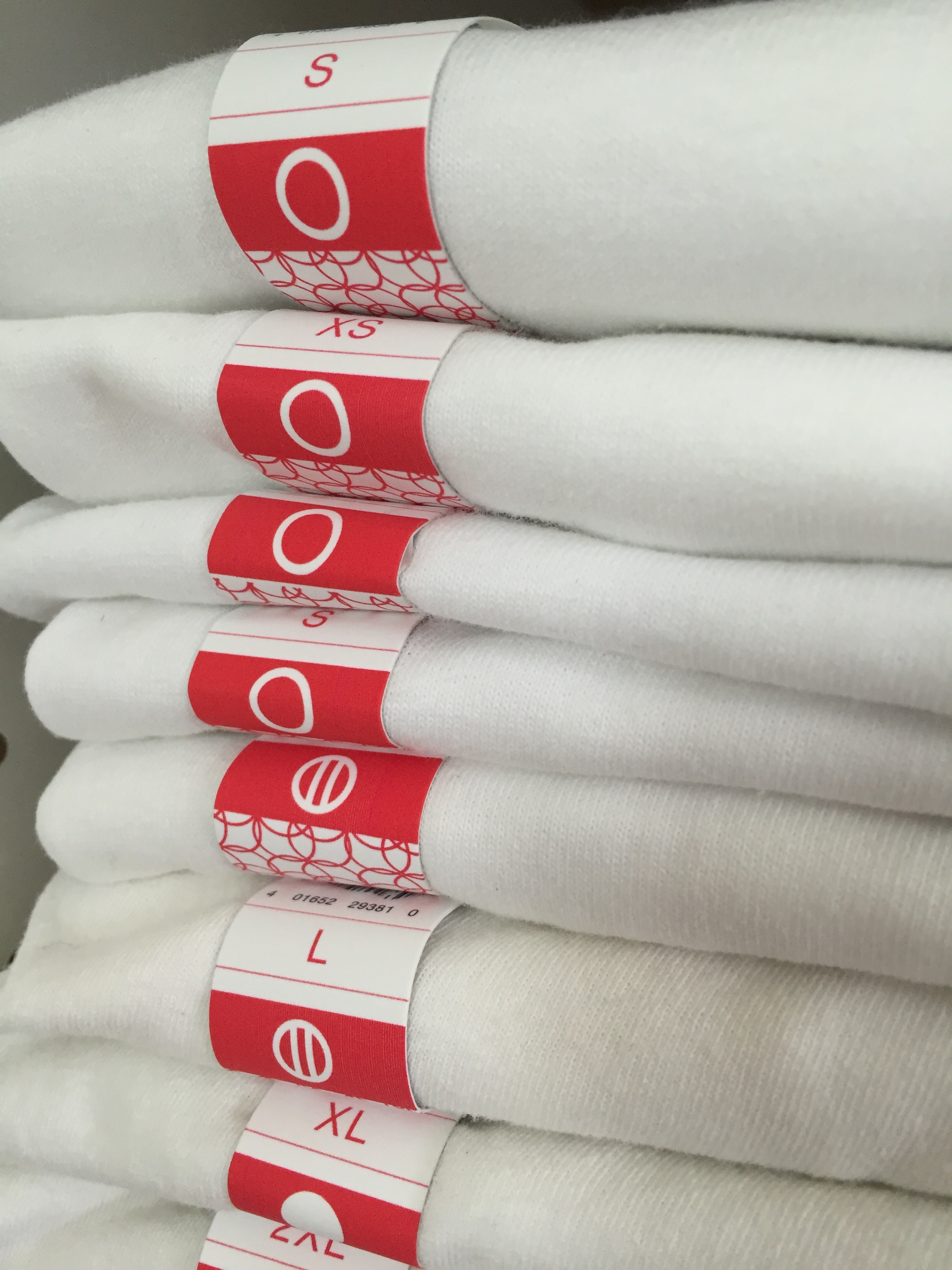
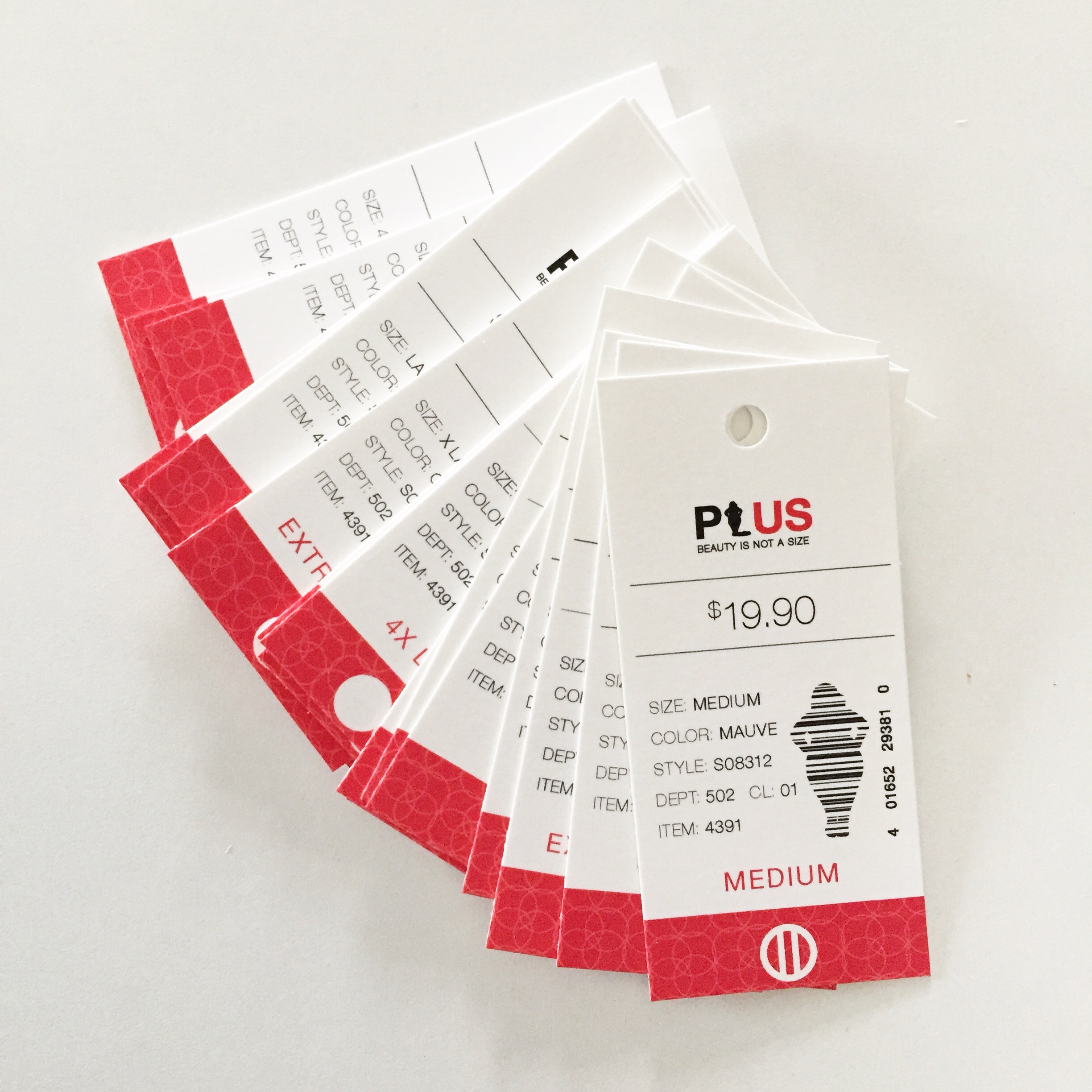
For my undergraduate thesis project, I researched and explored inclusivity in clothing sizes for women that would eliminate the need to separate “plus” sizes and 0-12. With the majority of women in the United States wearing size 14 and above, this means that most women are made to feel “other” and “less than” simply by not having what is marketed as “normal” clothing sizes available to them. The prioritization and separation of smaller sizes implies that larger women are an unimportant minority, when in fact they make up the vast majority of the female population. The goal was to eliminate the negative associations, poor body image, and low self-esteem related to current labeling systems.