
Book Design Projects
Click to view project details.
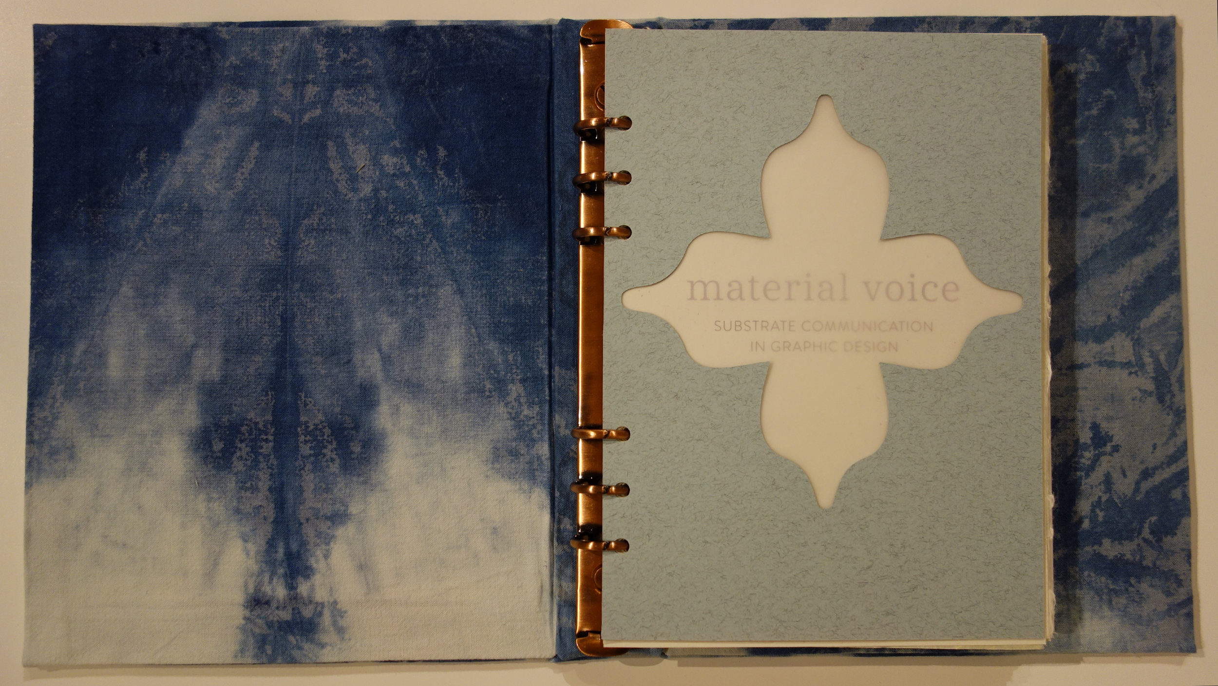
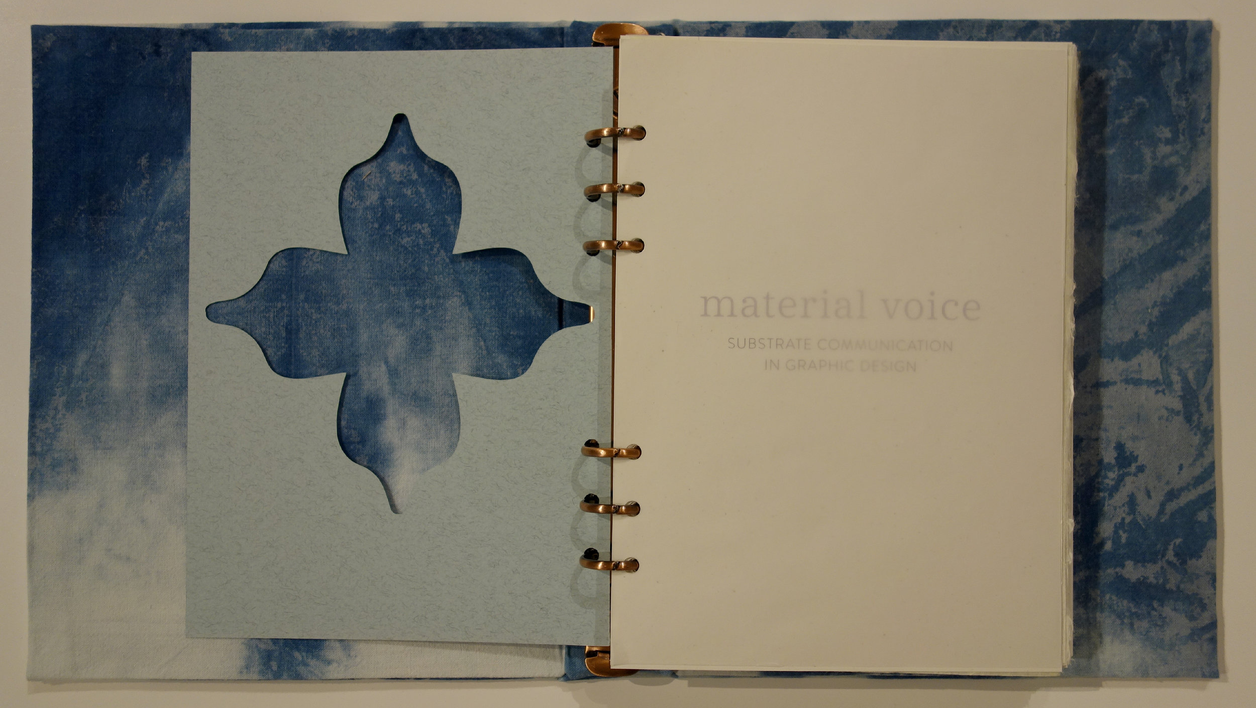
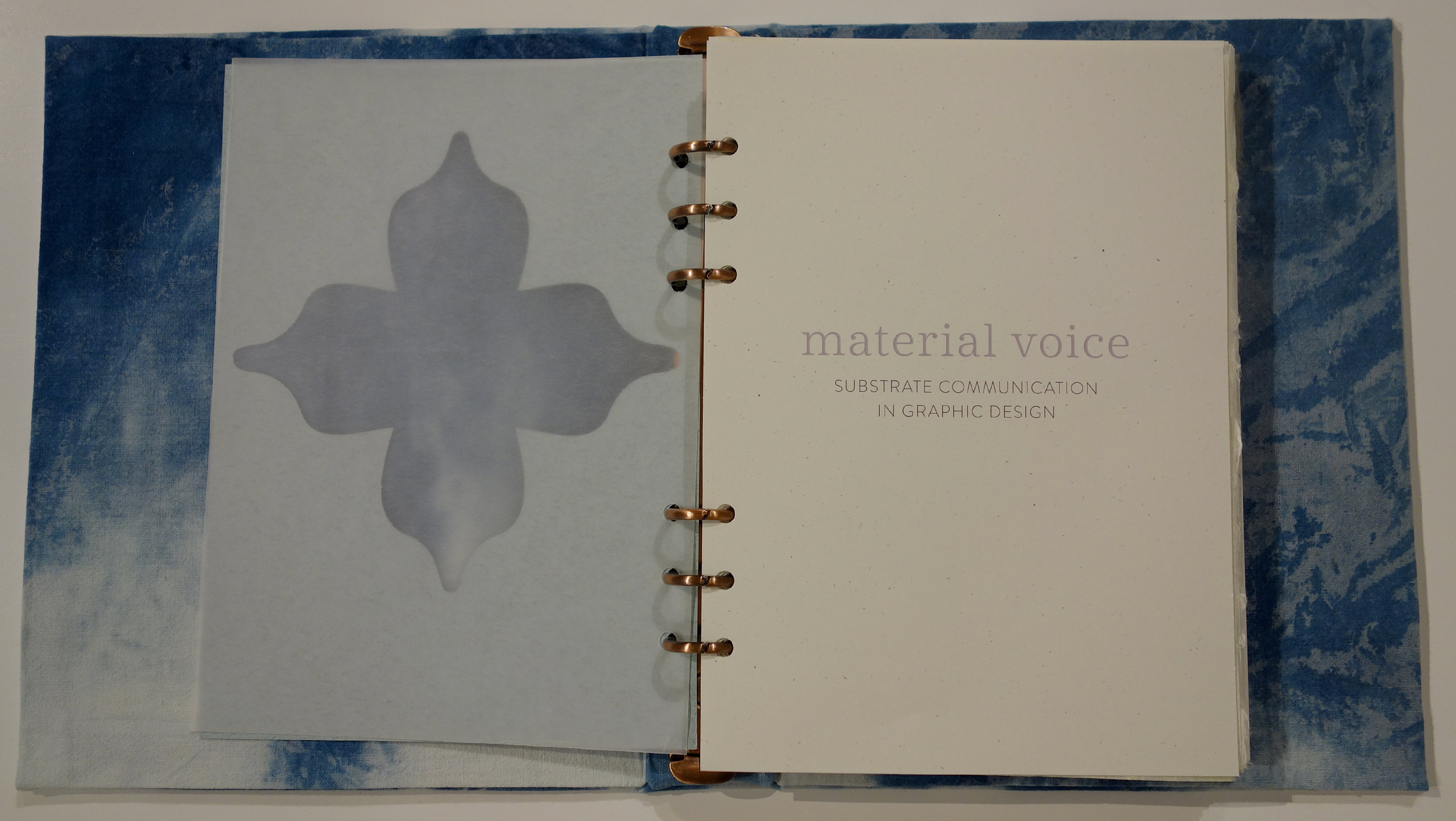


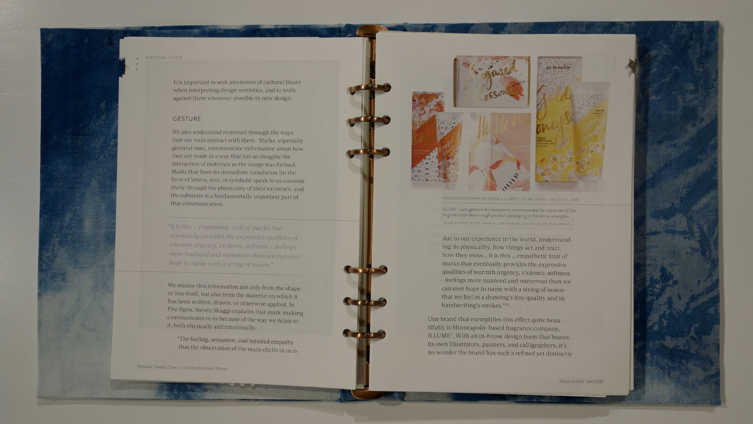
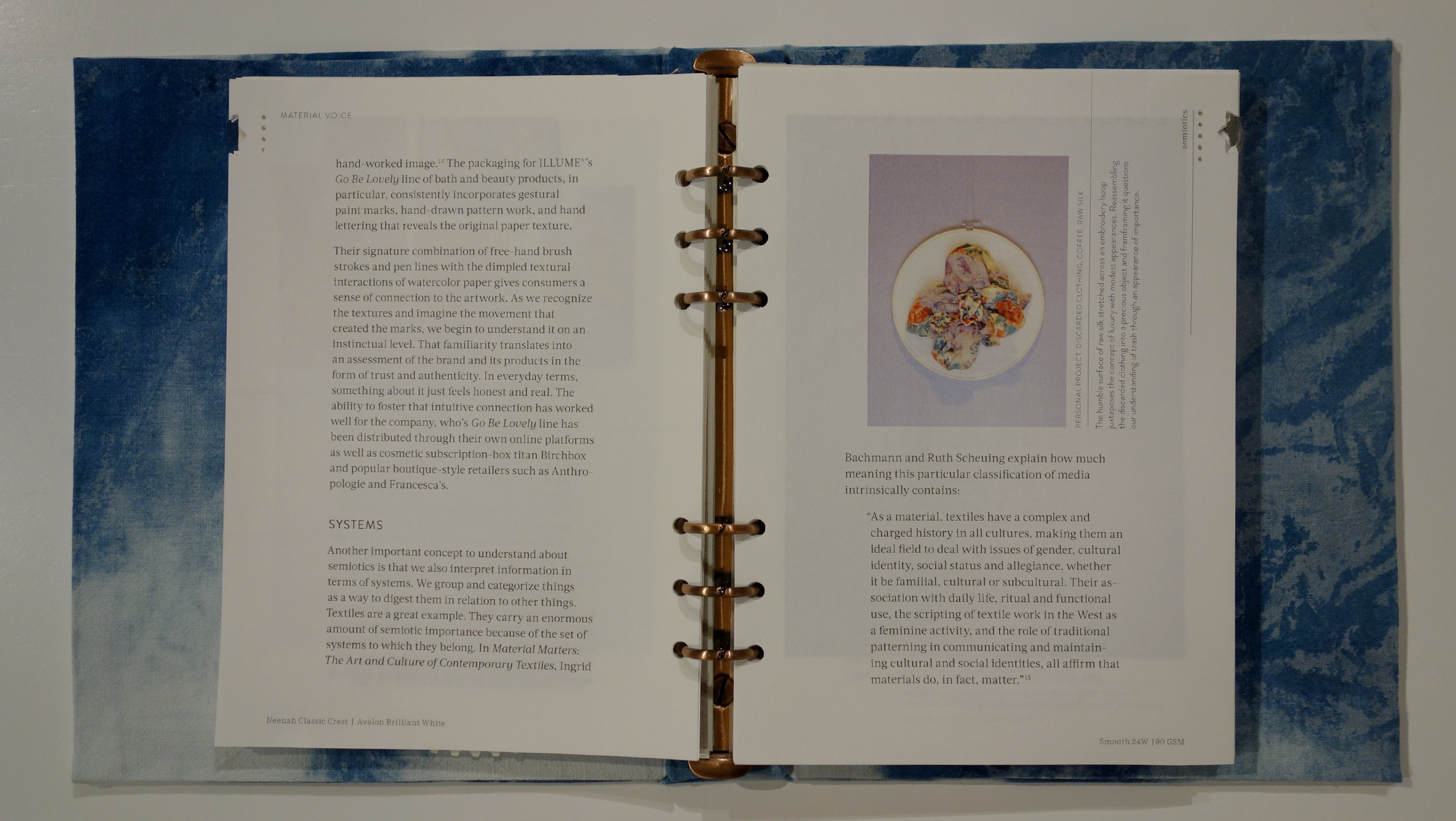
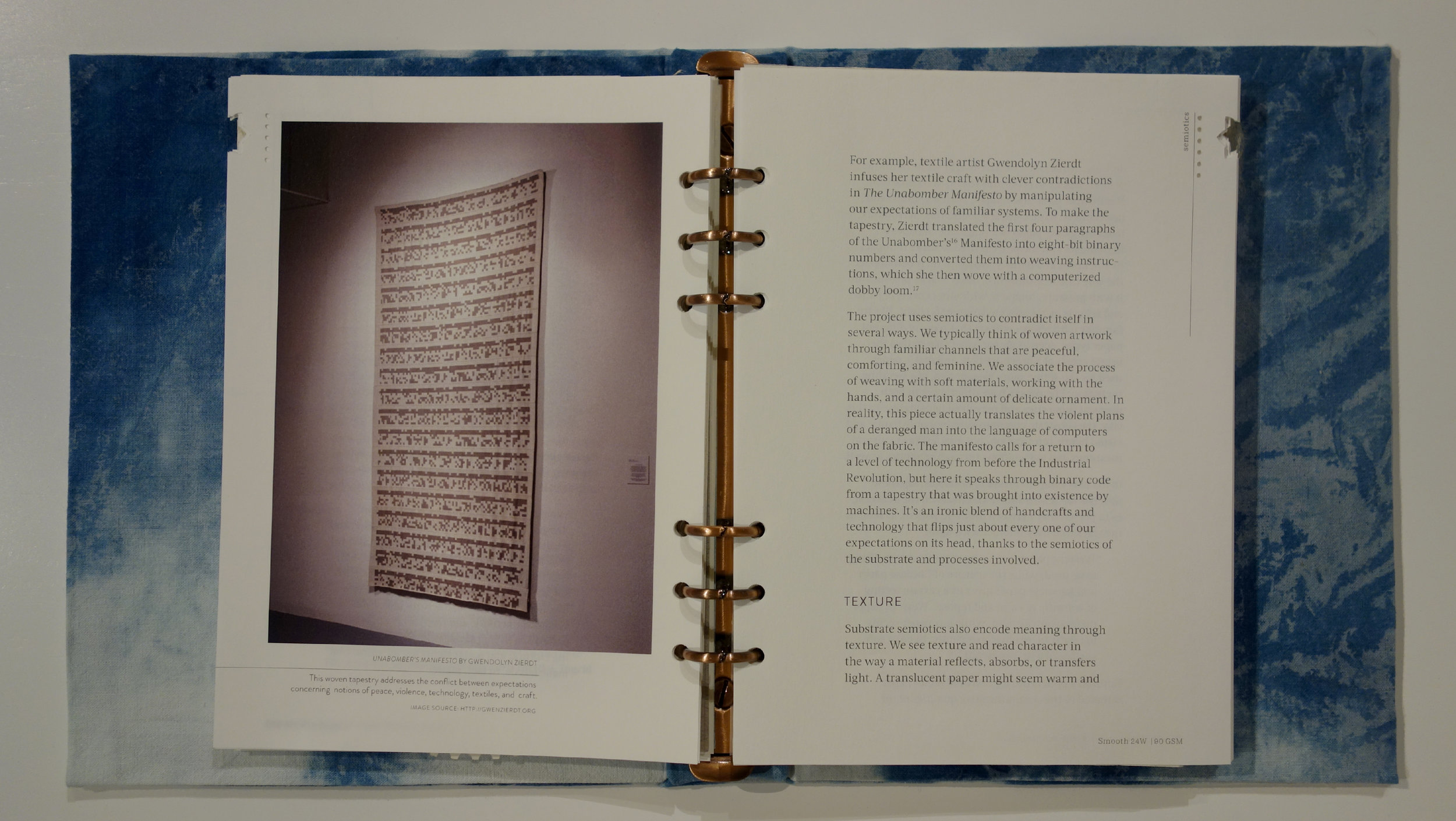


MATERIAL VOICE:
SUBSTRATE COMMUNICATION IN GRAPHIC DESIGN
MFA THESIS IN GRAPHIC DESIGN
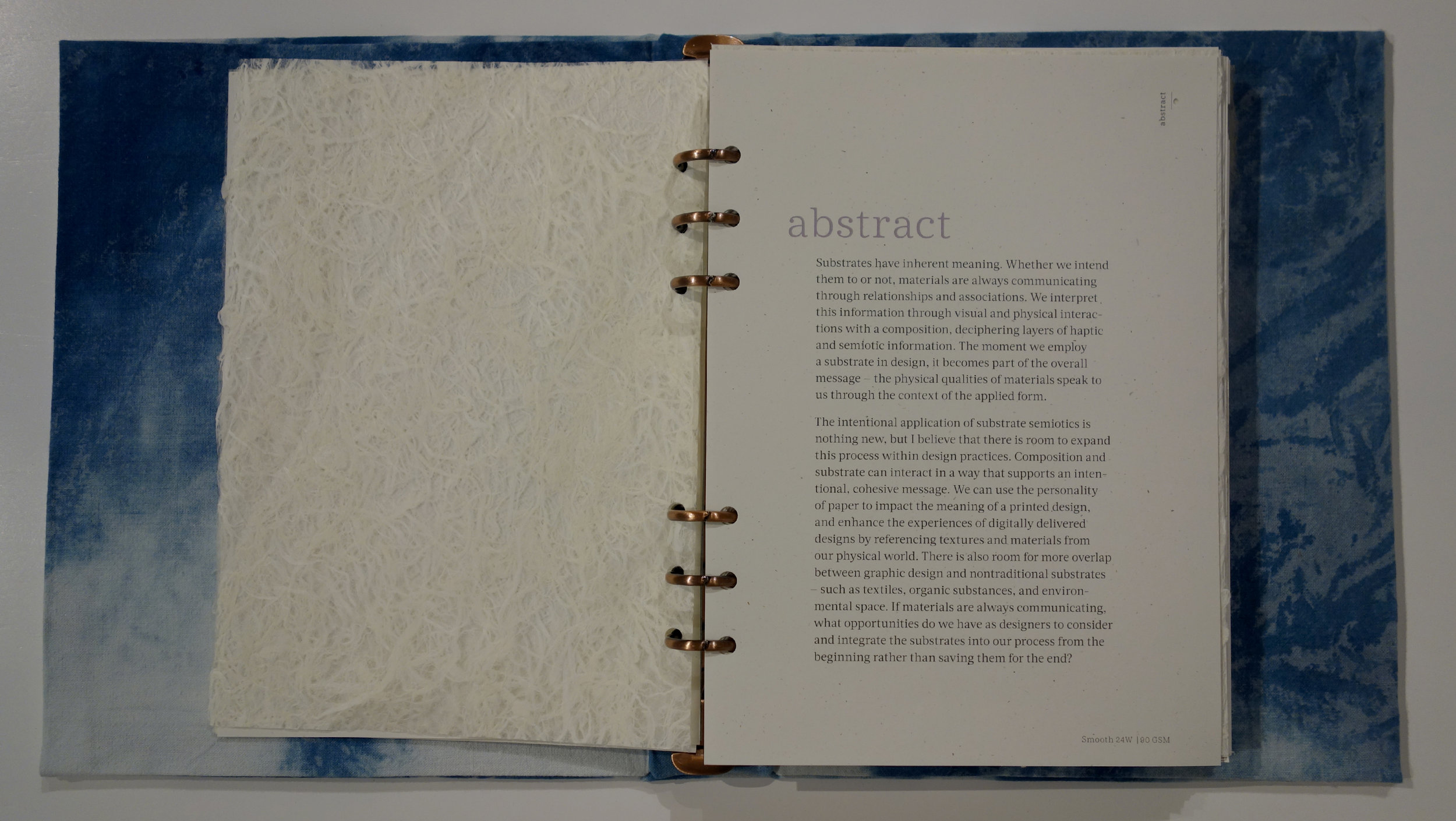
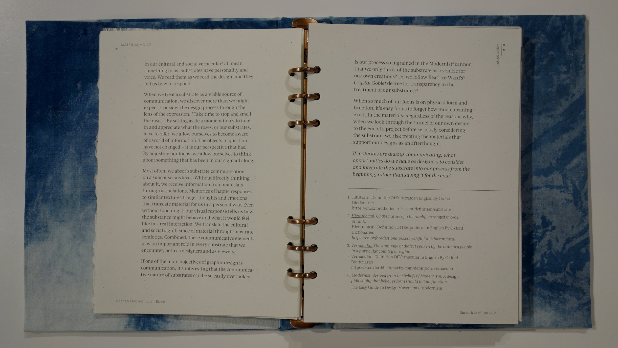
Material Voice: Substrate Communication in Graphic Design is the culmination of my graduate thesis research on the ways that materials and substrates impact the communication of graphic design. My research explores the relationship between semiotics, haptics, visual haptics, and nontraditional substrates in past, present, and emerging graphic design.
This text observes, catalogues, and questions the ways that we interact with different design elements in both real and imagined spaces. It references things like physical and visual texture that are familiar and beloved, and yet not always in the forefront of our minds until close to the end of our design process; explores the messaging that these physical elements themselves communicate to the viewer; and speculates ways that design practices can evolve by integrating substrates into the design approach from the beginning of the process rather than saving it for the end.
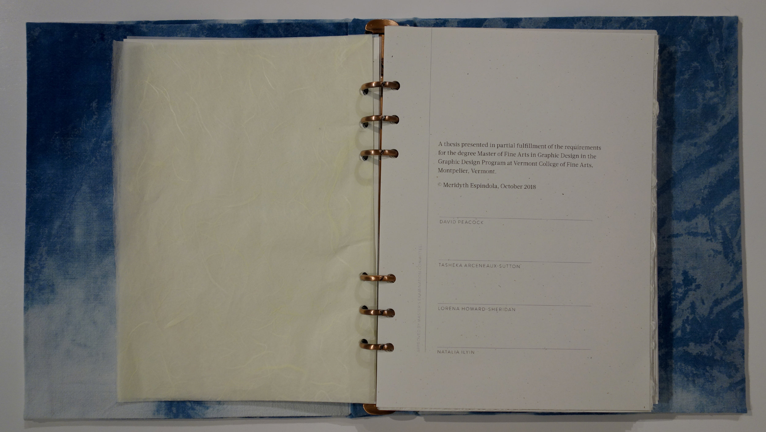
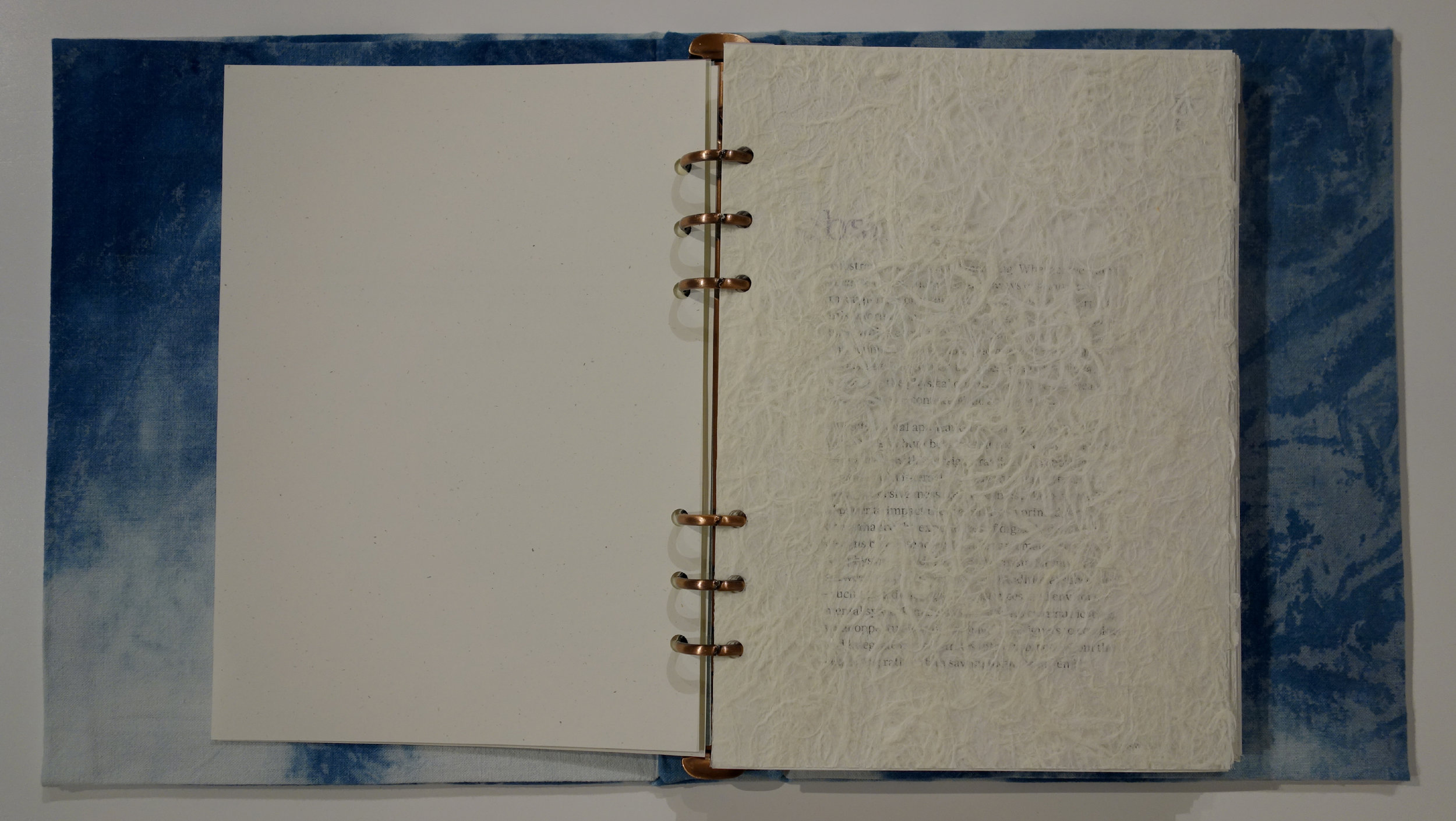
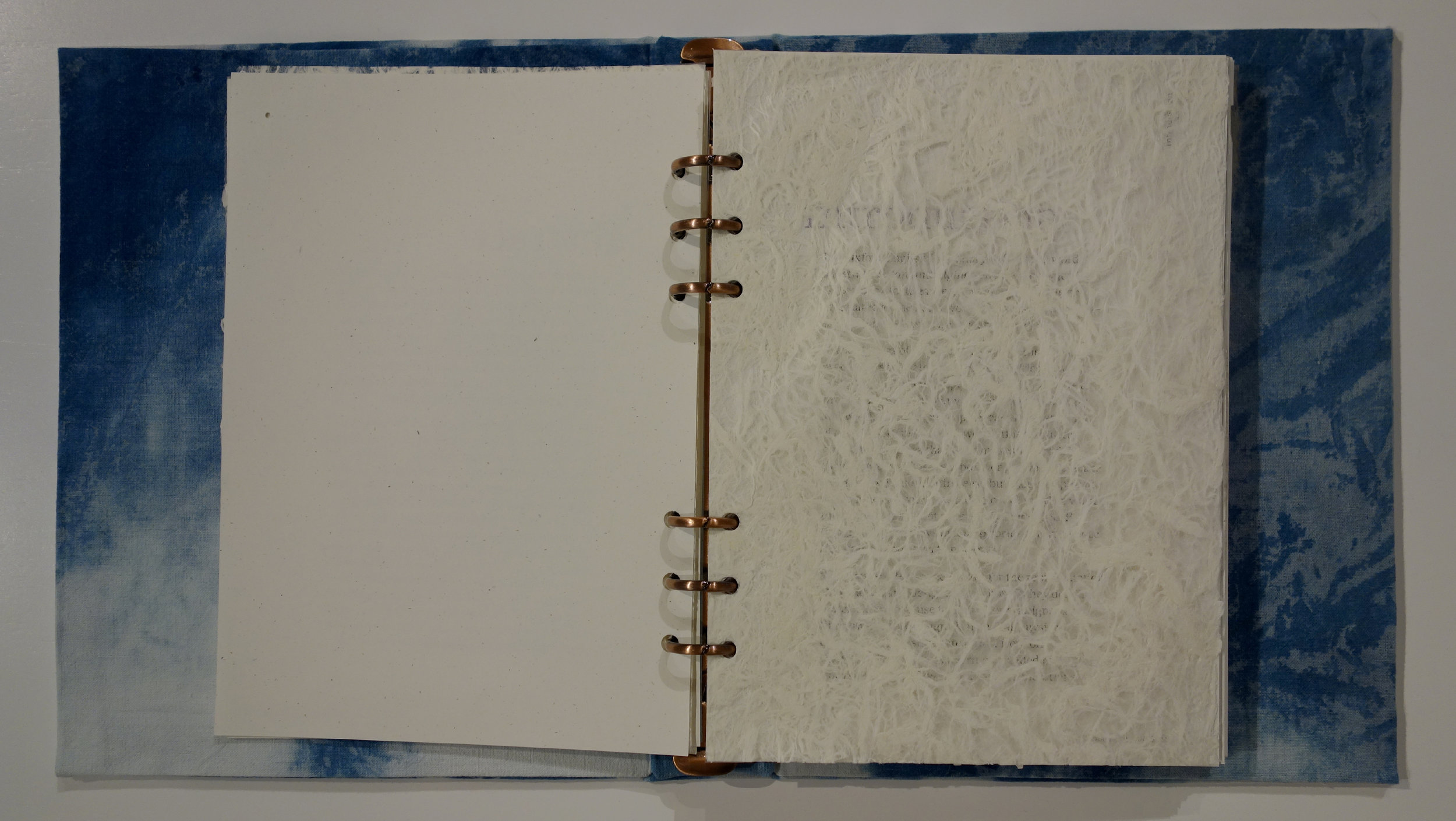
CONSTRUCTION
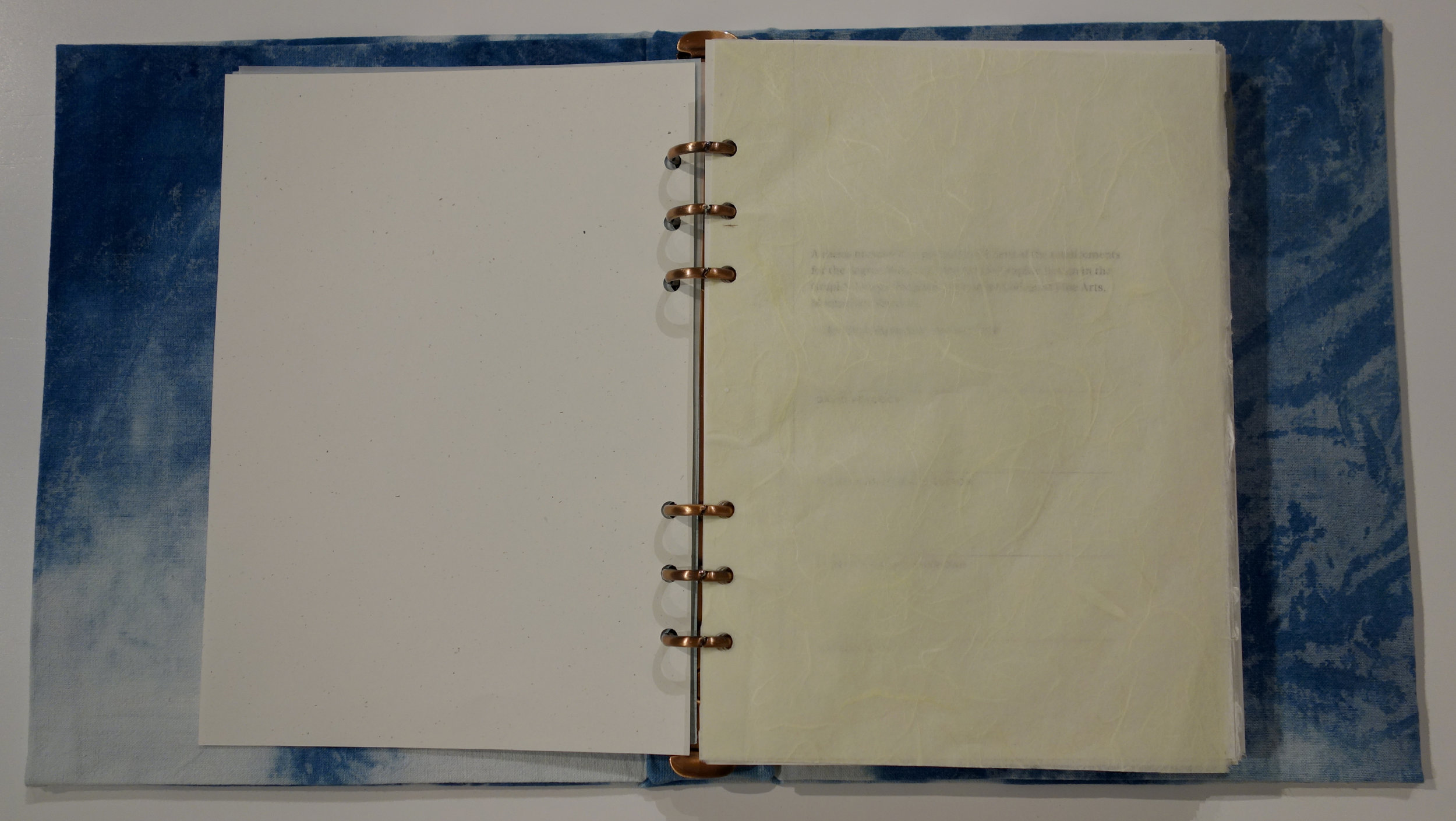
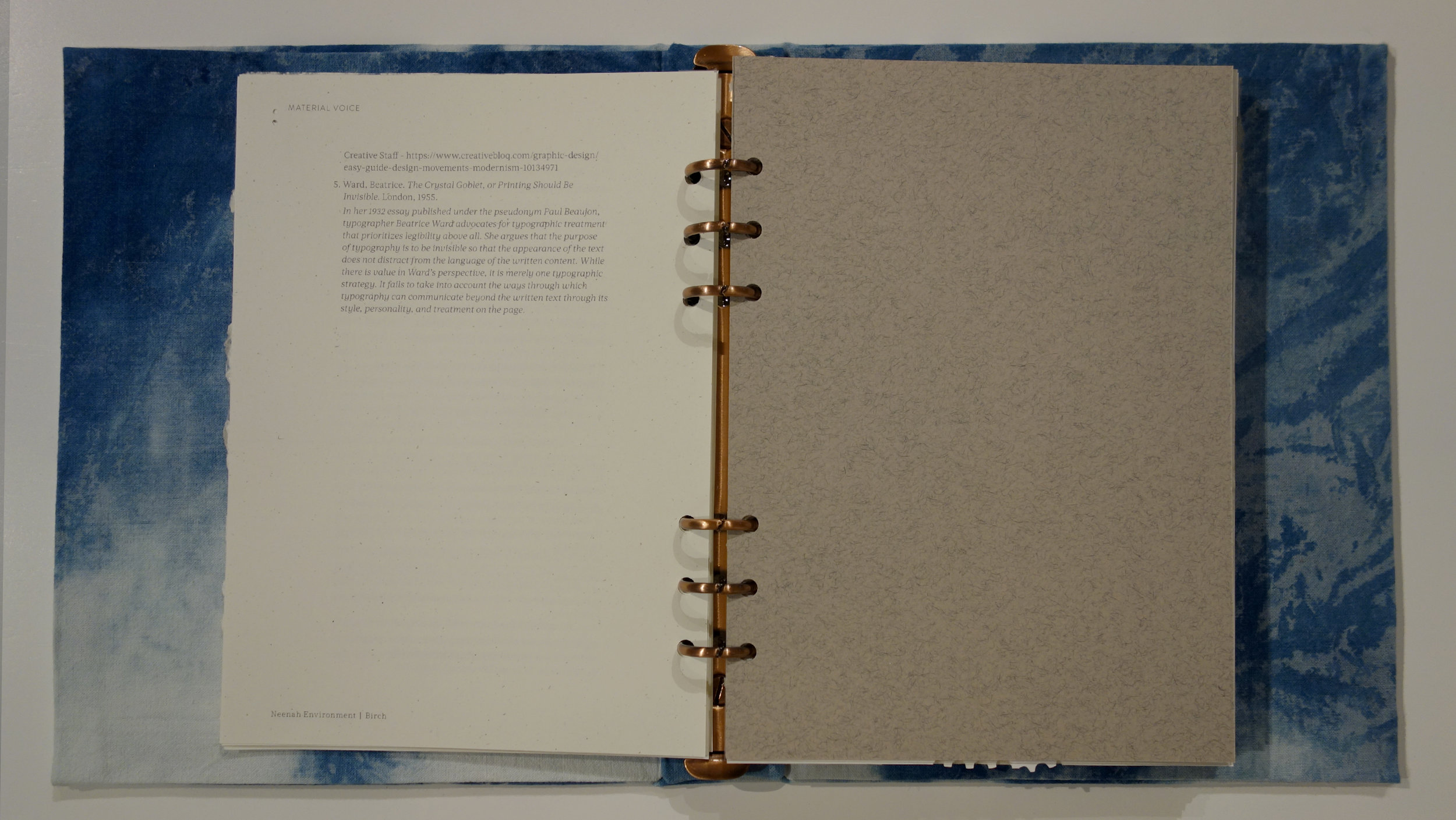
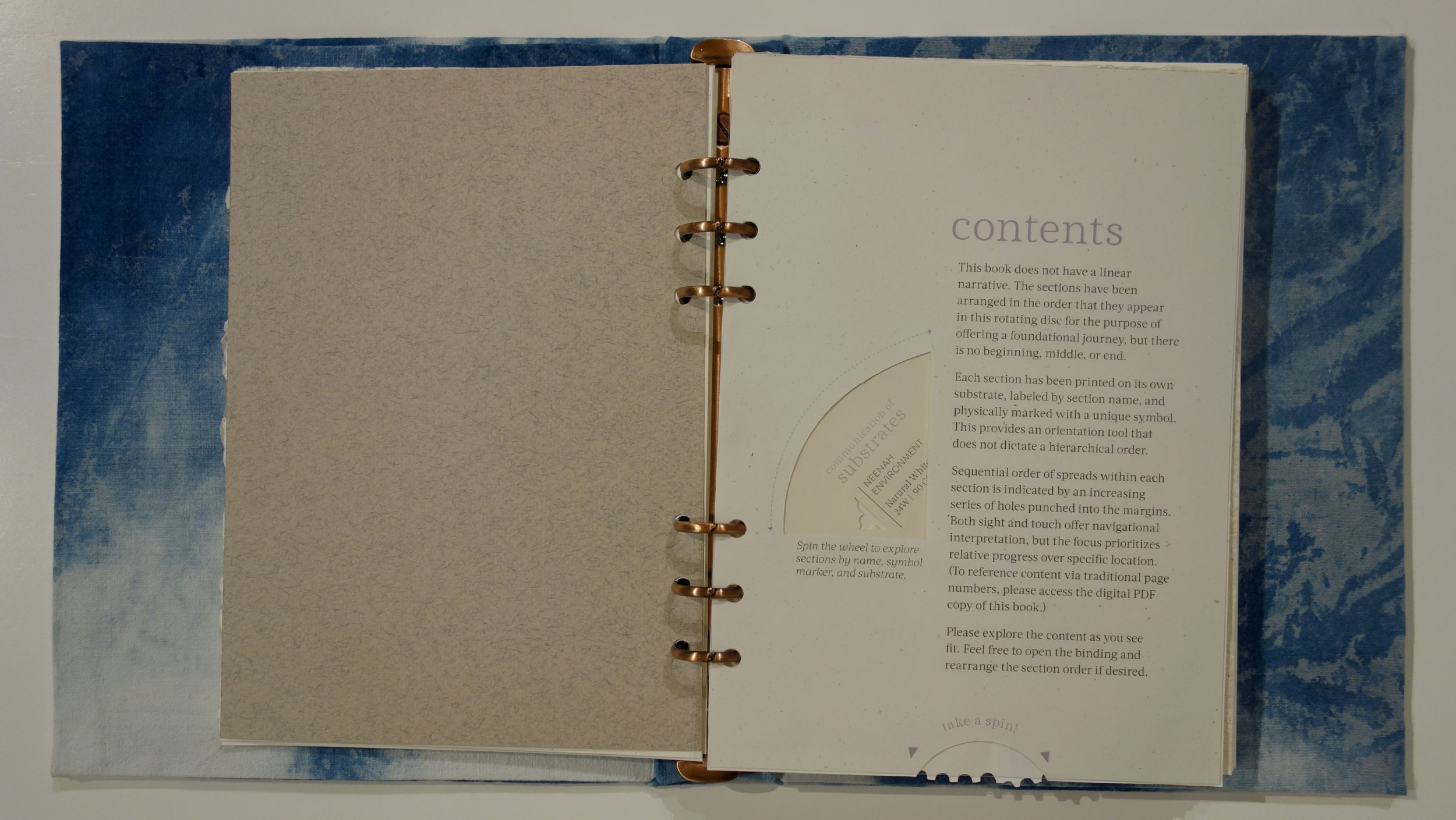
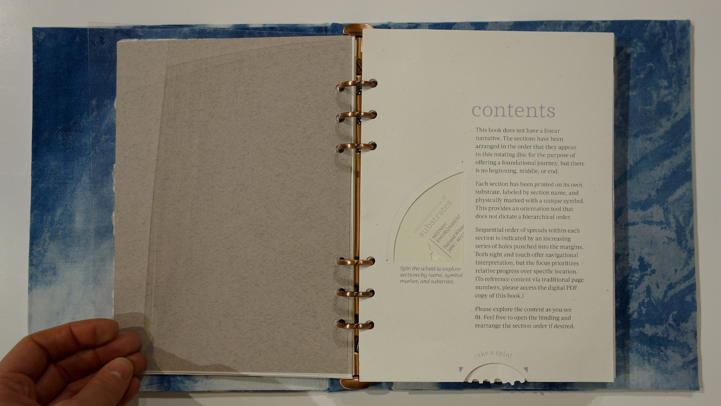
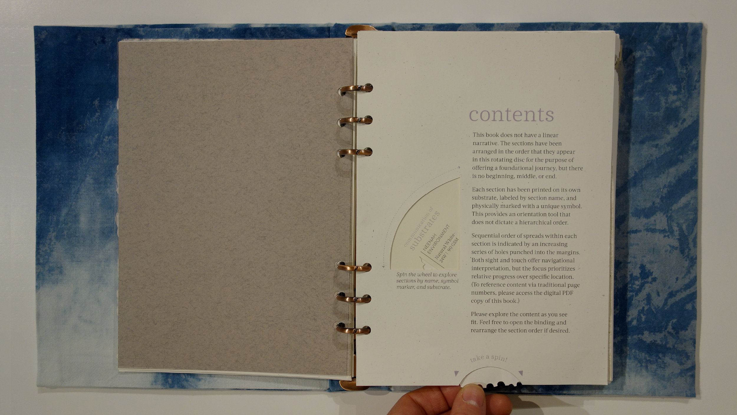
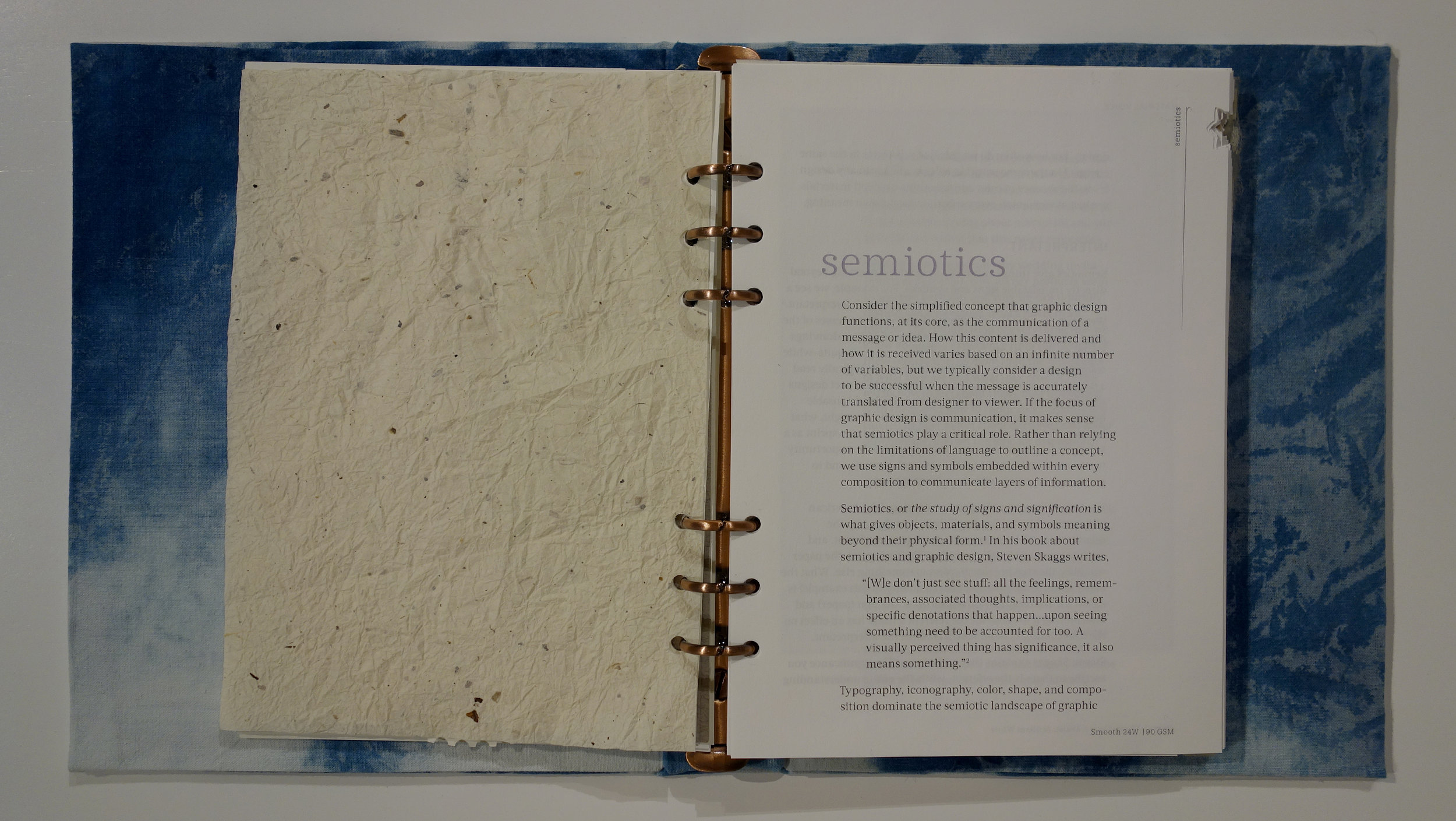
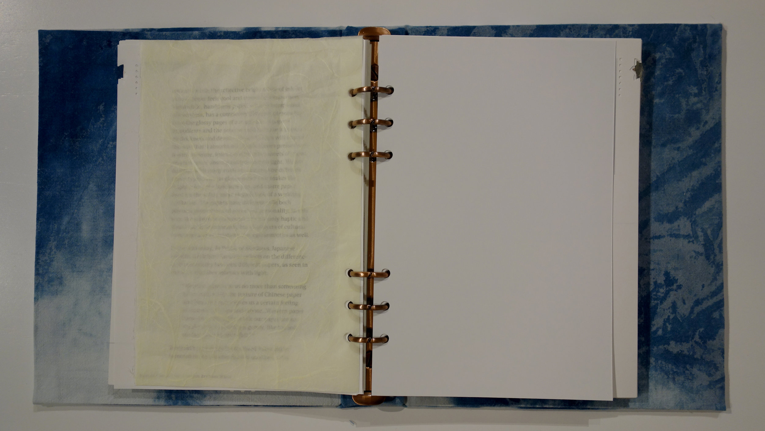
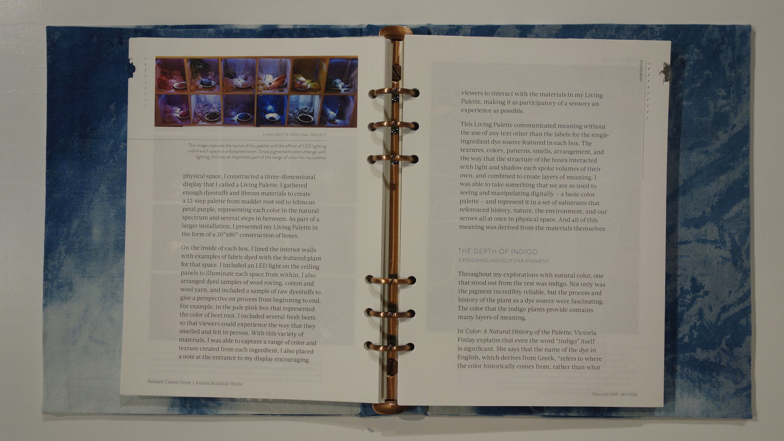
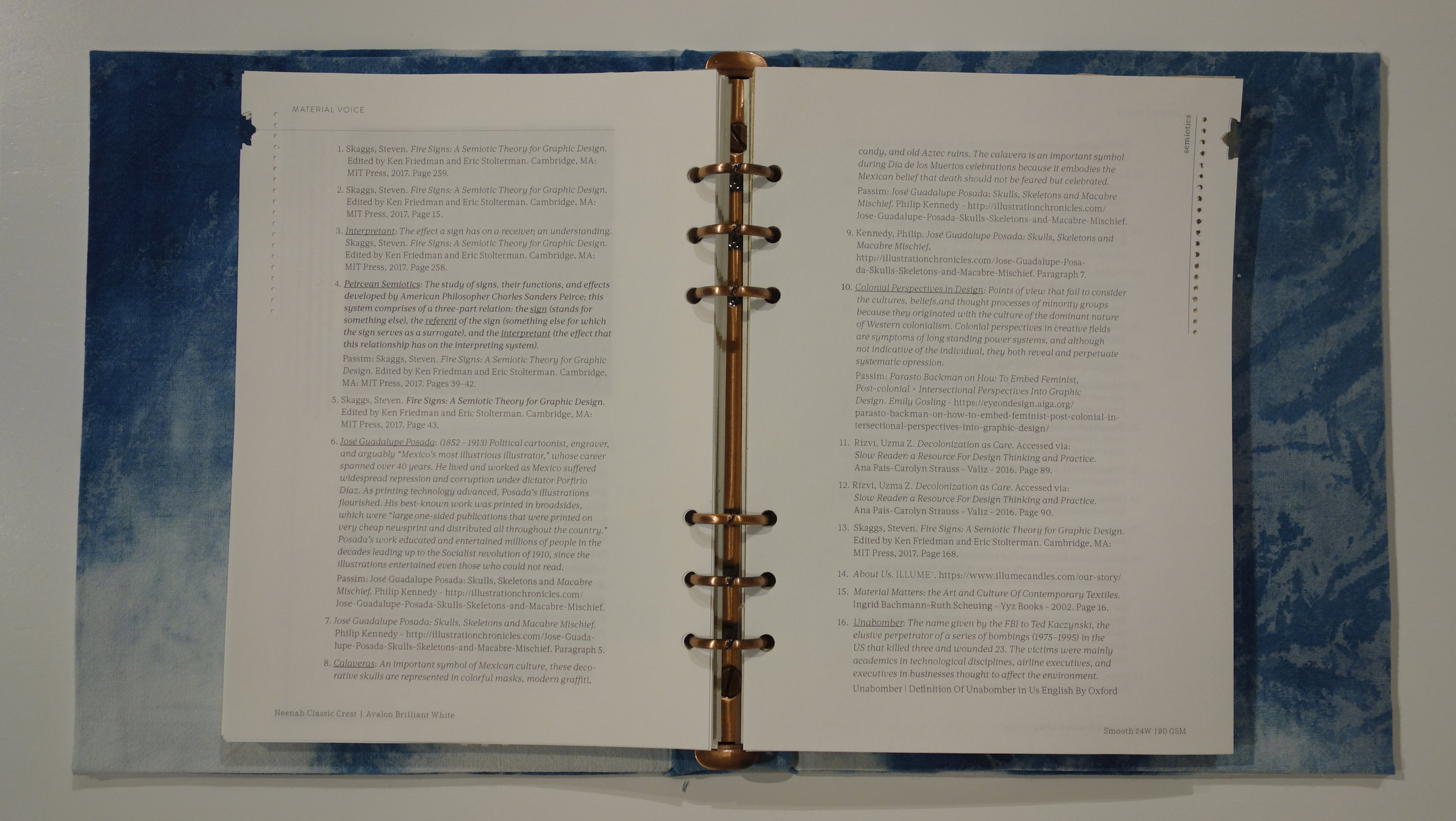
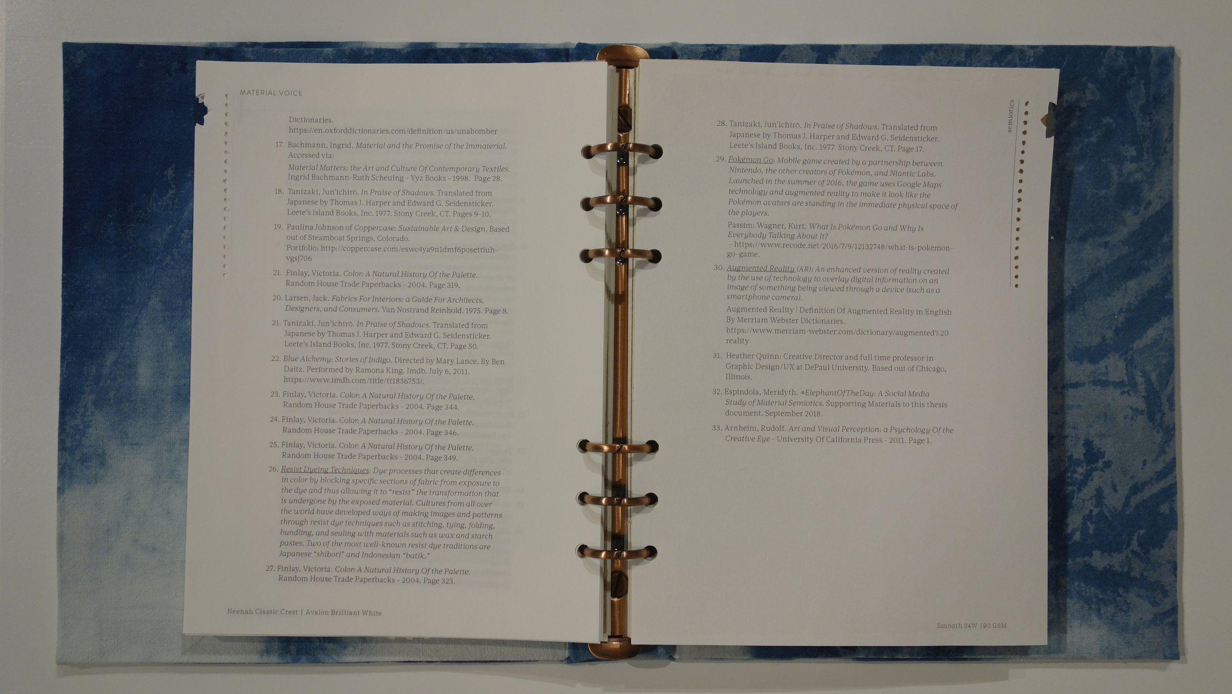
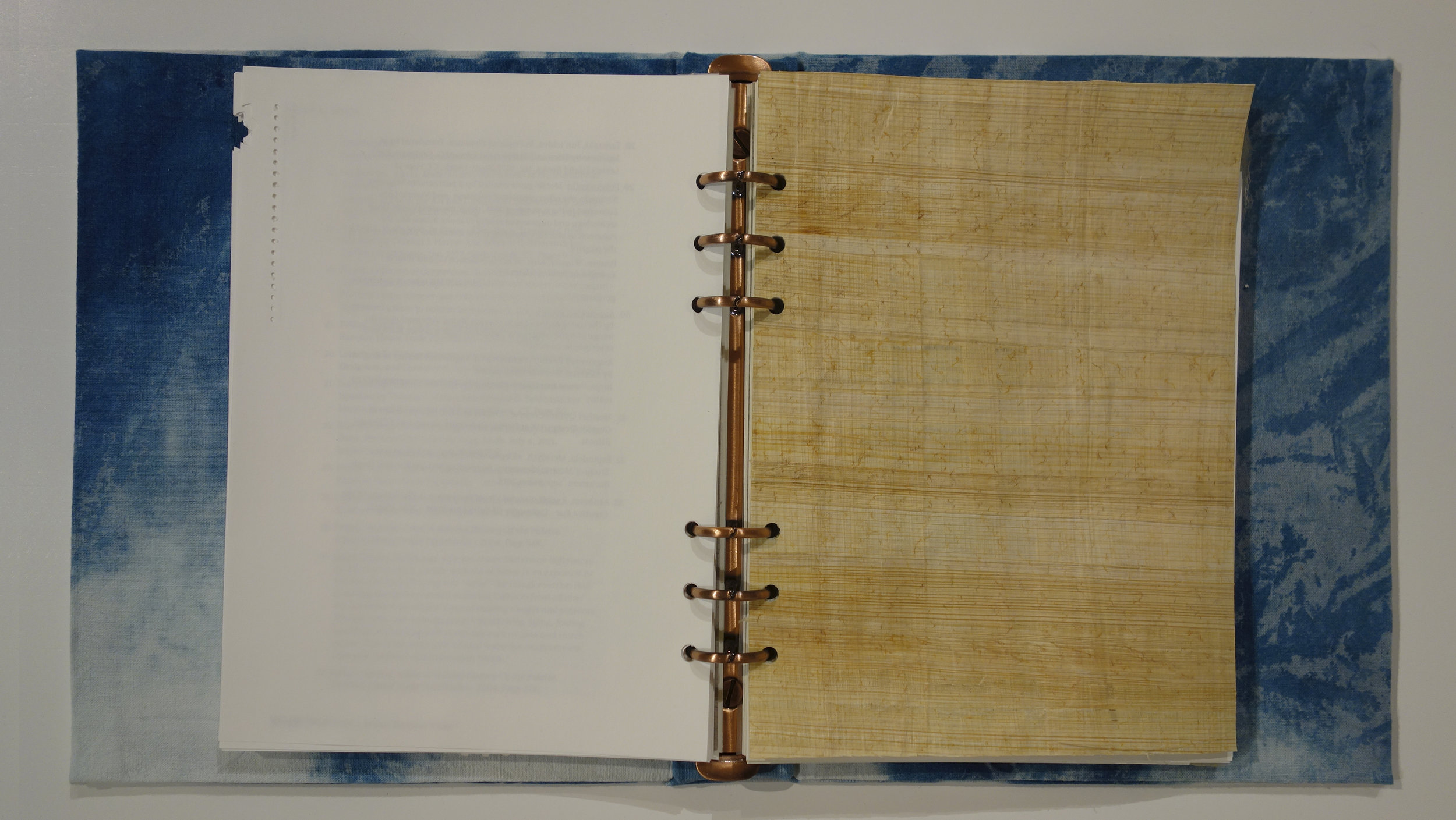
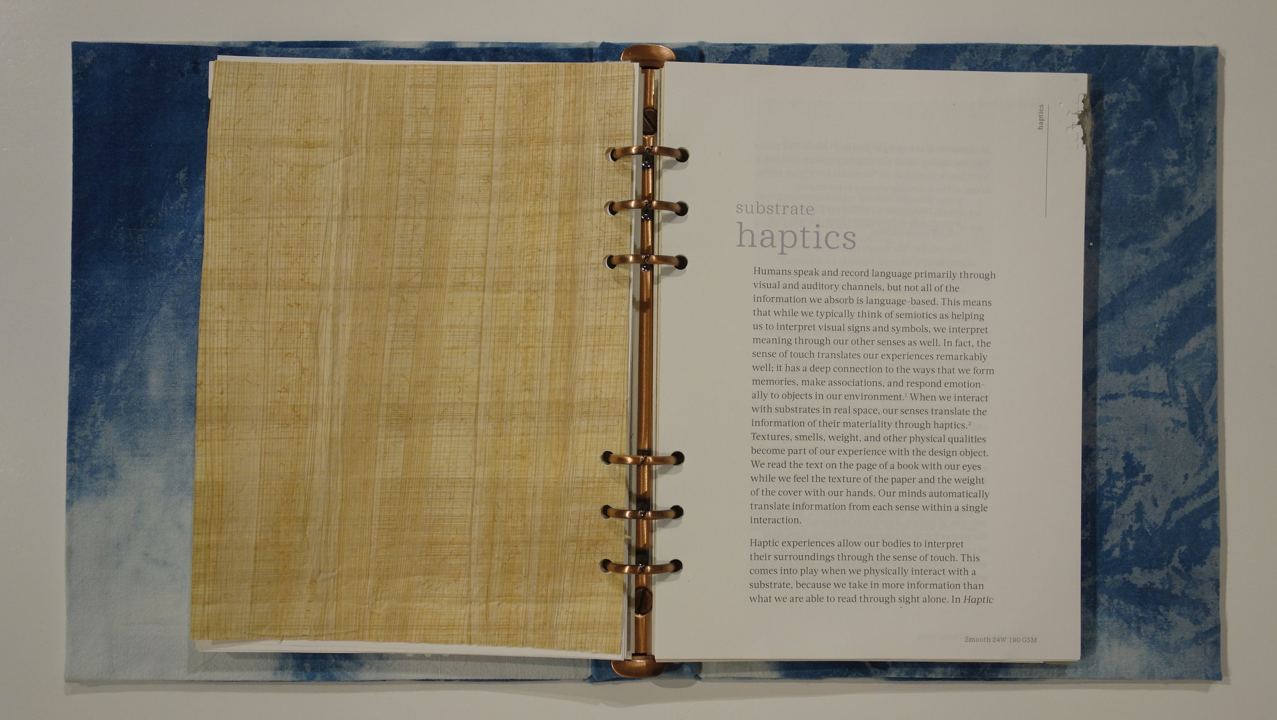
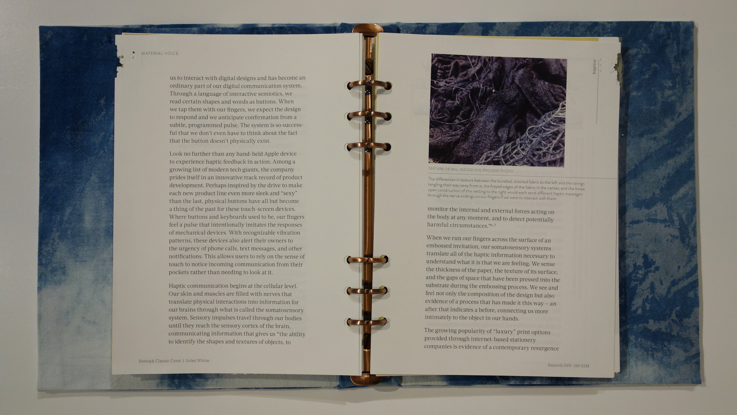
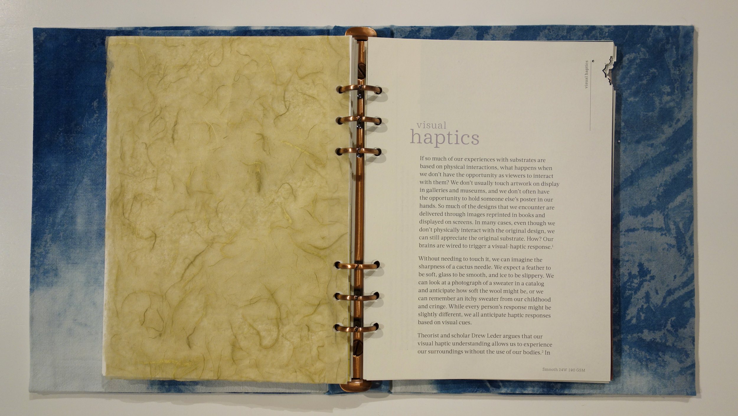
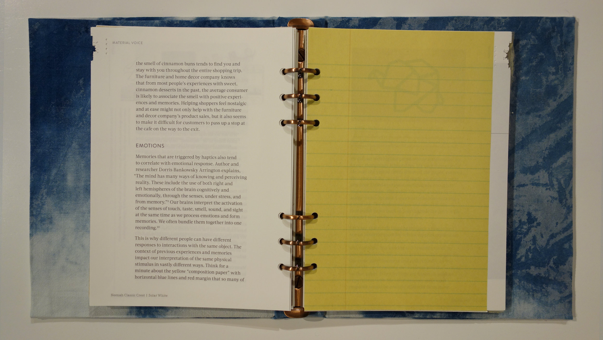
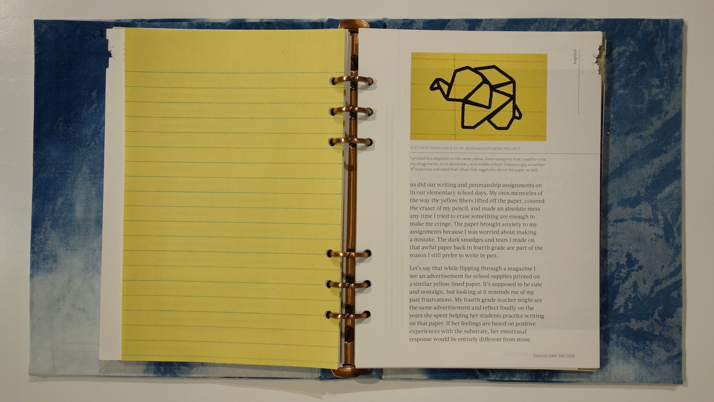
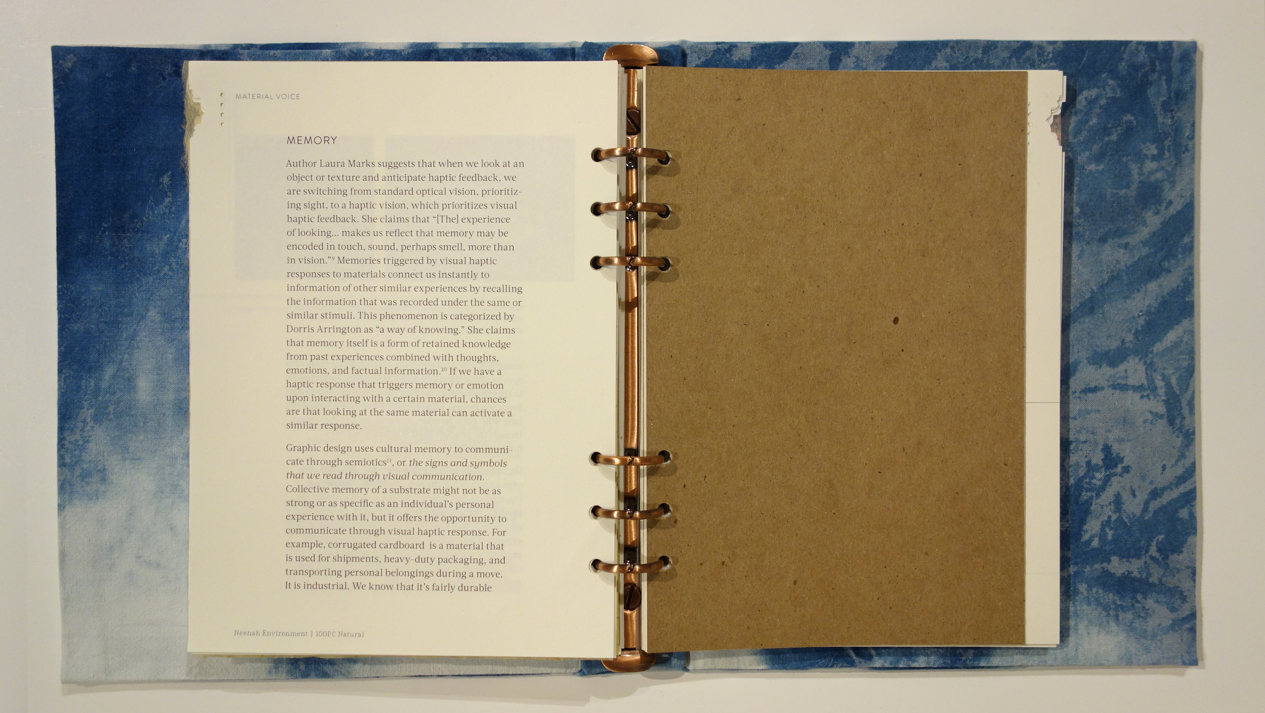
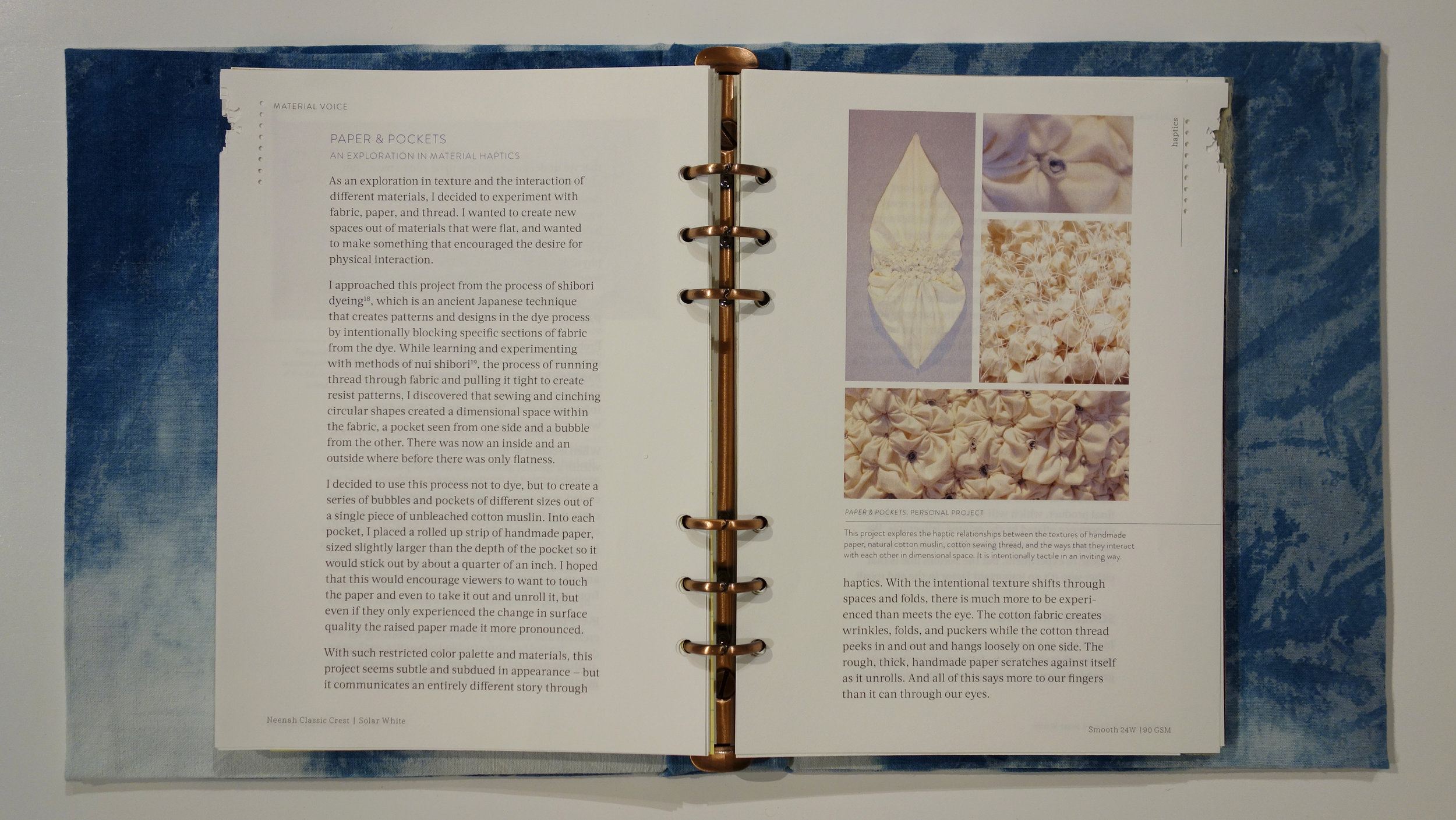
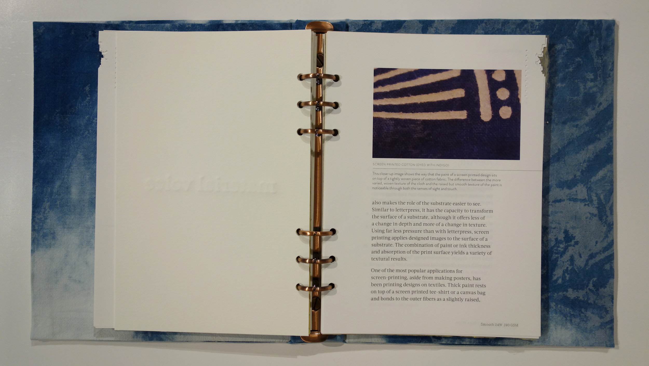
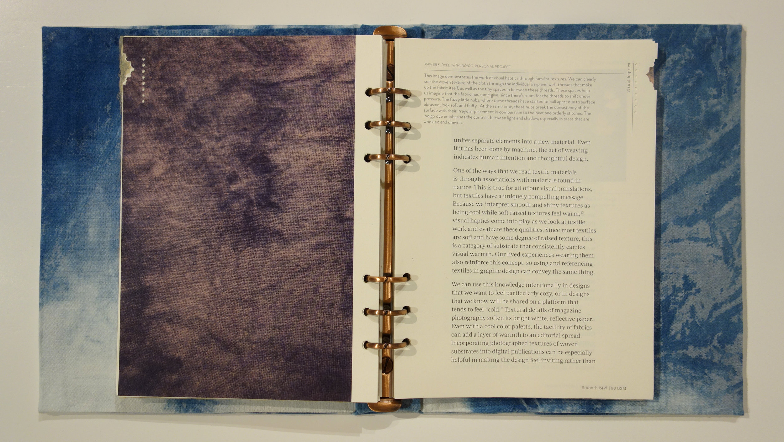
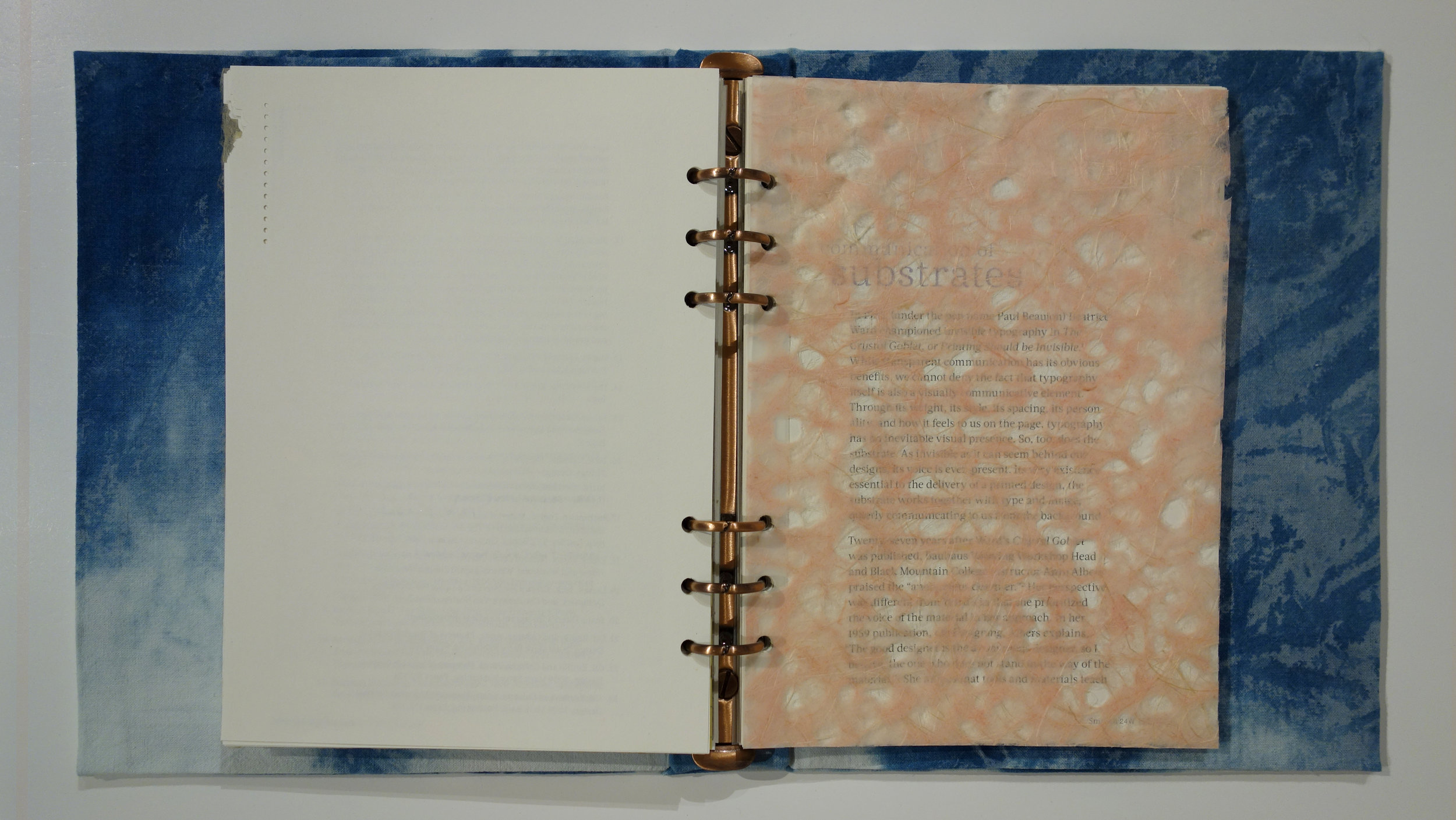
The book was constructed by hand, in an edition of three original copies. Each chapter has been printed on its own specific substrate, and marked not with page numbers but by a series of shape indications and a growing increment of punched holes down the side. There are also an array of different substrates that have been discussed in the text that are physically present as individual pages as well. The reader is thus able to read about a substrate while physically interacting with it as well.
The pages are held together only temporarily with a set of binder rings, encouraging the reader to take them out, interact with them, and arrange the sections in an order that they see fit. For this reason, the table of contents is not a list but a spinning wheel that indicates only the title of the section, the substrate it has been printed on, and the identifying die-cut shape with which to find it.
The cover of each copy was constructed by hand by covering book board with cotton cloth that was hand-dyed (by Meridyth) with indigo. The title and author text was letterpressed into the cover with a handmade bottle jack press built by Robert Espindola, and custom letterpress plates from Boxcar Press.
The printed interior pages were laser printed and cut to size at Air Graphics in Quincy, Massachusetts.
Two copies are housed in the Gary Library at Vermont College of Fine Arts, and the third is owned by Meridyth Espindola.

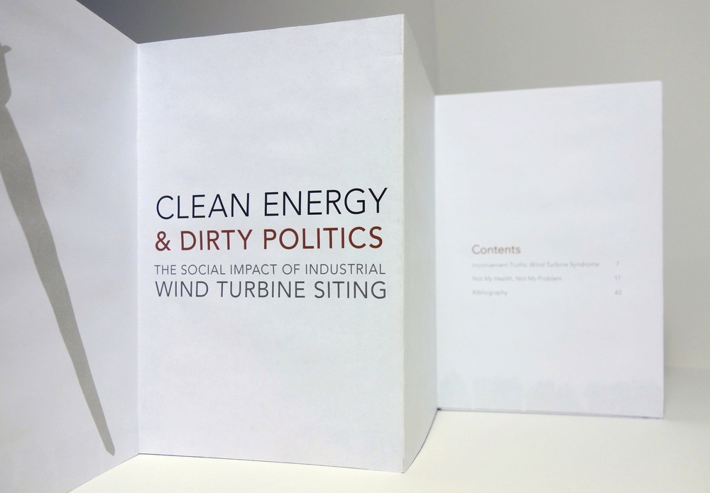
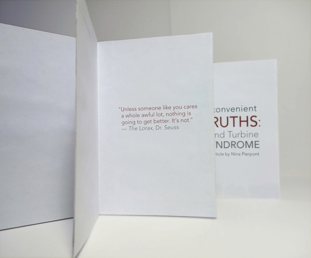
NOT MY HEALTH, NOT MY PROBLEM
This artist’s book pairs a scientific research study with personal accounts of the social, emotional, and economic impacts of large scale, industrial wind turbines in a residential area. While my childhood neighborhood struggled with the new realities of adjusting to the pulsing sound, flickering light, and sonic vibrations of industrial turbines closer to their homes than any turbines of this size in the world, my heart broke to see and hear the divisiveness between neighborhoods over the issue. As local politics ran wild, it became a polarizing topic, as those who lived farther from the turbines refused to believe or even listen to those suffering. These people were my neighbors. They were suffering, and they felt like they had no voice. This book was my way of shining a light on their underrepresented struggles.
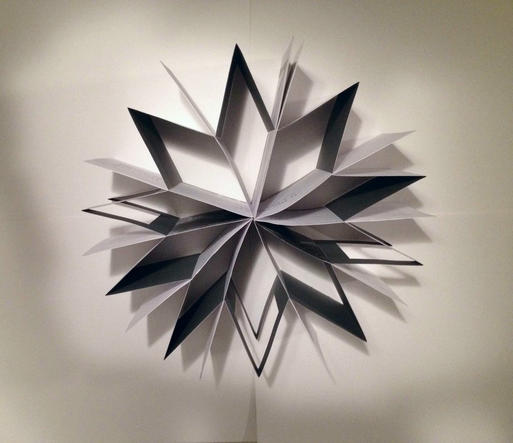
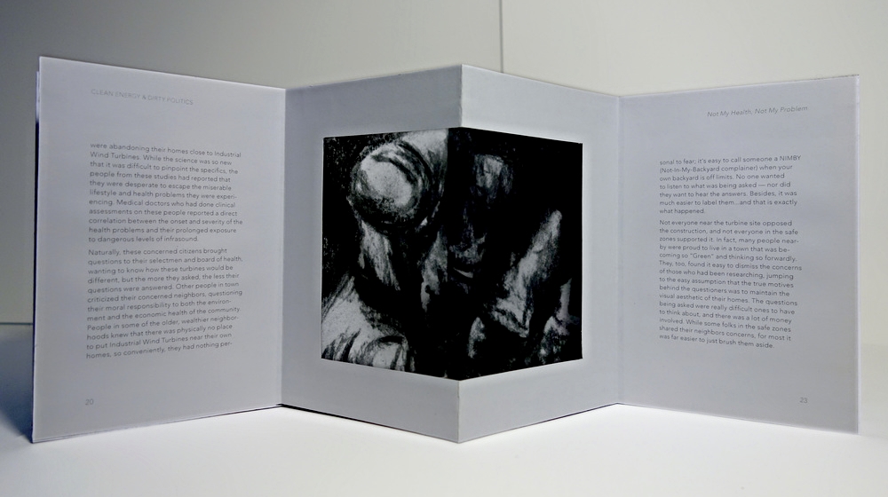
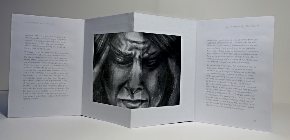
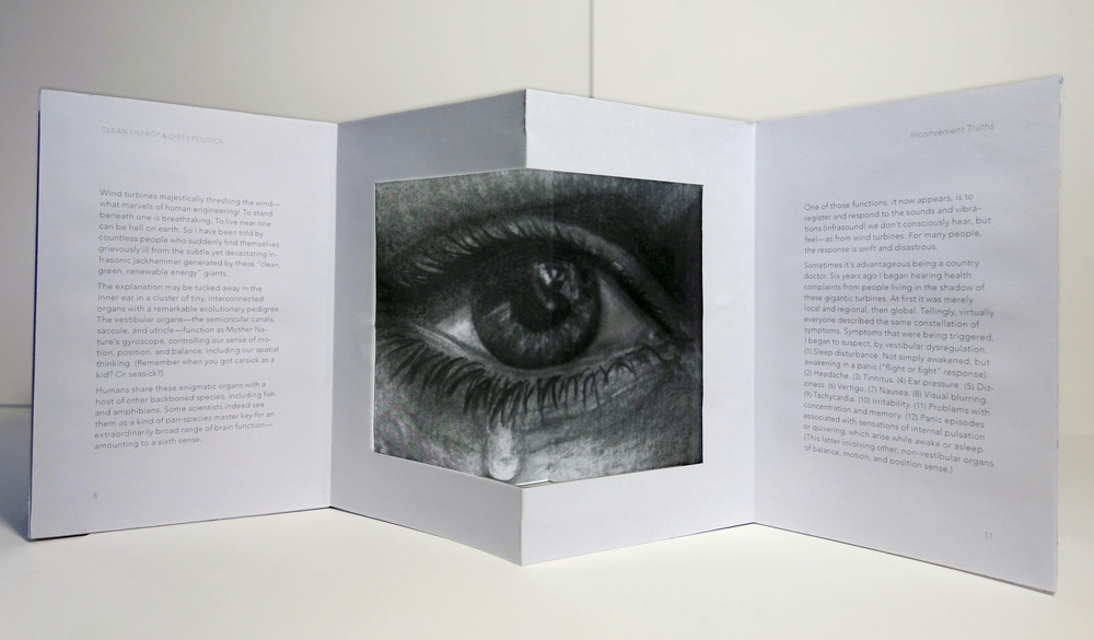
The structure of this book explores the relationship of inside versus outside through a physical structure that hides and reveals information as the viewer physically interacts with the book. From above, opening the book cover to cover reveals a pattern of pages that mimic the pattern of the turbine’s blades.
There are sections towards the center of the spine that can only be seen when you look for them. These hidden sections reveal images of the emotional and physical struggles reported by the residents of the neighborhood, and quotes taken directly from a local documentary discussing the issue. Just like the way that it is easy to ignore someone else’s problem, these images and quotes — the most vulnerable and raw content of the entire project — are only visible upon a closer look. The exterior spreads document the scientific study and my own personal reflection on the issue.
Not My Health, Not My Problem is a single-edition artist’s book.
The construction is a modified French fold; the pages were cut, folded, and constructed by hand.
The pages were typeset in Avenir Book, Avenir Bold, and hand drawn text.
The text and illustration pages were printed with an inkjet printer on white copy paper;
the gray interior was constructed from Recollections textured gray card stock, cut from 12” square sheets.
The Illustrations were drawn by the artist with charcoal and graphite.
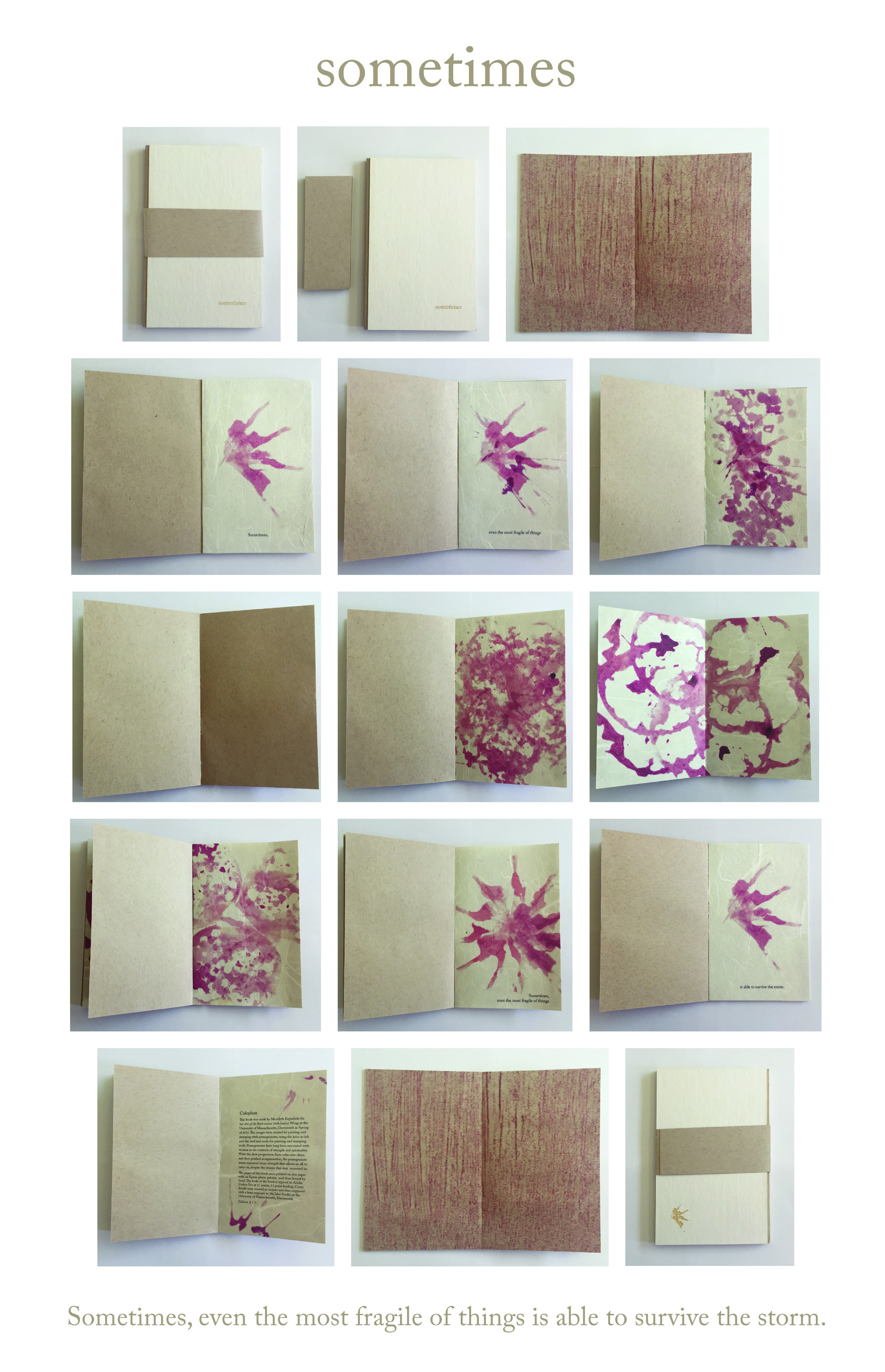
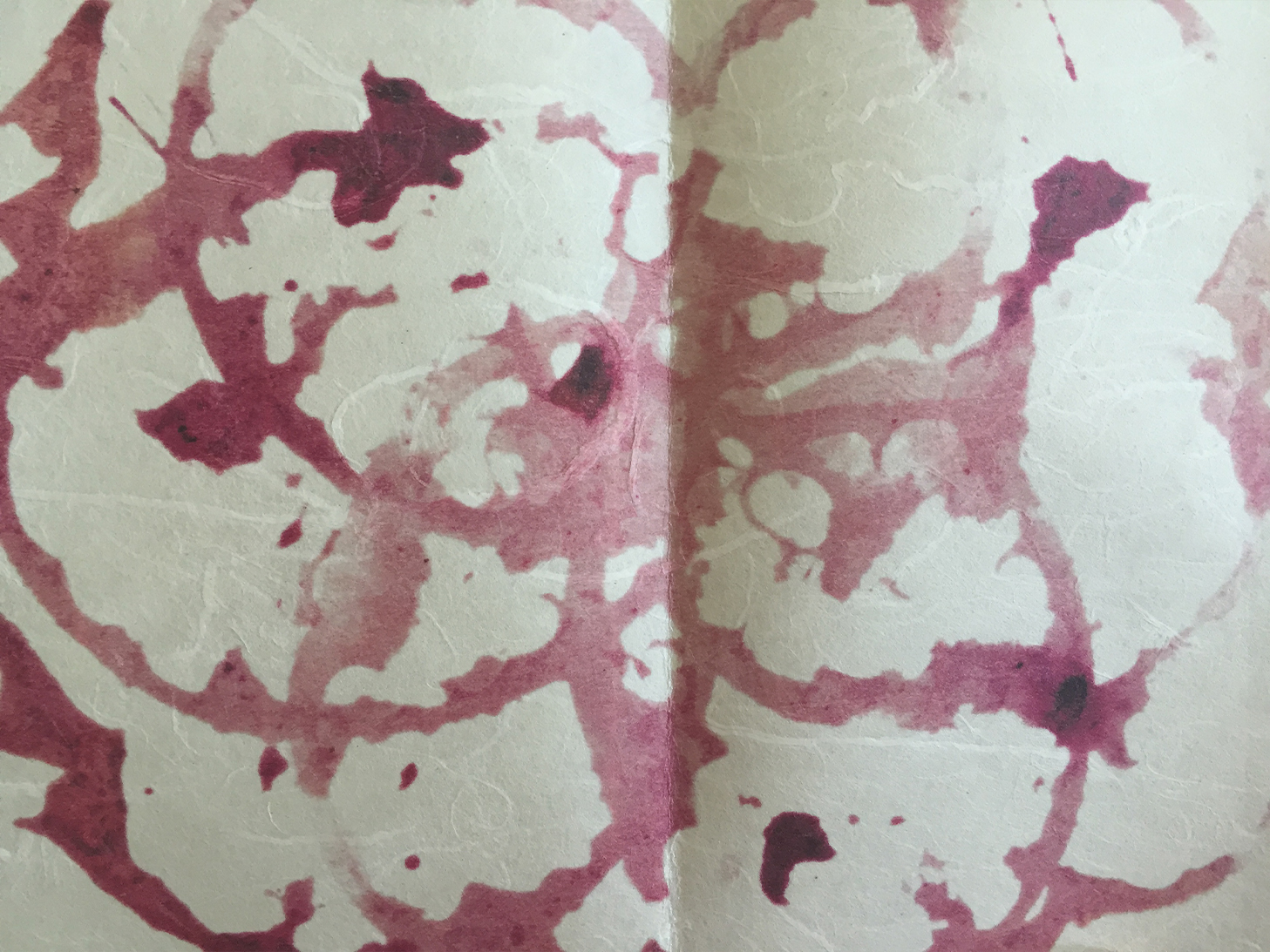
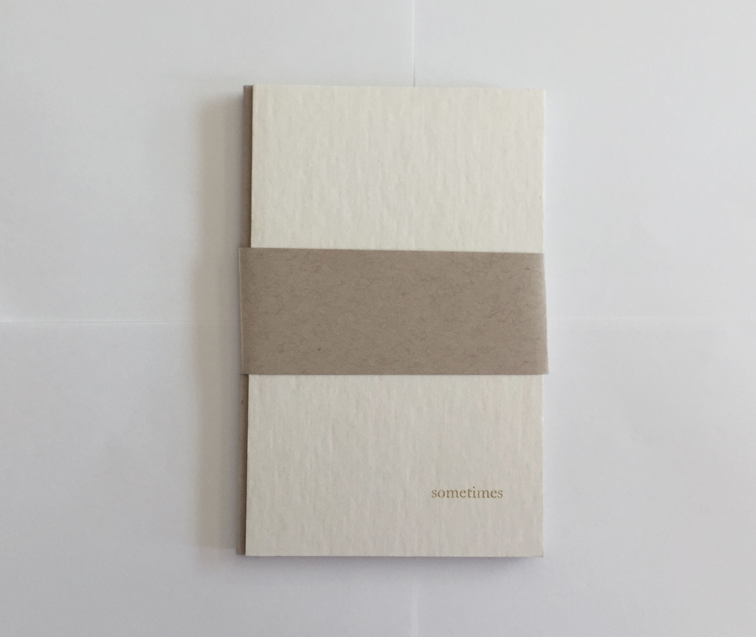
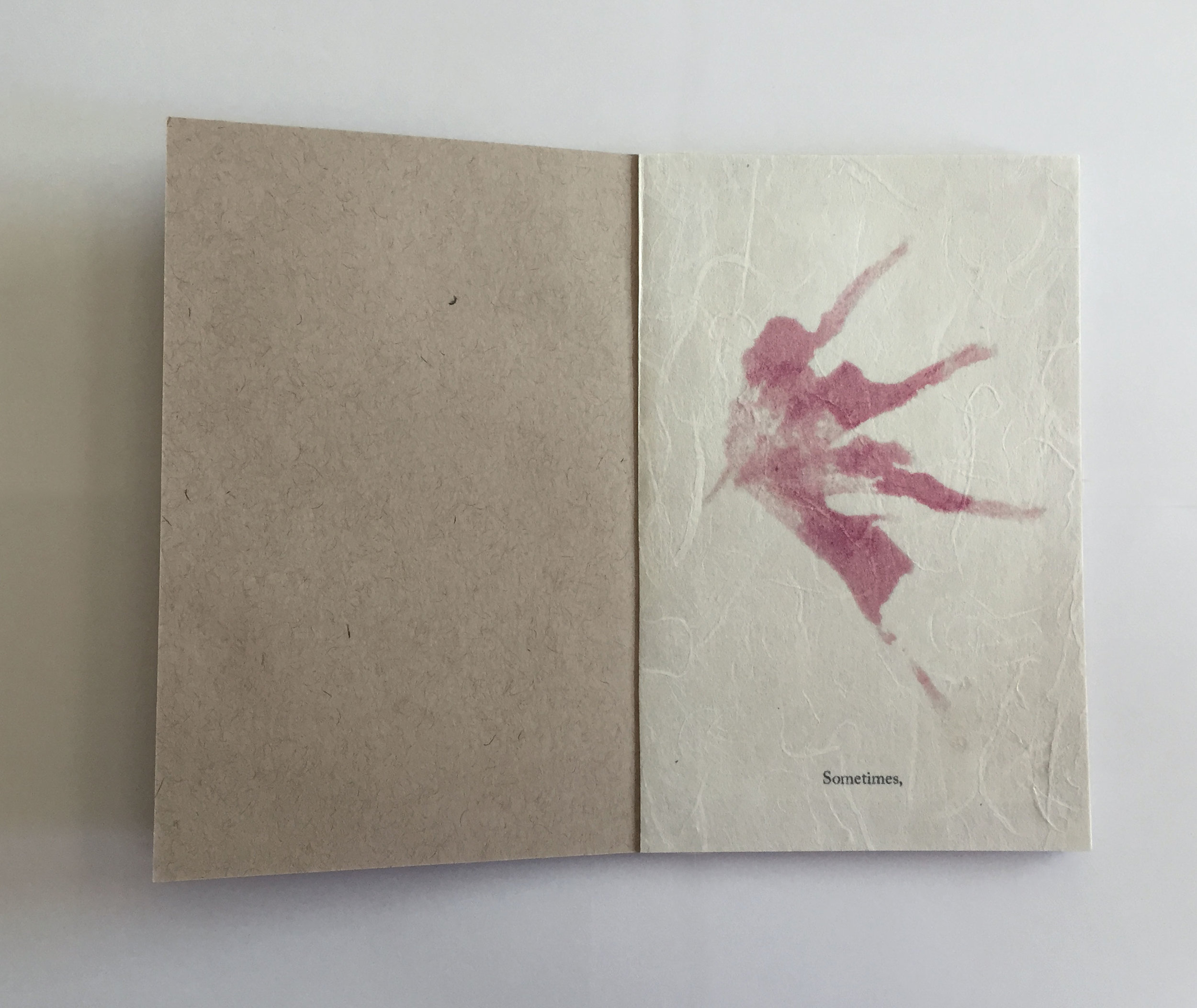
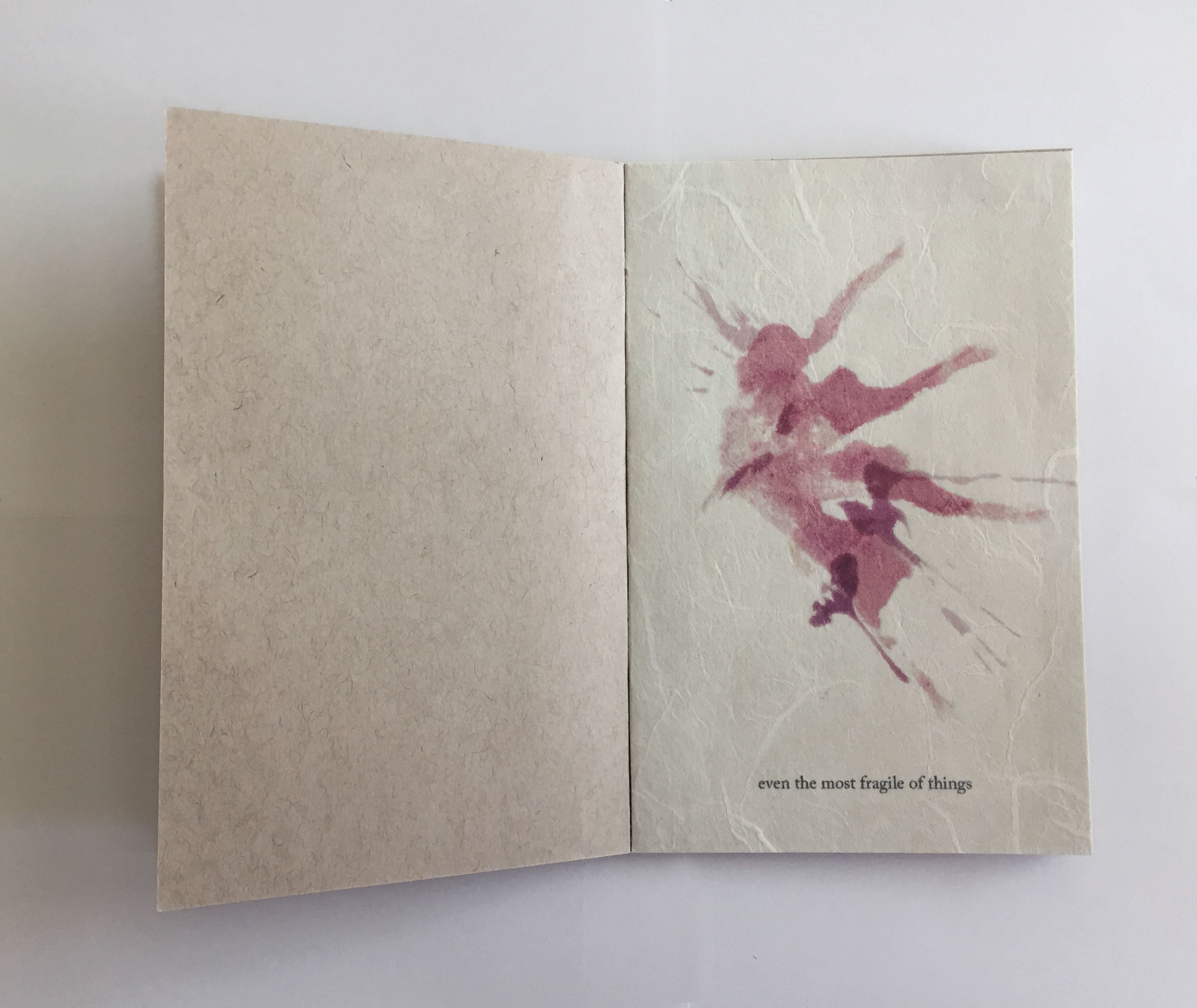
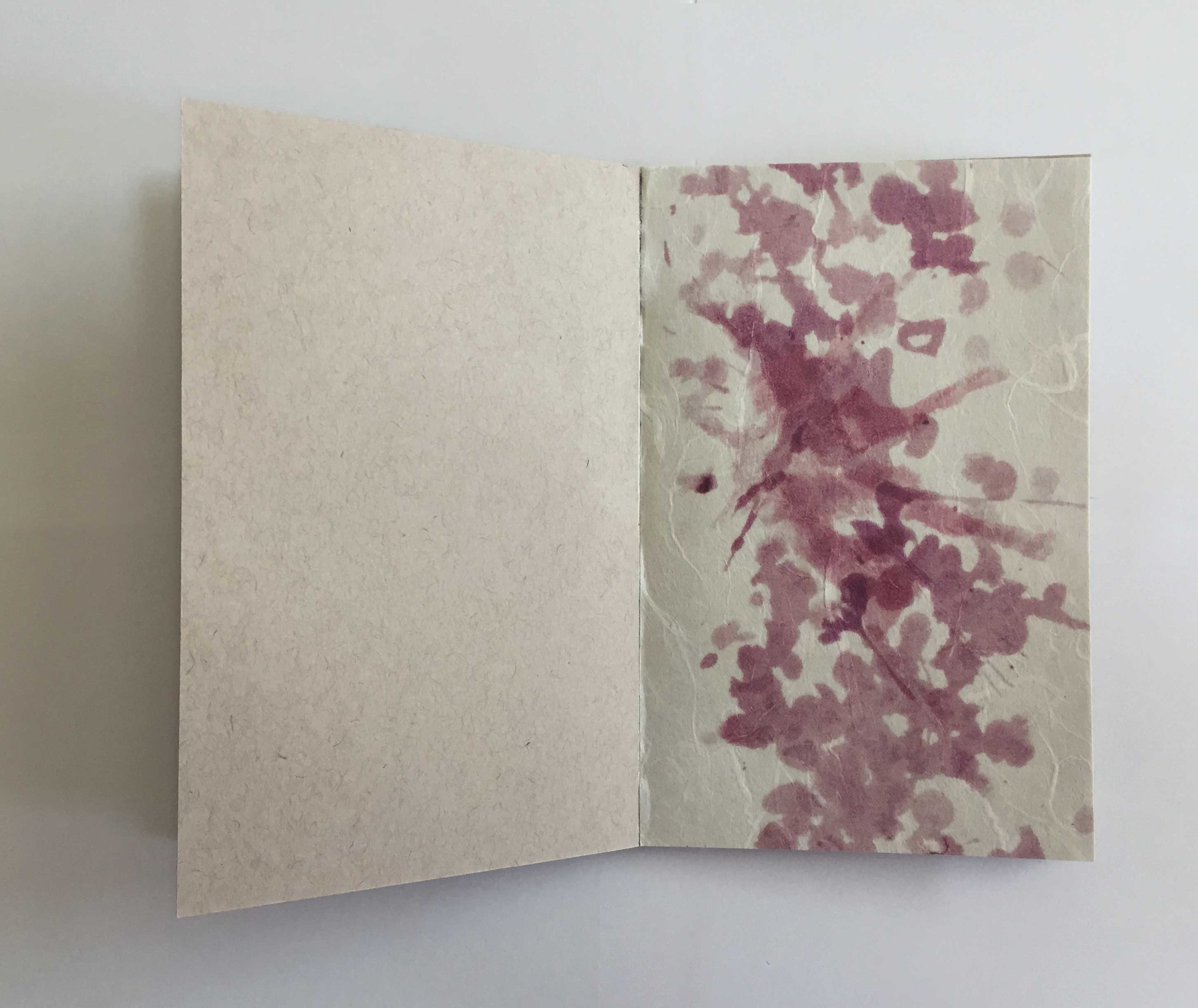
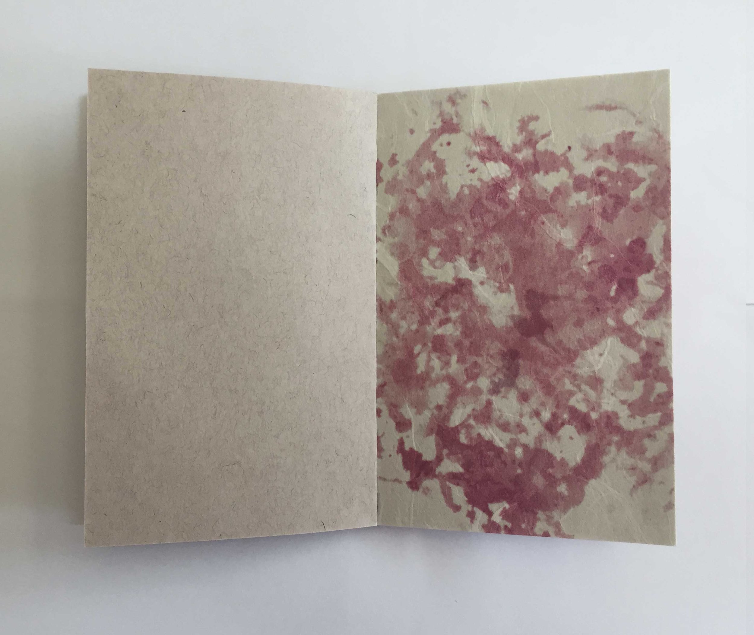
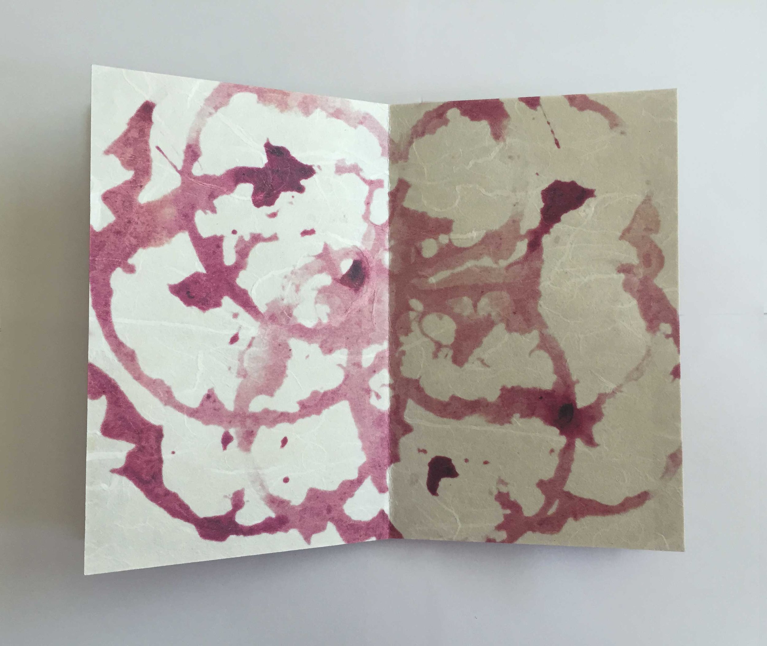
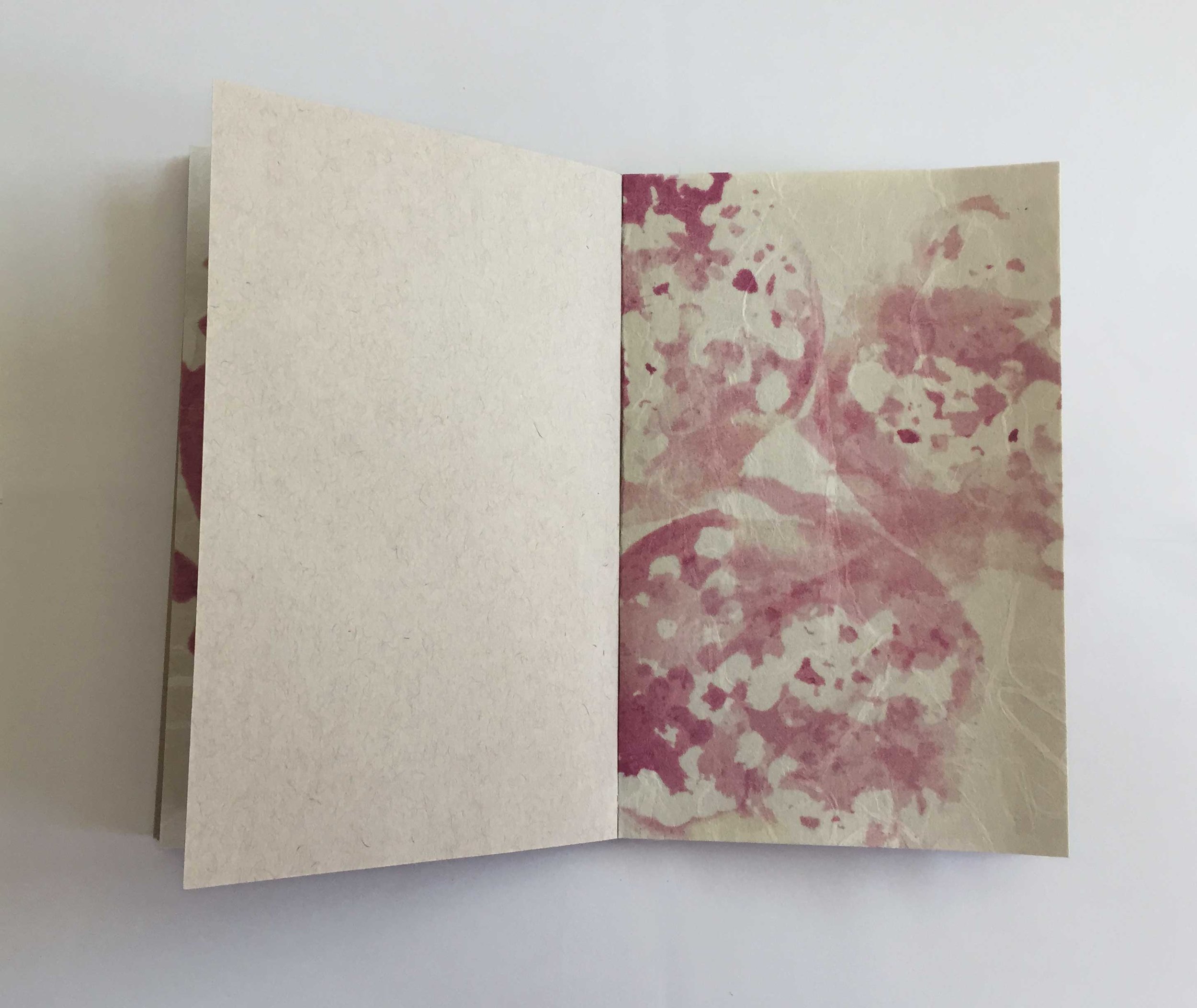
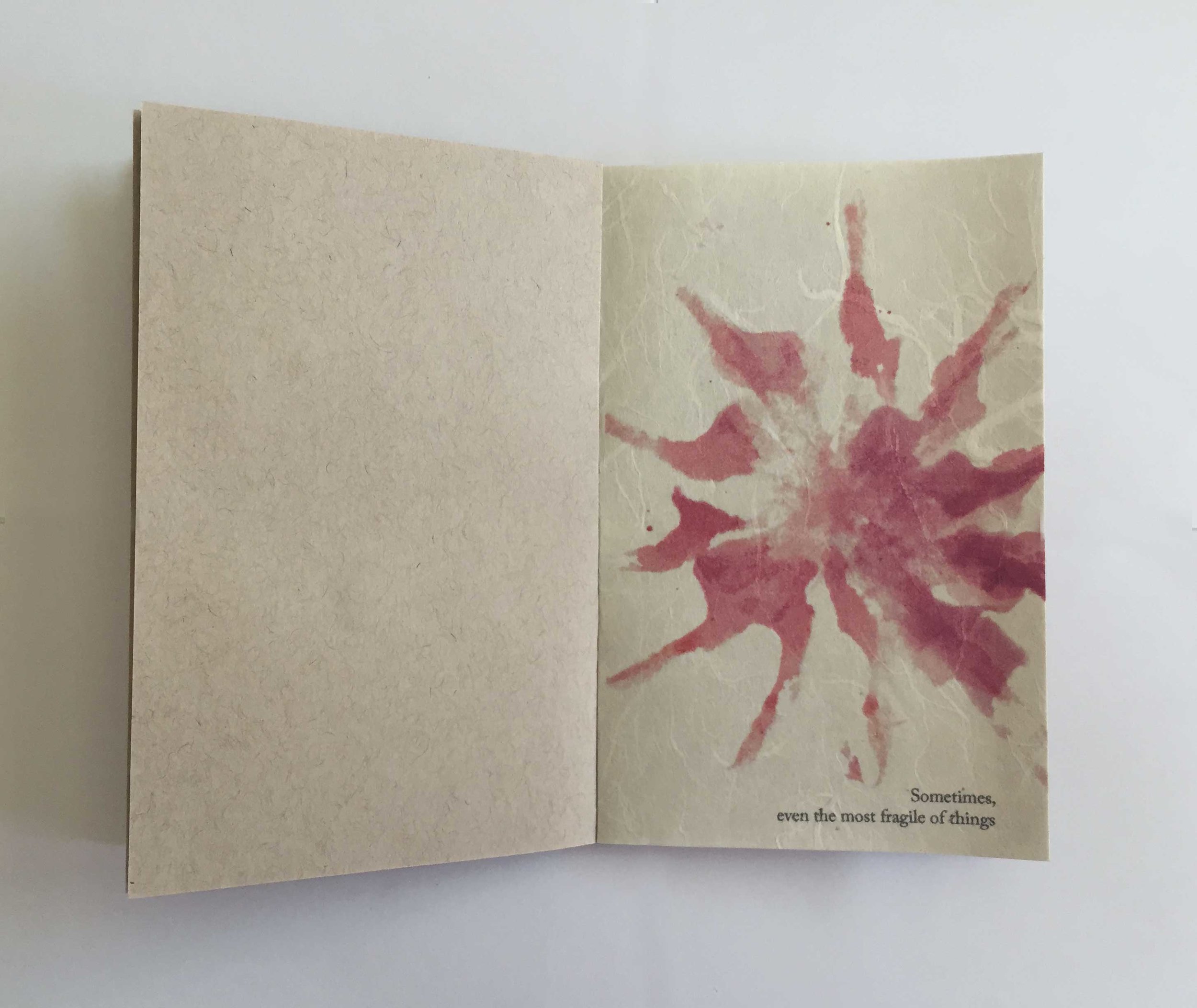
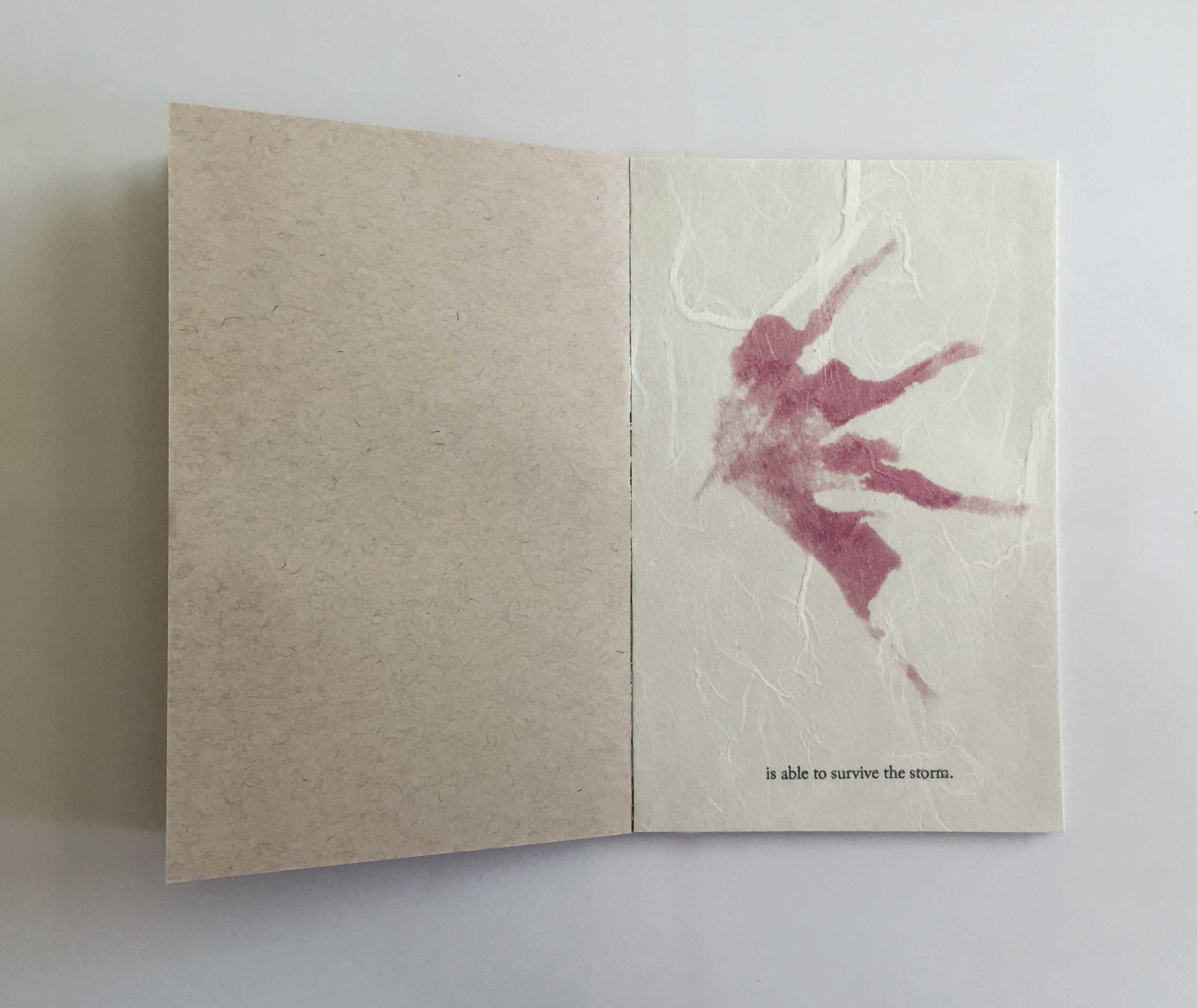
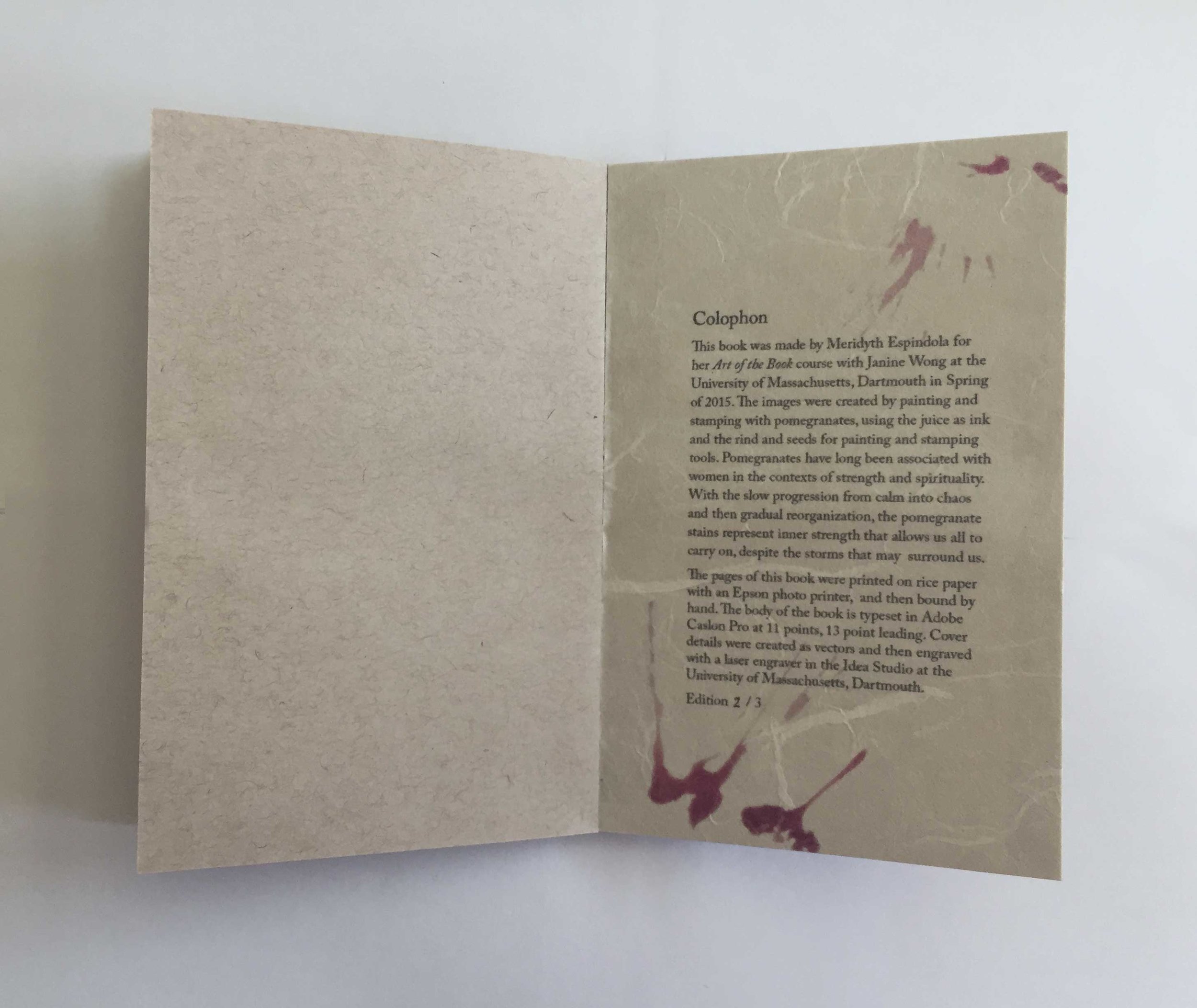
SOMETIMES
This artist’s book explores the balance between turbulence and peace through a series of organic prints on handmade rice paper. The prints were originally stamped from sections of a pomegranate fruit, its seeds, and its juice. The images were then scanned and reprinted digitally in combination with layers of abstract pressure prints from a letterpress.
Sometimes is a 3-Edition artist’s book.
The construction is a modified French fold; the pages were cut, folded, and constructed by hand.
The pages were typeset in Adobe Caslon Pro.
Images were all created by hand, using pomegranate fruit as well as string, glue, and pressure from a letterpress.
The cover text and logo mark were laser engraved onto book board.