
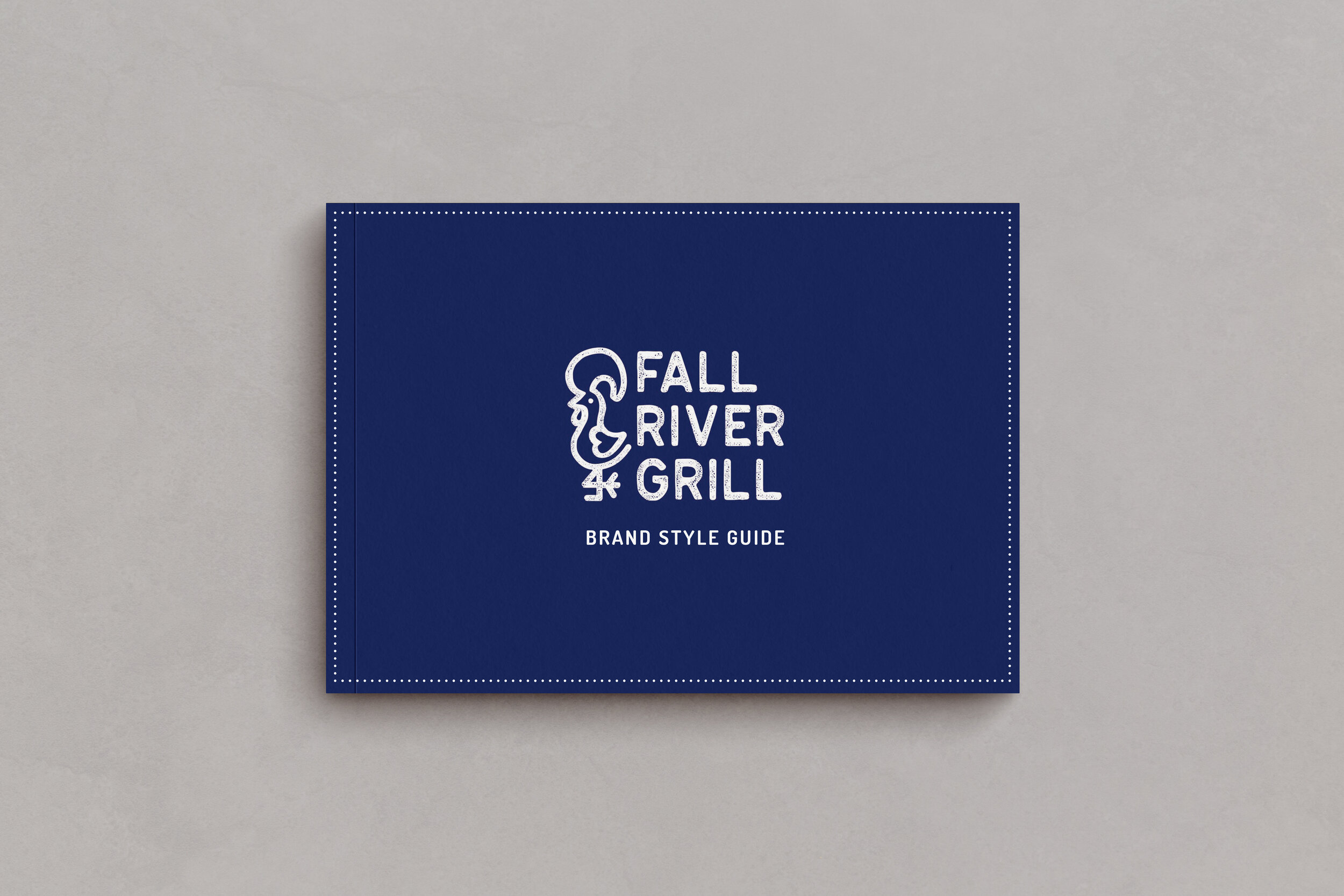

Fall River Grill
“FRG” Rebrand | Summer 2020
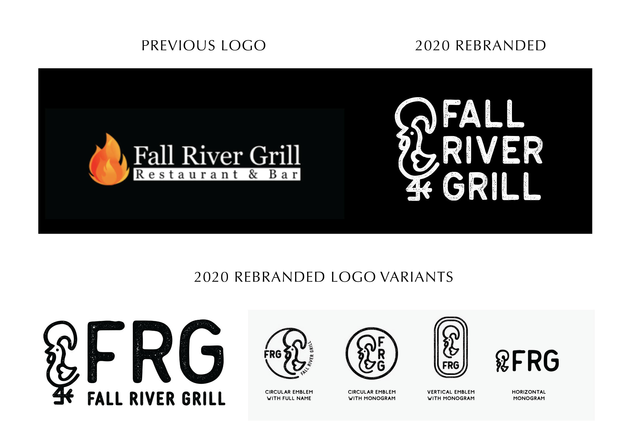
The goal of this project was to rebrand the restaurant to a more contemporary visual reflection of the Grill’s current direction, while staying true to its Portuguese family and cultural roots. During the pandemic shutdown, the restaurant took the opportunity to both renovate the interior and update their menu. The owners wanted a new brand identity to reflect this refreshed approach, aiming to attract new customers without alienating their existing regulars.
The client described their vision for the restaurant as authentic, casual, family friendly, Portuguese and proud. They wanted customers to come in and feel like they are at their grandmother’s house, surrounded by home cooked food and family. The atmosphere should feel comfortable, inviting, and warm.
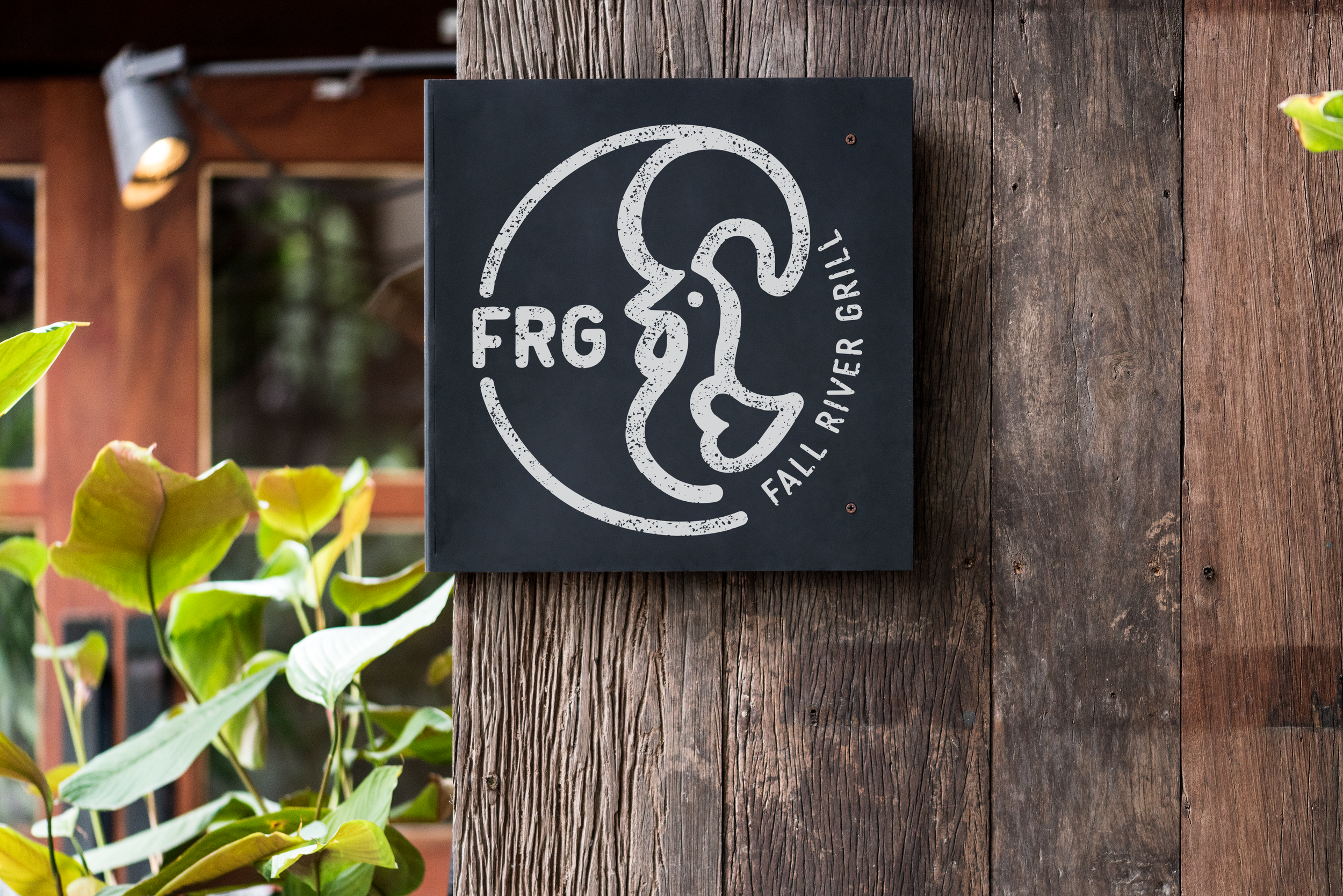
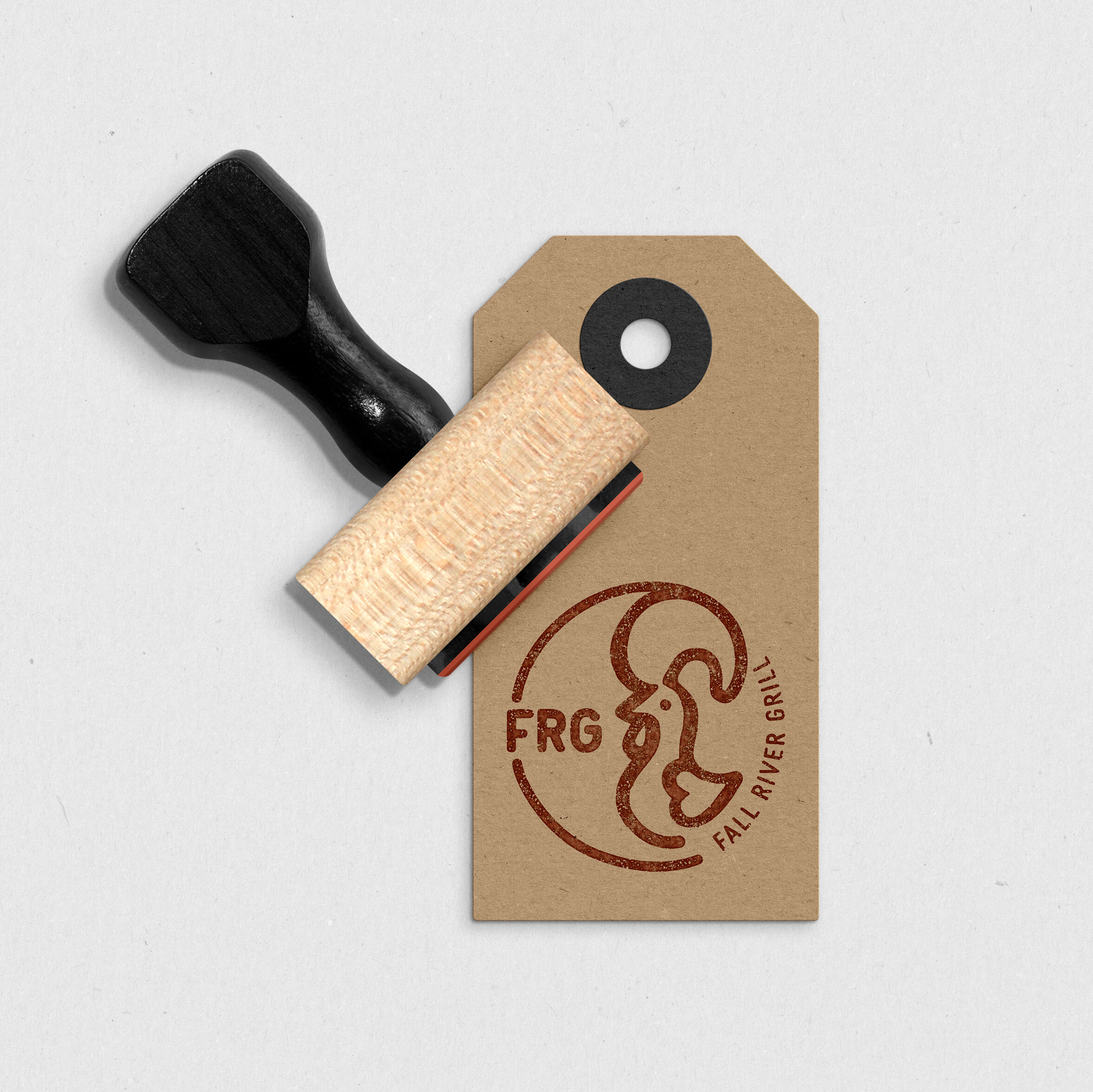
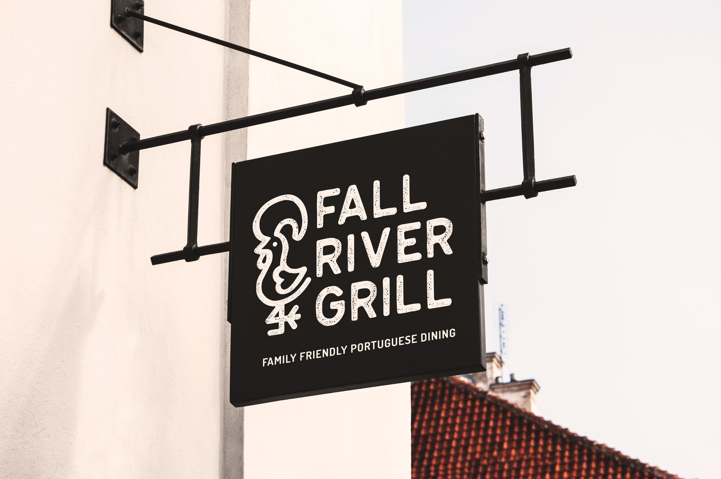
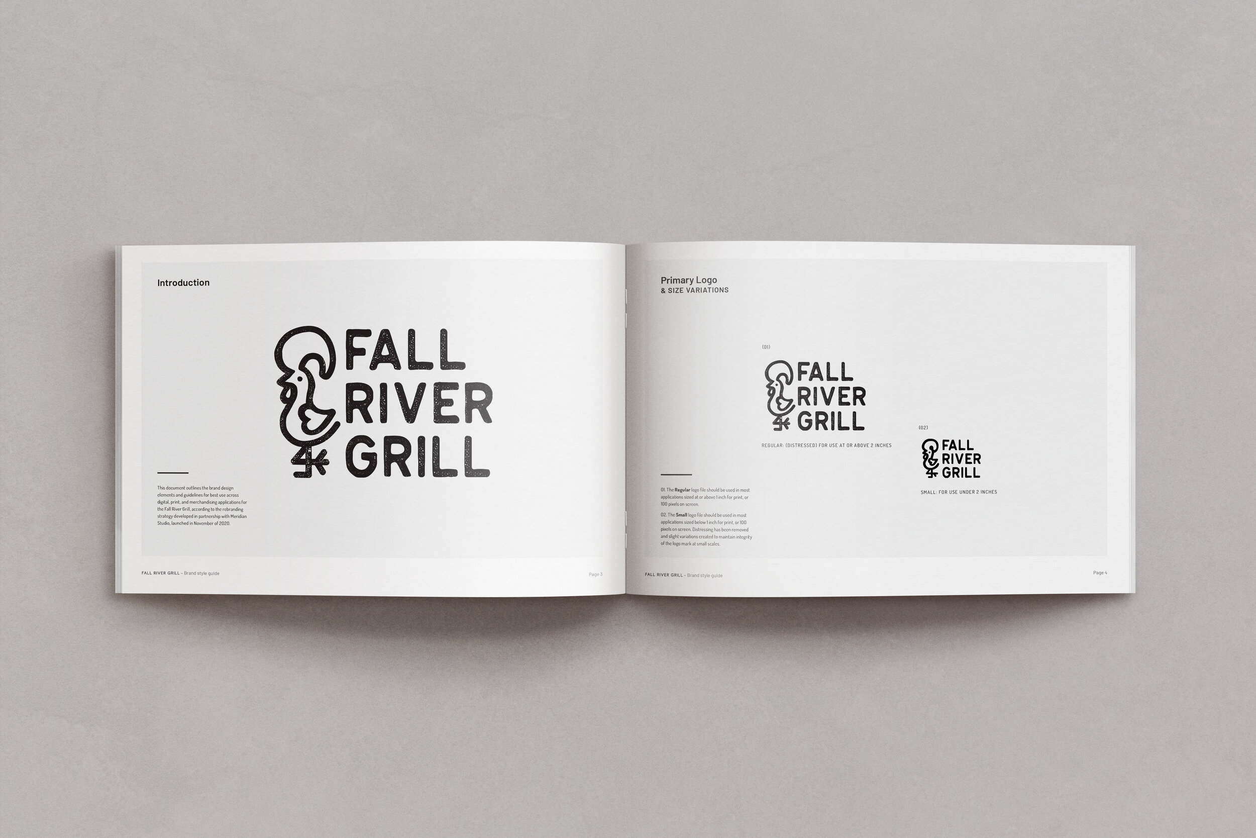
The inspiration for the visual identity system came from these conversations with the client, as well as images and cultural symbols from Portugal. I wanted the branding to be recognizably Portuguese to those with a connection to the culture, but not so over the top that it would make non-Portuguese potential customers hesitant to try it. We settled on an overall clean and contemporary combination mark featuring an interpretation of the legendary Portuguese Rooster of Barcelos, with a rustic weathered texture throughout.
Typography
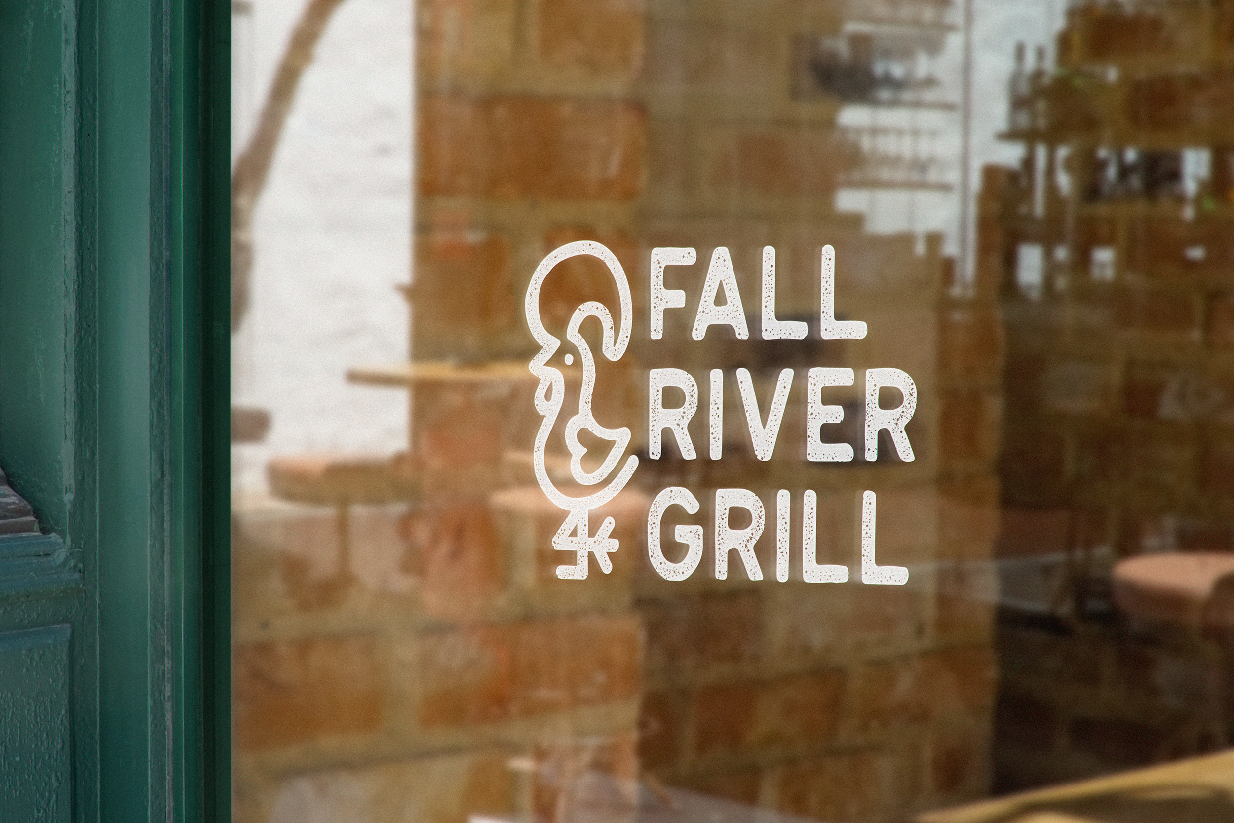
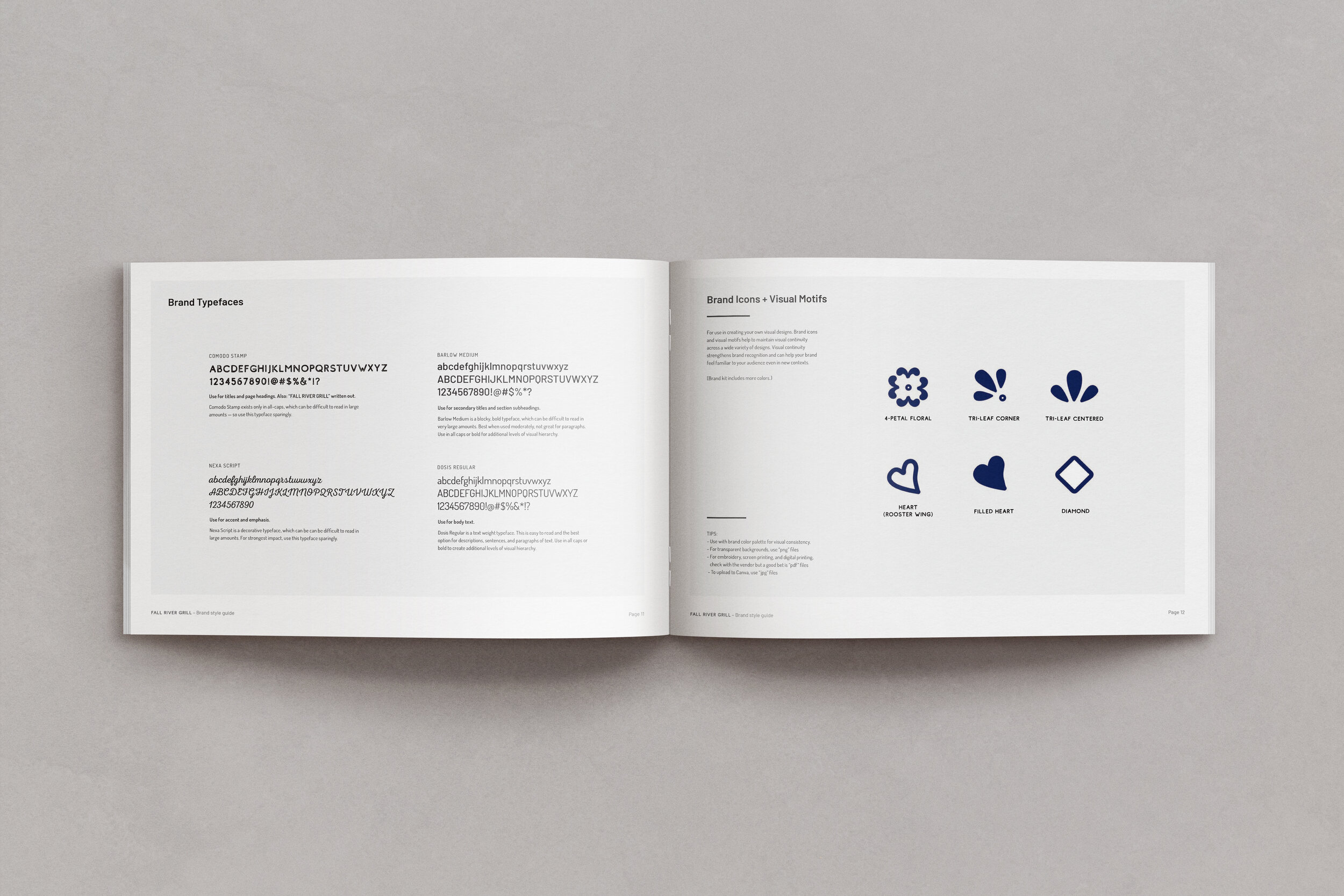
The typography was inspired by vintage street signs, shop signs, and other environmental typography from the Azores, where the owners’s family is from. This is also reflected in the interior design of the remodeled dining area, where family photos and other photography feature local land marks, stone walls, and traditional sign lettering.
Color Palette
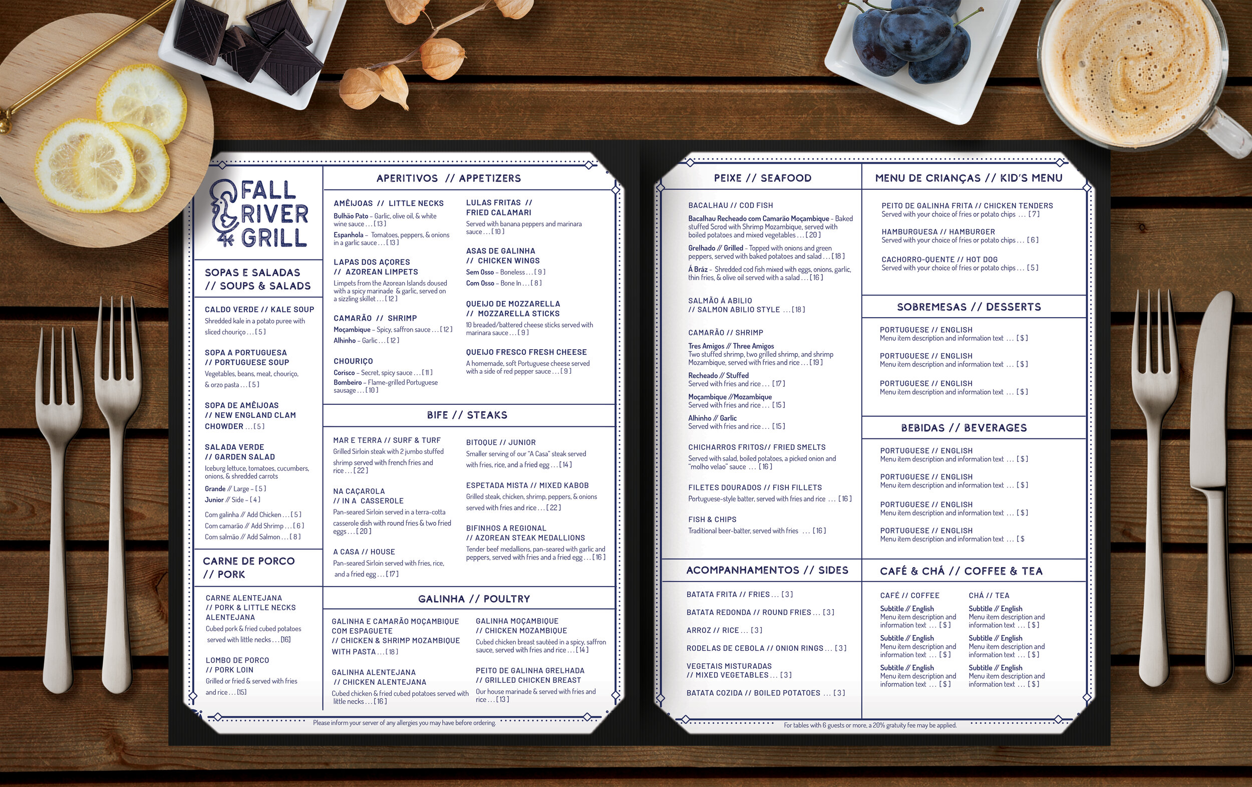
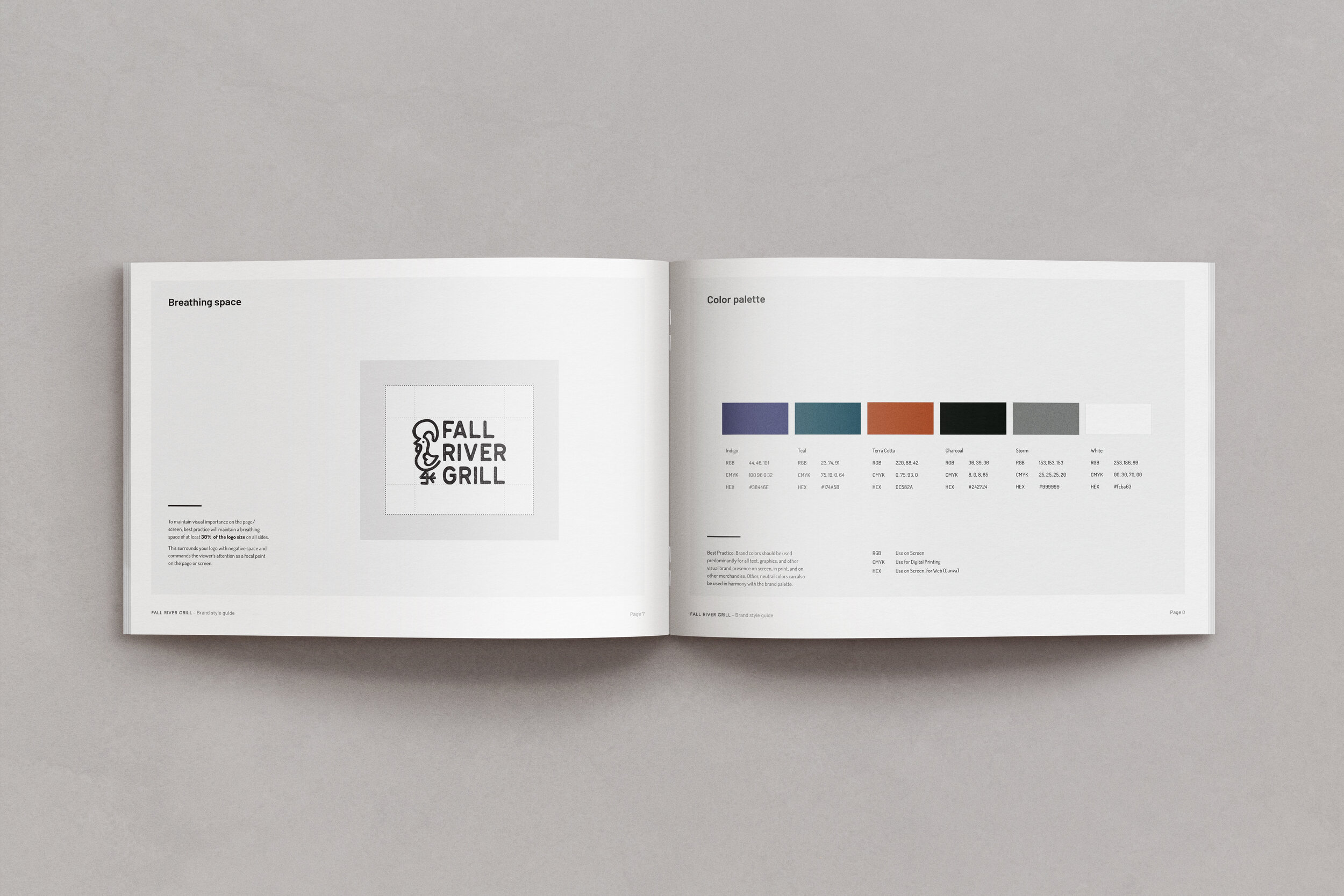
The color palette was designed to reflect the warmth discussed in the brand vision, match the remodeled interior with rustic dark wood and forest green, and give customers a feeling of connection to Portuguese culture and food. We brought the orange fire palette from their original logo into a rustic terra cotta, paired with a deep indigo and a teal, reminiscent of the ocean and greenery of São Miguel island, a warm charcoal, and a few neutrals. The deep indigo is the primary logo color and the color of the menu because blue on white references traditional Portuguese azulejos tiles and ceramics.
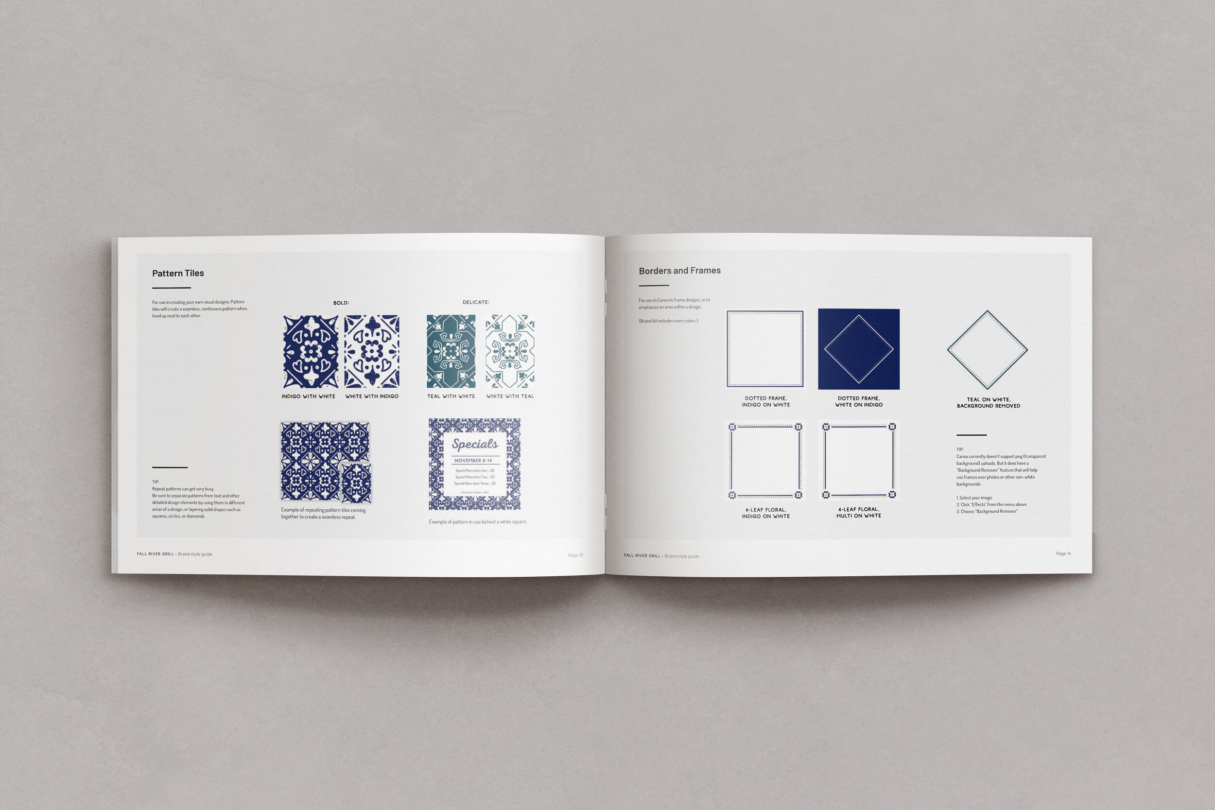
Pattern + Brand Elements
The two repeat patterns are both inspired by Portuguese tiles. One is comprised of shapes taken from the Rooster in the logo, designed to reinforce brand recognition through repetition of visual style. The other is based on a section of wall tiles installed behind the bar at the Grill. Both share similar line qualities and a distressed texture with the design of the logo mark itself.